
 1800 121 5955
In short: In enterprise SaaS, the interface is the product. Interactive UI — a dynamic feedback loop between user input and system response — is what determines whether users trust a product enough to build their workflows around it. This guide covers the six core principles, dense-dashboard design, onboarding as a retention engine, and why generic UX playbooks fail in specialized B2B contexts.

The Strategic Value of Interactive UI in Enterprise SaaS
Interactive UI isn’t a design preference — it’s the mechanism that determines whether users trust your product enough to build their workflows around it.
In enterprise SaaS, the interface is the product. Users don’t experience your backend architecture or infrastructure decisions; they experience what’s on screen when something goes wrong, when a workflow stalls, or when they need to make a fast decision under pressure. That’s why interactive UI — a dynamic feedback loop between user input and system response — has become one of the most consequential differentiators in the market. Dashboard UI design sits at the center of this: it’s where complex data, real-time signals, and user intent converge in a single view.
Static design often collapses under the weight of complexity. A fixed layout might work for a marketing homepage, but in a SaaS environment where users manage multi-step workflows, conditional logic, and live data, a non-responsive interface creates confusion fast. Users lose context, miss state changes, and make errors — not because they’re careless, but because the interface isn’t communicating clearly. In regulated industries — healthcare, finance, legal operations — that breakdown carries real consequences. Interface responsiveness directly shapes how much a user trusts the system with sensitive decisions.
Reducing user error is where interactive UI moves from nicety to business imperative. The Nielsen Norman Group’s long-standing guidance holds that a qualitative test with roughly five users can surface around 85% of the usability issues in a single design or flow — most error-prone interfaces are identifiable and fixable early (with the caveat that this applies to early, formative testing of a fairly uniform user group; complex or varied audiences need more). And yet many enterprise products ship with friction baked in, and the cost shows up in support tickets, workarounds, and churn. The principles ahead separate interfaces that earn trust from those that quietly erode it.
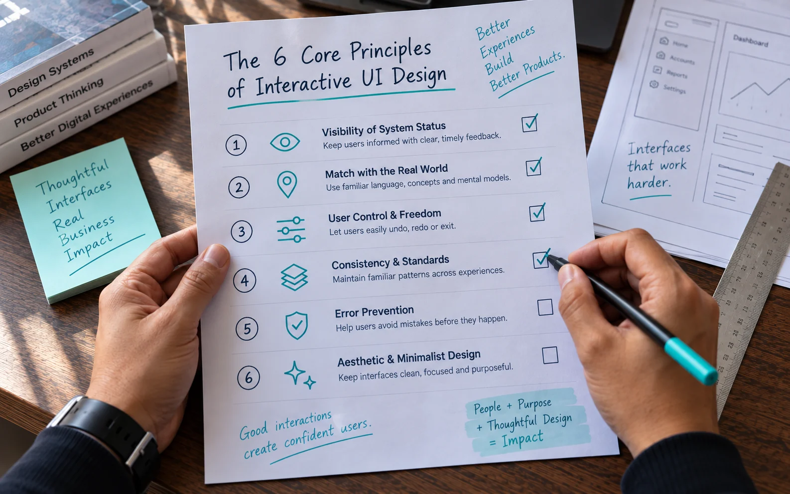
The 6 Core Principles of Interactive UI Design
Solid UI design principles aren’t aesthetic choices — they’re the structural rules that determine whether an enterprise product builds user confidence or quietly erodes it. These six, drawn from decades of usability research (notably Jakob Nielsen’s usability heuristics), define what that foundation looks like in practice.
1. Visibility of system status means users always know what’s happening. Background processes — syncing, saving, calculating — should surface clearly through progress indicators, status labels, or subtle animation. Silence from the interface reads as failure.
2. Match between system and the real world anchors the interface in familiar mental models. When terminology, icons, and workflows mirror concepts users already know from their industry, the learning curve shrinks and adoption accelerates. A compliance officer shouldn’t need to decode abstract UI language to do their job.
3. User control and freedom is non-negotiable in complex workflows. Undo, cancel, and back functions aren’t conveniences — they’re the safety net that lets users explore without fear. Remove them and users hesitate at every decision point.
4. Consistency and standards reduce cognitive load by making behavior predictable. When a button behaves the same way across every screen, users stop thinking about the interface and start thinking about their work.
5. Error prevention is more valuable than error recovery. Behavior-driven design that anticipates user habits — thoughtful constraints and confirmation prompts — prevents mistakes before they happen, which pays off measurably in task success.
6. Aesthetic and minimalist design prioritizes signal over noise. Every element competing for attention dilutes focus. For BFSI or healthcare dashboards carrying dense, high-stakes data, that trade-off becomes critical.

Optimizing Dashboard UI Design for Data Density
Dashboard UI is where enterprise SaaS products either earn user trust or lose it — and in high-stakes sectors like BFSI and Healthcare, the margin for poor decisions is almost zero.
The core challenge in these industries isn’t a lack of data. It’s too much of it. A compliance officer reviewing risk exposure and a clinician monitoring patient vitals share the same problem: their dashboards are often built to display everything at once rather than surfacing what matters right now. The result is cognitive overload, slower decisions, and users who quietly abandon the tool for manual workarounds.
Progressive disclosure is the structural solution most products underutilize. The idea is simple: show only what’s necessary for the current task, and reveal detail on demand. A BFSI dashboard might lead with portfolio-level risk indicators and let users drill into individual asset performance through a deliberate action. This keeps the default view clean without hiding the complexity power users need. The quality of user interface interaction at this layer is what separates a dashboard that feels intelligent from one that feels overwhelming.
Data hierarchy shapes every decision a user makes. If secondary information competes visually with primary signals, users stop trusting the interface to guide them — and they stop making fast, confident decisions.
Interactive filtering and drill-down have moved from differentiators to baseline requirements. Enterprise buyers now expect to slice data by time period, region, or category without reloading or navigating away from context. Interactive UI in complex sectors requires a balance between user needs and business outcomes — a standard generic dashboard templates rarely meet.
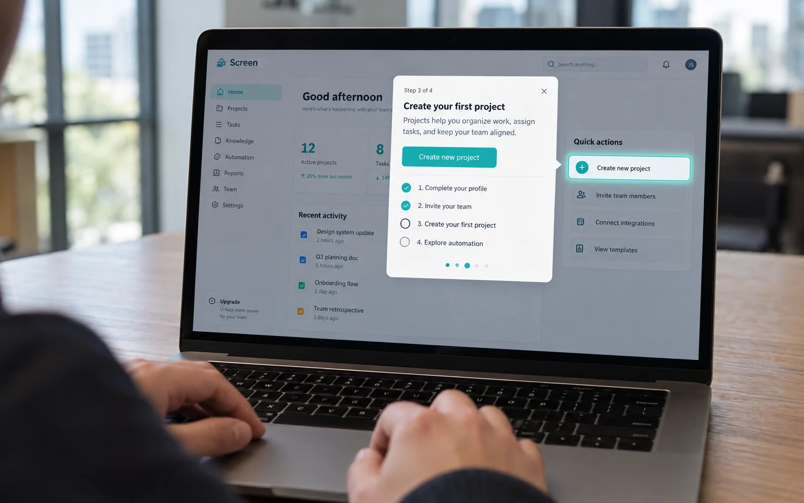
Onboarding UI Design as a Retention Engine
The first moments of a user’s SaaS session are the highest-leverage window in the entire customer lifecycle — what happens there determines whether a visitor becomes a power user or a churn statistic.
First-value moments are the psychological turning points where a new user experiences a product’s core benefit for the first time. Effective product UI design engineers these moments deliberately. Interface quality is a primary factor in how users perceive credibility, which means the onboarding interface isn’t just functional scaffolding — it’s actively building or eroding trust before a user has committed to anything.
Interactive walkthroughs outperform static tooltips precisely because they respond to behavior in real time. A tooltip sits and waits; an interactive walkthrough guides the user through an action, confirms the result, and advances their sense of progress. That behavioral loop — action, feedback, reward — is what makes a system feel sticky. Static hints tell users what exists; interactive guidance shows them why it matters.
Gamification, applied with restraint, accelerates feature discovery without adding friction. Progress indicators, milestone acknowledgments, and contextual nudges encourage exploration while keeping users oriented. The key word is restraint — intrusive badges or forced tutorial gates frustrate intermediate users who already have momentum. Well-calibrated onboarding surfaces discovery prompts only when behavior signals readiness.
Proactive interface feedback shortens time-to-value by surfacing the right information before a user has to search for it. Inline validation, smart defaults, and contextual suggestions remove decision fatigue at the moments most likely to cause drop-off — and their cumulative effect on long-term value is real.

Case Study: Interactive UI in High-Velocity Ordering
When interactive UI meets a high-stakes ordering environment, the design decisions you make directly determine whether a user completes a purchase or abandons the cart mid-customization.
High-velocity food-tech ordering presents exactly this challenge. A global ordering platform has to balance rich visual appeal with raw order velocity: customers expect a visually engaging experience, but any friction in the customization journey carries a direct cost in conversion. The tension between “beautiful” and “fast” isn’t abstract here — it shows up in revenue.
The customization journey is the primary friction point. Users building a custom order face a sequence of choices — crust, toppings, size, extras — and without clear visual feedback, those choices feel uncertain. Uncertainty breeds hesitation, and hesitation kills conversion. Focusing on micro-interactions to reduce cart abandonment tackles this directly by making every selection feel immediate and confirmed: tap a topping, and the visual updates in real time, so users never wonder whether their choice registered.
Micro-interactions do the heavy lifting. Rather than static confirmation messages, subtle motion cues communicate “yes, that worked” without interrupting the flow. This mirrors what strong onboarding UI does in SaaS: it guides users through a sequence of decisions without making them feel lost or unconfirmed at each step.
The principle applies well beyond food tech: when interactive UI removes ambiguity, users move faster and trust the product more.

Why Traditional UX Principles Often Fail in SaaS
Generic UX playbooks are built for broad consumer audiences — which makes them a poor fit for the specialized, high-stakes environments where SaaS products actually live.
B2C vs. B2B design intent
Consumer apps optimize for delight: frictionless onboarding, bright visuals, emotional resonance with a first-time user. B2B SaaS has a different contract. A financial analyst running reconciliation or a logistics manager tracking fleet operations doesn’t need to feel charmed — they need to feel fast, accurate, and in control. Designing for delight in a utility context can actively erode trust with the people who matter most.
The over-simplification trap
A common SaaS-redesign pattern strips interfaces down in the name of “clean” design, only to frustrate power users who relied on the density they lost. Expert users build workflows around specific interface behaviors; when those disappear behind progressive disclosure or minimalist menus, productivity drops. The design looks better in a portfolio and performs worse in a quarterly review.
Research-first methodology
This is where cookie-cutter design systems fall apart. A research-driven strategy — understanding the actual jobs users are hired to do, then building around them — is essential for future-proofing experiences in regulated and specialized industries. That rigor doesn’t come from following design-blog trends.
Legacy user expectations
Every SaaS team eventually faces the tension: how do you innovate without alienating users who’ve spent years learning your current system? The answer isn’t to freeze the UI — it’s to evolve it incrementally, with user research validating each step. That discipline matters even more under the regulatory constraints that govern entire verticals.
Future-Proofing UI for Regulated Industries
In regulated industries like banking and healthcare, interactive UI isn’t just a competitive advantage — it’s a compliance obligation that shapes every design decision.
Accessibility sits at the center of that obligation. WCAG conformance, screen-reader compatibility, and keyboard navigability aren’t optional enhancements bolted on after launch. They’re baseline requirements in sectors where a non-accessible interface exposes your organization to legal risk and excludes the very users you’re built to serve. Meeting accessibility standards while preserving a fluid, responsive experience requires deliberate system thinking from day one.
Security communication is where UI design gets genuinely complex. Users in BFSI and Healthcare need to feel confident the platform is secure — but every extra authentication step, permission prompt, or session timeout is friction that compounds over a workday. The goal is a design language that signals trustworthiness through visual consistency, clear iconography, and transparent feedback rather than interruptions. Design security into the interface rather than layering it on top.
Design-system scalability becomes non-negotiable as products expand across web and mobile. A component library that behaves inconsistently between a desktop dashboard and a mobile workflow creates confusion — and in a compliance-sensitive environment, confusion carries real consequences. Interface precision at this level is a prerequisite for regulated product teams, not a nice-to-have.
Usability testing closes the loop. Structured testing with actual end users — not just internal stakeholders — surfaces compliance risks before they reach production. A workflow that seems logical to a developer can create dangerous ambiguity for a clinician or a financial advisor under time pressure. These insights don’t just improve UX; they reduce regulatory exposure.
The Bottom Line: Key Takeaways for Product Leaders
Interactive UI isn’t a design preference — it’s a fundamental driver of the SaaS metrics that matter most, from churn reduction to long-term customer value.
Product leaders who treat interface design as a downstream concern find themselves fighting avoidable retention problems. The connection between how users experience your product and how long they stay — and how much they spend — is direct. Friction compounds. Every hesitation, every confusing state, every missed confirmation quietly erodes the trust that keeps accounts renewing. Investing in responsive, well-considered interactions builds the habitual engagement that raises lifetime value.
- Interactive UI shapes business metrics. Churn and LTV aren’t just sales problems — they’re design problems.
- Core UX principles aren’t optional. Consistency and error prevention are table stakes for enterprise tools.
- Micro-interactions move revenue. Behavioral design at the detail level produces measurable outcomes.
- Research comes first. UI updates that don’t start with user research tend to solve the wrong problems.
Knowing where you stand against these benchmarks begins with an honest audit of where your current interface creates friction.
Transforming Human-Screen Interactions into Business Outcomes
The shift from static interfaces to interactive, outcome-driven product UI isn’t a trend — it’s the defining competitive variable separating SaaS products that retain users from those that quietly lose them.
Every layer of a modern SaaS product, from onboarding flows to compliance dashboards, benefits measurably when interaction design is treated as a strategic discipline rather than a visual afterthought. Static UIs create friction. Friction creates churn. And churn is the slowest, most expensive way to learn you made the wrong design decisions.
The specialist gap is where many teams stumble. Building interactive UI for complex domains — fintech, healthcare, enterprise workflow tools — requires more than a generalist team. It demands partners who understand how interaction patterns intersect with compliance requirements, data-heavy interfaces, and the cognitive load of professional users. Without that domain fluency, even well-intentioned redesigns introduce new friction in place of the old.
Before you engage any partner, audit your current interface for interactive friction by asking a few direct questions: Where do users abandon workflows? Which screens generate the most support tickets? Where does analytics show hesitation or repeated clicks? Those signals map directly to where interaction design is failing to do its job — and they’re exactly what a research-driven process is built to solve.
Frequently Asked Questions
What is interactive UI?
A dynamic feedback loop between user input and system response — the interface responds visibly and immediately to what the user does (state changes, inline validation, motion cues), rather than sitting static. In enterprise SaaS, it’s what lets users trust the system with complex, high-stakes work.
What are the core principles of interactive UI design?
They build on established usability heuristics: visibility of system status, match with the real world, user control and freedom, consistency and standards, error prevention, and aesthetic/minimalist design.
How do you design dashboards for dense data?
Lead with progressive disclosure — surface what matters for the current task and let users drill into detail on demand — and establish a clear data hierarchy so primary signals never compete visually with secondary information.
Why do generic UX playbooks fail in B2B SaaS?
Because they optimize for first-time consumer delight, while professional users need speed, accuracy, and control. Over-simplifying a specialized tool strips the density power users depend on — which is why research into the actual job comes first.
Written by Team ScreenRoot. 16+ years leading enterprise UI/UX research for BFSI, SaaS, and Healthcare clients.
When you’re ready, let’s talk.
📞 Call us (Toll-Free): 1800 121 5955 (India)
✉️ Email us: [email protected]



