
 1800 121 5955
In short: Enterprise SaaS retention improves when you simplify navigation, prioritize the small core of features that deliver most of the value, onboard users contextually by role, make dashboards actionable, and run a continuous usability-testing loop. Feature volume doesn’t retain users; time to value does.
Effective B2B SaaS retention strategies don’t start with adding features — they start with understanding which features your users are actually ignoring. Pendo’s widely cited Feature Adoption Report found that approximately 80% of features in the average software product are rarely or never used. That’s a significant portion of your development budget sitting dormant while users quietly disengage.
Retention gaps are rarely obvious. They hide in workflow abandonment, support tickets, and the slow churn of users who never fully adopted your platform. The good news is that a structured UX audit surfaces these issues before they become contract cancellations.
Start with a Retention-Focused UX Audit
Here’s how to run one:
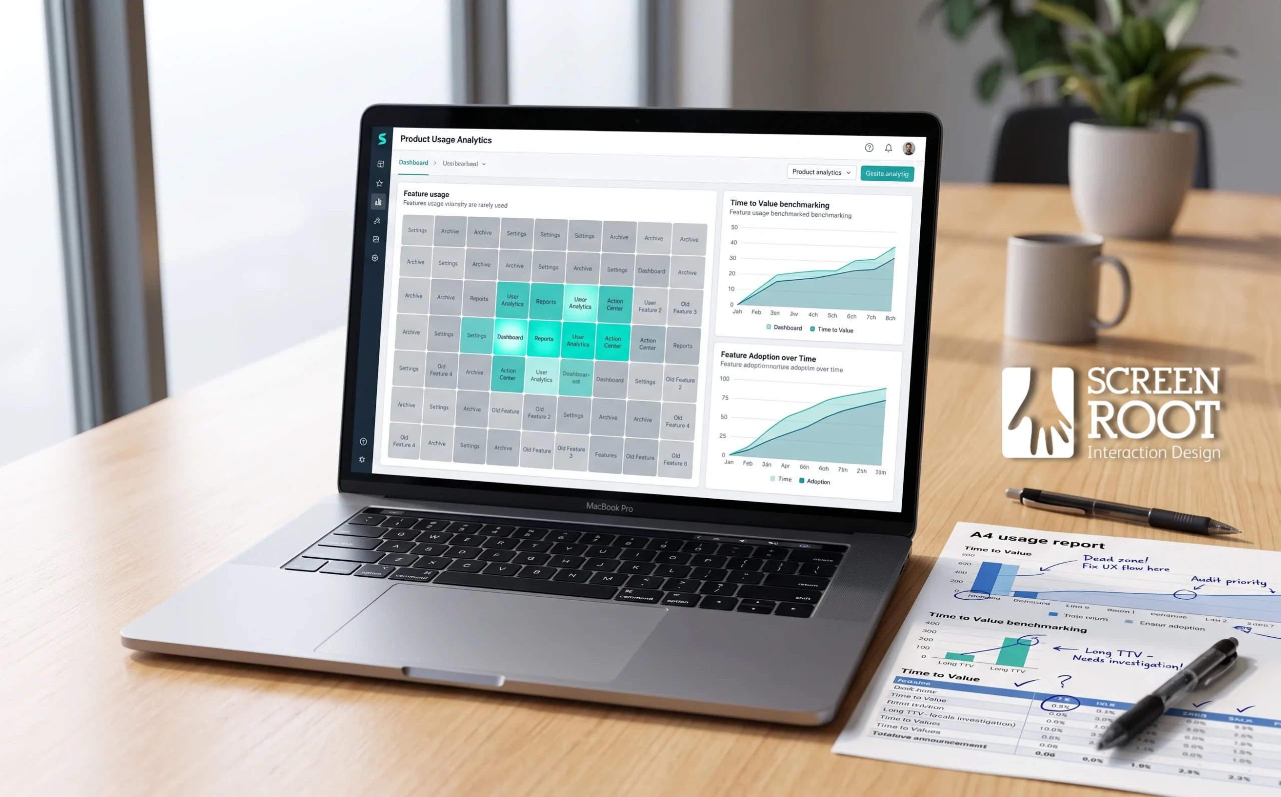
1. Analyze product usage data to identify “dead zones” — features with consistently low engagement. Segment by user role and company size to reveal patterns that aggregate data masks.
2. Conduct usability testing with users in high-pressure environments, such as banking or financial operations, where cognitive load is already elevated and friction is least tolerable.
3. Map your Time to Value (TTV) for core enterprise tasks. Measure how long it takes a new user to complete a critical workflow and benchmark it against user expectations.
4. Identify friction points in complex workflows that create cognitive overload — multi-step processes, inconsistent navigation patterns, or unclear error states.
Once you’ve mapped where users struggle, you’re ready to tackle navigation — where most cognitive overload begins.
Step 1: Reduce Cognitive Load with Mobile-First Navigation
Once you’ve identified where users are dropping off in your audit, the next move is structural. This step walks you through simplifying your navigation so users can reach critical features faster — without the friction that quietly drives churn.
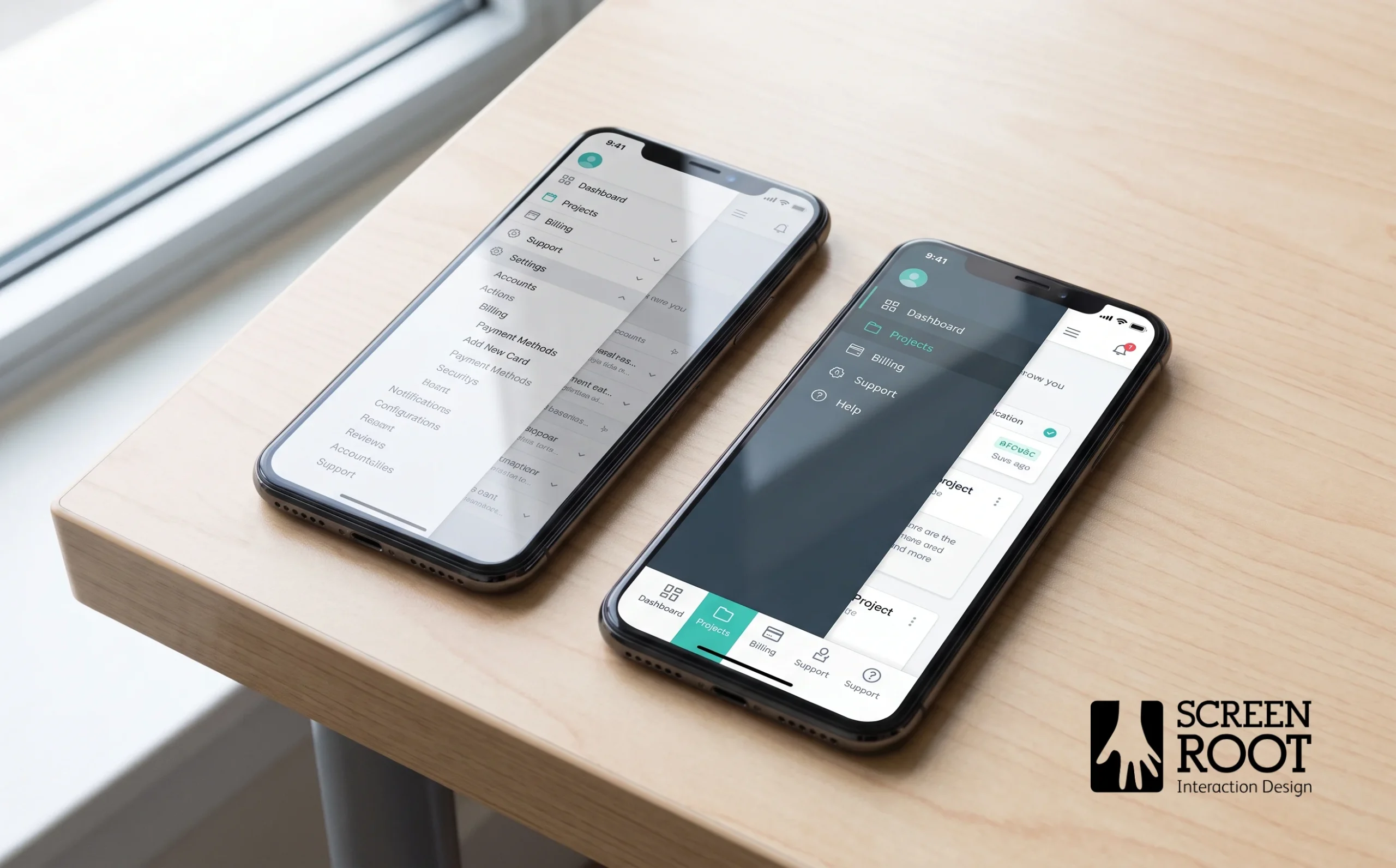
Adopting a mobile-first philosophy is one of the most effective moves inside any enterprise software feature adoption framework. Designing for a smaller screen first forces genuine prioritization — you can’t hide a dozen rarely-used menu items behind nested dropdowns when screen space is limited. And that constraint, applied intentionally to desktop interfaces, results in cleaner, faster navigation for everyone.
In ScreenRoot’s enterprise design engagements, simplifying complex navigation through a mobile-first approach has consistently reduced cognitive load and supported higher daily active usage.
1. Audit your current menu depth — Map every navigation path and flag any feature buried three or more clicks deep. Those are your highest-risk retention gaps.
2. Flatten deep menu hierarchies by consolidating related features into a single, clearly labelled top-level category. Fewer layers mean users spend less time searching and more time doing.
3. Apply progressive disclosure so the interface surfaces only what’s relevant to the user’s current task. Secondary options appear on demand, keeping the default view clean.
4. Implement global search as a primary shortcut for power users who know what they want. A persistent, fast search bar reduces reliance on menu structures entirely.
The core principle: every navigation decision should protect the user’s attention, not compete for it. With cleaner structure in place, you’re ready to evaluate which features deserve the most prominent real estate — which is exactly what Step 2 addresses.
Step 2: Decide Which Features to Launch or Highlight Next
With navigation friction reduced, the next challenge is knowing which features deserve your attention. Poor prioritization is one of the most common reasons enterprise SaaS products lose users — you build what’s visible, not what’s valuable. This step walks you through a focused approach to feature decisions that directly support retention.
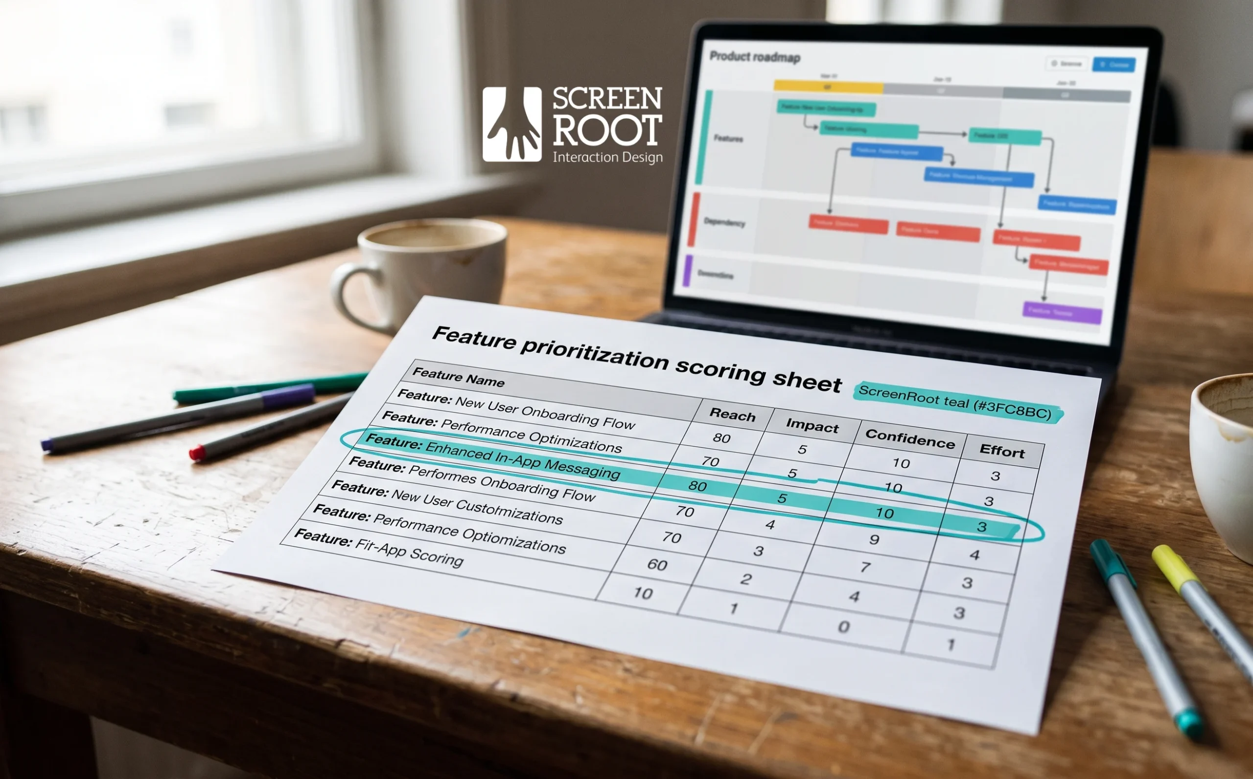
1. Apply the RICE framework to your backlog
Score each feature candidate by Reach, Impact, Confidence, and Effort. For UX design in complex enterprise workflows, this scoring must account for cross-departmental dependencies and approval cycles that inflate effort estimates. A feature with a modest reach score can still rank high if it eliminates a high-frequency friction point.
2. Prioritize compliance and security features for regulated industries
In BFSI and Healthcare specifically, friction around audit trails, access controls, or data residency often triggers churn before any UX issue does. Address these first — they’re non-negotiable for enterprise buyers.
3. Interview churned users directly
Understanding why users left surfaces missing capabilities that retention metrics alone won’t reveal. Ask specifically which features, if present, would have changed their decision.
4. Focus on the core 20% of features driving 80% of value
The interface is the part of the product your customer actually sees and touches — if it fails, the technology stack behind it never gets the chance to matter. Protect and polish the features your best users rely on most.
Once you’ve locked in your feature priorities, the next challenge is making sure users actually discover them — which is where onboarding design becomes critical.
Step 3: Implement Contextual In-App Onboarding
Contextual onboarding is one of the highest-leverage investments for improving time to value in enterprise SaaS. Rather than walking every user through the same generic product tour, you can deliver guidance that’s relevant, timely, and role-specific — which directly supports the retention gains you’re working toward. Bain & Company research, published in Harvard Business Review, found that a 5% increase in customer retention can lift profits by 25% to 95%. Getting onboarding right is a significant lever.
Generic vs. Contextual Onboarding
| Generic Onboarding | Contextual UX Onboarding |
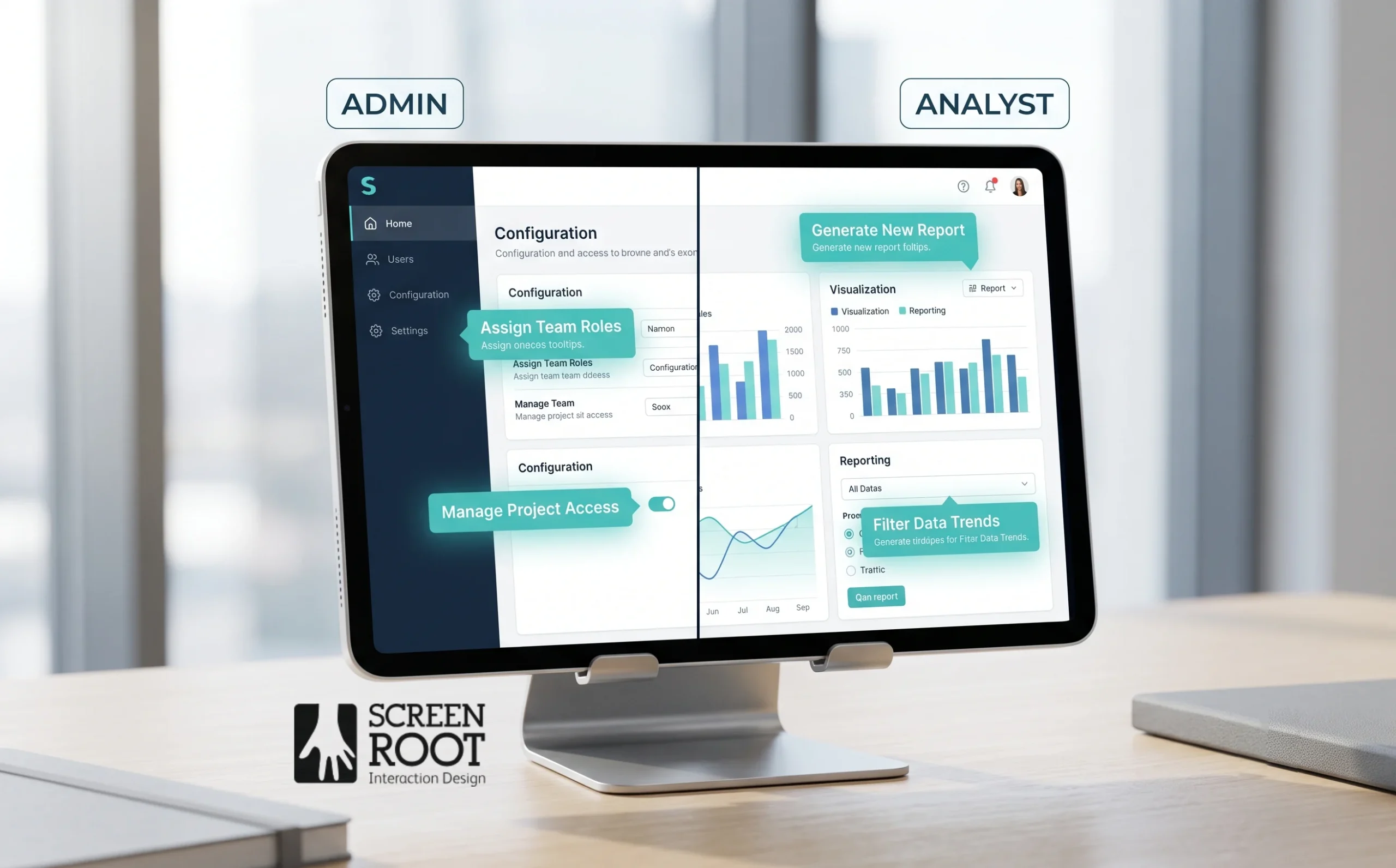
| Same tour for every user | Role-based walkthroughs (Admin vs. Analyst) |
| Triggered at login | Triggered by specific user behaviour |
| Feature-focused | Task-focused |
| Static tooltips | Dynamic, behaviour-driven prompts |
The goal isn’t to show users everything — it’s to show the right user the right thing at the right moment.
1. Replace generic product tours with task-based walkthroughs that guide users toward a specific outcome, not a feature inventory.
2. Design empty states to educate rather than just inform — include a clear call to action so users know exactly how to get started with a new feature.
3. Trigger tooltips based on actual user behavior, such as hovering over an unused module, rather than on session count or login events.
4. Segment onboarding flows by user role so an Admin sees configuration guidance while an Analyst sees reporting shortcuts — never the same path.
Once onboarding is contextual and role-aware, the natural next challenge is surfacing the right data. That brings us to how your dashboards communicate — and whether they drive action or just display numbers.
Step 4: Design Actionable Dashboards for Data Visualization
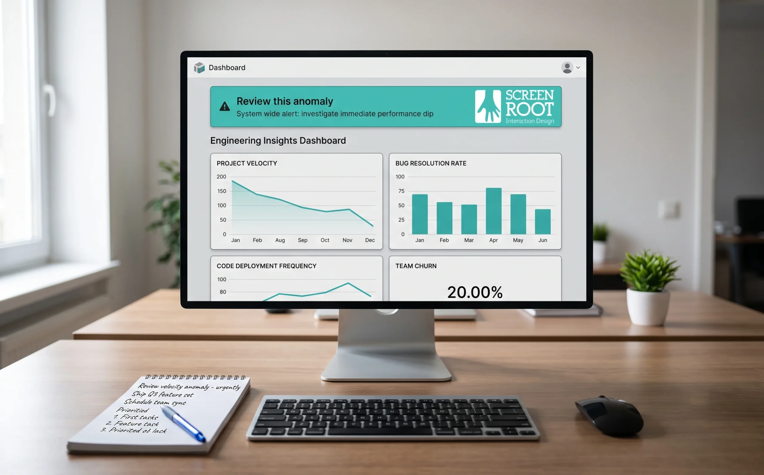
Contextual onboarding gets users to the right features faster — but once they’re there, the dashboard experience determines whether they stay. Advanced data visualisation and actionable dashboards are essential SaaS features for maximising user retention, and reducing churn through product design starts here. The goal isn’t pretty charts; it’s clarity that tells users exactly what to do next.
Follow these steps to build dashboards that drive daily engagement:
1. Replace decorative metrics with decision-ready insights
Surface recommended actions alongside data — for example, flag a usage spike with a prompt like “Review this anomaly” rather than leaving interpretation to the user.
2. Configure permission-based, role-specific views
A CFO and a frontline analyst need different data cuts. Build role-based data views so each persona sees only what’s relevant, reducing cognitive load.
3. Integrate third-party data sources into a single pane
Pull CRM, billing, and operational data together so the dashboard becomes a genuine single source of truth — not one tab among many.
4. Apply visual hierarchy to surface urgency
Use colour, size, and placement to push anomalies and overdue tasks to the top, especially in regulated sectors where missed alerts carry real risk.
5. Make every widget interactive
Users should drill down from a summary metric to the underlying records in two clicks or fewer.
Done right, an actionable dashboard becomes the reason users open your product every morning. And that daily habit is precisely what your measurement strategy needs to track — which is where usability testing and adoption KPIs come in.
Step 5: Measure and Iterate Using Usability Testing
Actionable dashboards surface the right data — but you still need a disciplined process to confirm that your UX changes are actually improving retention and adoption. This step walks you through a monthly audit cycle that closes the feedback loop and keeps your product improving over time.
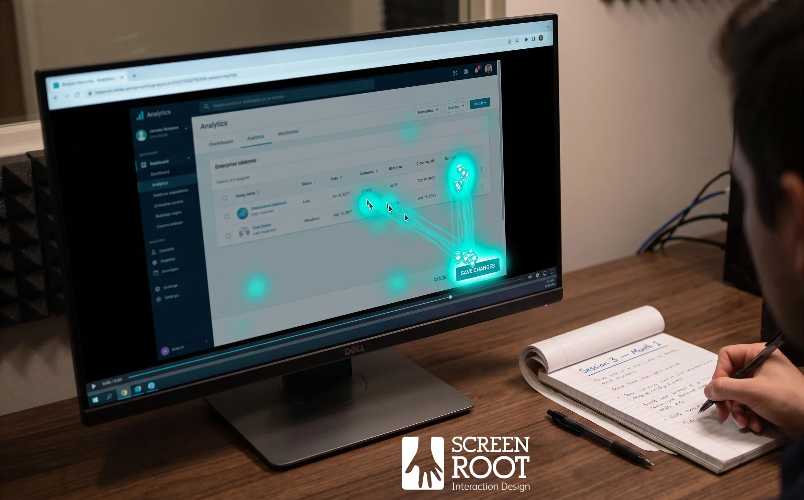
1. Deploy heatmaps and session recordings on every newly released feature. These tools reveal exactly where users pause, rage-click, or abandon a workflow — signals that quantitative analytics alone can’t fully explain. Review recordings weekly during the first month after any major UI change.
2. Schedule monthly usability testing sessions with actual enterprise clients, not just internal testers. In practice, real users surface edge cases and role-specific pain points that no internal team anticipates. Even two or three sessions per month generate meaningful, actionable insight.
3. Track Feature Adoption Rate as a core KPI alongside standard retention metrics. Teams that treat adoption as a primary metric make faster, better-targeted product decisions than those focused solely on engagement time.
4. Collect and act on qualitative feedback systematically. Clicks and funnels tell you what is happening; user interviews and open-ended surveys tell you why. Iterating on the UI without qualitative context often produces changes that look logical on paper but fail in the field.
5. Log every iteration in a shared changelog so product, design, and customer success teams stay aligned. A common pattern in research-driven design practices — including ScreenRoot’s approach in complex enterprise contexts — is that undocumented changes create confusion when diagnosing later retention dips.
6. Repeat the audit monthly, using findings from each cycle to inform the next round of prioritization. Usability testing isn’t a one-time fix; it’s the engine that keeps your retention strategy calibrated as user needs evolve.
Running this process consistently transforms UX improvements from one-off projects into an ongoing discipline — which sets up the broader strategic picture you’ll want to carry forward.
How to Summarise Your SaaS Retention Strategy
With usability testing and dashboard design now in your toolkit, it’s worth consolidating the full picture. Improving enterprise SaaS retention isn’t a single initiative — it’s a layered strategy where each element reinforces the next. Here’s how to bring it all together.
1. Prioritize usability over feature volume.
More features don’t automatically mean more value. In practice, bloated interfaces accelerate churn by overwhelming users before they reach the outcomes they signed up for. Stripping complexity down to what’s essential keeps users engaged and reduces support overhead.
2. Apply mobile-first simplicity to complex enterprise workflows.
Even in regulated industries like BFSI and Healthcare — where workflows carry serious compliance weight — a clean, mobile-responsive UI isn’t optional. It’s how you meet users where they actually work.
3. Use contextual onboarding to drive adoption of the critical 20% of features.
Structured onboarding directly improves early retention by guiding users to the features that deliver immediate value — not every feature you’ve built.
4. Invest in research-driven design.
Your UI must support the underlying technology stack, not fight it. Design decisions grounded in user research consistently outperform assumption-based redesigns on adoption metrics.
In summary:
- Reduce churn by simplifying — not expanding — your feature set
- Design mobile-first even when your users are enterprise teams
- Onboard users into core features before exposing advanced ones
- Ground every design decision in research, not assumptions
What these steps share is a consistent focus on the intersection of user needs and business outcomes — which is exactly where a structured UX transformation begins.
How to Get Started with Enterprise UX Transformation
Improving enterprise SaaS retention through UX isn’t a one-time project you complete and ship — it’s an ongoing discipline. Here’s how to begin without overwhelming your team or your users.
1. Audit a single high-impact workflow first
Resist the urge to redesign the entire platform. Identify the workflow with the highest drop-off or support ticket volume and fix that one before expanding scope.
2. Map user needs to business outcomes
Every UX decision should sit at the intersection of what users need and what retention metrics you’re trying to move. If it doesn’t serve both, deprioritise it.
3. Instrument the experience before you change it
Establish a baseline using session data, task-completion rates, and in-app feedback. You can’t measure improvement without a starting point.
4. Run a focused usability test
As covered in Step 5, even three to five sessions reveal patterns. Use findings to prioritise your first round of design changes — not your instincts.
5. Partner with specialists who understand regulated industries
Enterprise UX in compliance-heavy sectors has real constraints. Working with a premier UI/UX design agency that understands those nuances shortens the feedback loop considerably.
6. Iterate, measure, and repeat
Treat each improvement cycle as a learning opportunity. User-centered prioritization consistently outperforms assumption-driven roadmaps.
The path to stronger retention starts with one decision: treat UX as infrastructure, not decoration. Make that shift, and the results compound over time.
Frequently Asked Questions
Why do enterprise SaaS users churn even when new features keep shipping?
Because feature volume doesn’t create value — usable workflows do. Most churn traces back to friction in core tasks, slow time to value, and features users never discover, not to a missing capability.
What is Time to Value (TTV) and why does it matter?
TTV is the time it takes a new user to complete their first meaningful outcome in your product. The shorter it is, the more likely users are to adopt, renew, and expand.
What makes onboarding “contextual”?
It adapts to the user: role-based walkthroughs, behavior-triggered guidance, and task-focused flows — instead of one generic tour for everyone at login.
Which KPIs best measure feature adoption?
Feature Adoption Rate, activation rate for core workflows, Time to Value, and post-release usage depth — reviewed alongside retention and support-ticket volume.
How often should we run usability testing?
Monthly, at minimum, with real enterprise users. Even two or three sessions per cycle surface actionable friction that analytics alone won’t explain.
Written by Team ScreenRoot. 16+ years leading enterprise UI/UX research for BFSI, SaaS, and Healthcare clients.
When you’re ready, let’s talk.
📞 Call us (Toll-Free): 1800 121 5955 (India)
✉️ Email us: [email protected]



