
 1800 121 5955
In short: Poor lead-generation UX is a revenue problem, not a cosmetic one, especially in regulated service sectors where users arrive anxious. The patterns that move the needle: reduce cognitive load in forms with progressive disclosure and multi-step flows, keep contextual CTAs persistently visible, design mobile-first for time-pressed decision-makers, and build trust signals into the exact moments users hesitate.
Poor lead-generation website design isn’t a cosmetic problem; it’s a revenue problem, and the numbers make that case faster than any pitch deck.
Consider the baseline: usability research has long found that B2B websites tend to lag consumer sites on task-success measures. That gap sounds modest until you realize it represents qualified prospects hitting friction and quietly exiting. For service businesses in regulated industries, financial services, insurance, healthcare – that gap isn’t just a UX metric. It’s a direct measure of how many high-intent visitors your site is turning away.
The conversion opportunity on the other side of that gap is substantial. Well-executed UX improvements can lift conversion meaningfully when a site is built around how users actually think, not around how a company wants to present itself. (Eye-catching “hundreds of percent” figures circulate widely in design marketing; treat them as directional illustrations of upside, not guarantees – the real gains depend entirely on your starting point.)
The trust gap is what makes high-stakes service verticals uniquely challenging. In BFSI and Healthcare journeys, users arrive carrying anxiety, about data security, about making the wrong financial decision, about sharing sensitive information with a brand they don’t yet know. Generic service websites treat this as an afterthought. Research-driven UX treats it as the central design problem.
In a commoditized service market, where pricing and features are increasingly similar across providers, the experience your digital touchpoints deliver becomes the primary differentiator. And that starts well before a prospect fills out a form.

Reducing Cognitive Load in Complex Lead Forms
Asking too much, too soon is the fastest way to lose a qualified lead, and in regulated industries, form abandonment isn’t just a UX problem, it’s a pipeline leak.
Progressive disclosure is the pattern that fixes this. Rather than presenting every field upfront, it reveals information in stages – matching what the form asks to what the user is ready to give. The psychology is straightforward: when people feel overwhelmed, they disengage. Breaking a complex intake form into smaller, sequenced steps reduces that perceived burden and keeps users moving forward.
Multi-step forms consistently outperform long single-page layouts in high-stakes contexts, and the advantage is especially pronounced in regulated sectors. A user applying for a loan or requesting a healthcare consultation is already cautious. A wall of fields signals effort and risk; a focused two-question first screen signals respect for their time. Each completed step also creates a small psychological commitment, a micro-investment that makes abandonment feel like a loss.
Inline validation is where form UX best practices separate good from great. Showing a green tick the moment an email is formatted correctly, or flagging an error before submit, removes the anxiety of not knowing whether you’re doing it right. It replaces guesswork with confidence, and that shift in emotional state directly affects conversion.
ScreenRoot’s work in the BFSI sector centers on turning complex human-screen interactions into seamless, outcome-driven experiences, applying structured disclosure and workflow simplification to environments where compliance makes some form complexity unavoidable.
Reducing friction in the form itself is only part of the equation. Where those forms live on the page, and how persistently they’re surfaced – shapes conversion just as much.

Strategic Placement of Persistent Conversion Signals
Conversion-focused web design fails when CTAs appear only once, buried at the bottom of a long service page where most visitors never scroll.
The “where” of CTA placement matters more than most teams realize. On long-form service pages, common in financial services, legal, and healthcare – a sticky CTA button keeps the conversion path visible as users scroll. This isn’t aggressive; it’s practical. A visitor reading your third paragraph on compliance services shouldn’t have to hunt for a way to reach out. Persistent signals keep intent alive while the page does its persuasive work.
The “what” separates high-performing pages from forgettable ones. Contextual CTAs, tied directly to the surrounding content – consistently outperform generic “Contact Us” prompts. A section on enterprise risk assessment should prompt “Schedule a Risk Review,” not a one-size-fits-all button that could belong on any page anywhere. When your CTA reflects what the user is already thinking about, the cognitive leap to action shrinks.
The “how” comes down to visual hierarchy and restraint. White space isn’t empty; it’s directional. Breathing room around a CTA draws the eye naturally, without flashing banners or aggressive pop-ups that erode brand authority. Balancing persistence with non-intrusive design makes your conversion signals feel like helpful signposts, not pressure tactics. And that distinction matters enormously to enterprise decision-makers, who are increasingly making those calls on a mobile device.

Mobile-First Optimization for the Enterprise Decision Maker
Mobile isn’t a secondary channel for high-stakes service websites; it’s where enterprise decision-makers do preliminary research, and poor mobile UX kills qualified leads before they reach your sales team.
Even in B2B, executives and procurement leads browse vendor shortlists on their phones during commutes and between meetings. Mobile users are more likely to abandon tasks that aren’t optimized for the device, yet mobile conversion often lags desktop. That gap isn’t a device problem. It’s a design problem.
Thumb-friendly design is the starting point for fixing mobile lead forms. Input fields, dropdowns, and submit buttons need to be sized and spaced for a thumb’s natural range of motion – not built around a mouse cursor. A sticky CTA that travels with the user ensures that the moment someone decides to act, the path forward is visible. That single pattern can meaningfully reduce drop-off on longer pages.
Reducing mobile friction means eliminating unnecessary effort at every input step. Autofill support, smart keyboard types (numeric for phone fields, email-specific keyboards for email fields), and biometric authentication for returning users aren’t premium add-ons, they’re baseline expectations now.
Mobile performance compounds every one of these issues. Slow load times on cellular connections amplify form abandonment and damage the first impression your brand makes. And trust is equally fragile, the UX patterns that build confidence during data entry matter just as much as the technical ones that reduce friction.

Trust Architecture: UX Patterns for Regulated Industries
In BFSI and Healthcare, trust isn’t a soft metric; it’s a conversion prerequisite, and every UX decision either builds it or quietly destroys it.
Regulated industries carry an inherent credibility burden. Users arriving at a wealth-management platform or a healthcare SaaS site are evaluating risk before they evaluate features. That means the interface itself must do heavy lifting other industries can delegate to brand reputation alone.
- Trust — social proof and security signals without clutter.
The instinct to stack logos, certifications, and testimonials on every page typically backfires. Place trust contextually: security badges at the point of data entry, not the homepage header; client logos near relevant case studies, not in a sprawling footer carousel. Users filter out visual noise quickly, so every trust signal needs a reason to be exactly where it is. - Transparency — set expectations for “what happens next.”
Friction spikes when users submit a form and have no idea what follows. A simple line, “A specialist will contact you within one business day” – reduces abandonment and pre-qualifies intent at once. A mobile friendly contact form should include inline confirmation copy, field-level validation, and a clear next-step statement. These micro-copy decisions signal competence before a single conversation happens. - Authority — confidence through research-first design.
What separates durable regulated-industry UX from short-term redesigns is a research foundation: interfaces built around compliance requirements and user mental models simultaneously, not retrofitted after launch. That way, authority signals aren’t cosmetic, they’re structural.
Every micro-copy decision, trust-signal placement, and transparency pattern is a revenue decision. Zoom out, and these individual patterns connect into a broader picture, one where UX stops being a design function and becomes a measurable driver of business outcomes.
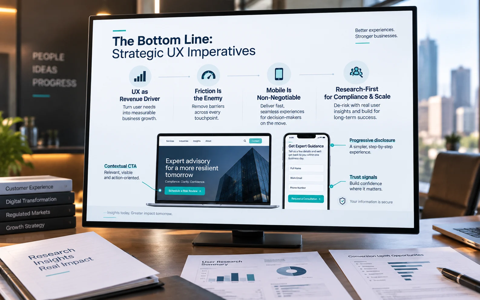
The Bottom Line: Strategic UX Imperatives
For high-stakes service websites, UX isn’t a design expense; it’s a measurable revenue driver that determines how many qualified leads you convert.
Many organizations in BFSI, healthcare, and professional services still treat their website as a brochure rather than a conversion engine. That gap is where leads quietly disappear. Four imperatives for decision-makers to carry forward:
- UX is a revenue driver, not a cost center.
Reduced drop-off, higher form completions, and shorter sales cycles justify UX investment at the board level. - Friction is the primary enemy of lead generation.
In complex service categories, every unnecessary click, ambiguous label, or slow page erodes hard-won trust. - Mobile optimization is non-negotiable for B2B acquisition.
Preliminary research happens on phones; a degraded mobile experience disqualifies your firm before a conversation starts. - Research-first design ensures scalability and compliance.
Designing from real user data builds systems that adapt to regulatory change and evolving buyer behavior without full rebuilds.
High-stakes buyers don’t tolerate friction, and they don’t give second chances. Conversion-focused web design isn’t about aesthetics; it’s about engineering every touchpoint to reduce hesitation, reinforce trust, and move qualified prospects toward action.
Partnering for Digital Transformation
Choosing the right UX partner in a regulated industry isn’t just a vendor decision; it’s a strategic commitment that determines whether your transformation actually converts.
In BFSI and Healthcare, the margin for error is narrow. A partner without deep domain experience will spend your budget learning your industry’s compliance constraints, trust signals, and user anxieties from scratch – a costly orientation you shouldn’t have to fund. What separates effective partners is accumulated pattern recognition: knowing which UX interventions move the needle in complex, high-stakes environments before the first wireframe is drawn.
Research-first beats design-first every time in these sectors. A polished interface built on assumptions can be a liability. The disciplined approach starts with structured research, usability testing, and stakeholder workshops to surface the real friction points, the difference between redesigning a form because it looks outdated and redesigning it because behavioral data shows users abandon it at the income-verification step. One produces a prettier problem; the other produces a working solution.
With 16+ years delivering UX research, usability testing, and design workshops across regulated industries, ScreenRoot approaches enterprise UX where the stakes are measurable and the outcomes have to be, too. If your website is losing qualified leads at friction points that haven’t been fully diagnosed, that’s exactly where a UX audit or strategy workshop adds the most value.
Frequently Asked Questions
Why is B2B lead-generation UX harder than B2C?
B2B service buyers, especially in regulated sectors – arrive with more anxiety and higher stakes, and they research on mobile between meetings. Generic patterns built for low-risk consumer purchases don’t address the trust and clarity these decisions require.
What’s the single most effective form fix?
Progressive disclosure. Breaking a long form into a few sequenced steps, starting with a low-effort first screen, reduces perceived burden and keeps users moving, usually outperforming one long single-page form.
Where should CTAs go on long service pages?
Keep a contextual CTA persistently visible (a sticky button) rather than burying one at the bottom, and match its wording to the section, “Schedule a Risk Review” beats a generic “Contact Us.”
Does mobile really matter for enterprise B2B?
Yes. Executives and procurement leads shortlist vendors on their phones. A form that requires pinching, zooming, or excessive typing loses them before they ever reach your sales team.
Written by Team ScreenRoot. 16+ years leading enterprise UI/UX research for BFSI, SaaS, and Healthcare clients.
When you’re ready, let’s talk.
📞 Call us (Toll-Free): 1800 121 5955 (India)
✉️ Email us: [email protected]



