
 1800 121 5955
In short: In digital finance, users judge trustworthiness almost instantly, and a cluttered or confusing interface reads as a risk to their money. Treating UX as strategic infrastructure – not a finishing layer, is what reduces friction, lowers support costs, and earns the durable trust that keeps users through market volatility.
Trust in digital finance isn’t built over months of careful relationship management. It’s won or lost before a user reads a single word on your screen. Research on web credibility has found that users form a first impression of a website’s visual appeal and trustworthiness in around 50 milliseconds of the page loading. In fintech, that’s not just a design statistic. It’s a business risk.
In financial services, looking credible isn’t cosmetic, it’s functional. A payment platform that feels cluttered or dated doesn’t just frustrate users; it triggers a deeply rational alarm. If this interface can’t be bothered to appear trustworthy, why would I hand it my money? The visual language of your product is, whether you intend it to be or not, a direct proxy for institutional reliability.
Traditional banks understood this intuitively. Marble lobbies, heavyweight stationery, and corner-office formality weren’t vanity, they were signals engineered to communicate permanence and safety. Digital-first platforms now carry that same obligation, but the medium has changed. Your UX is your marble lobby. Payment UX best practices aren’t optional refinements; they’re the handshake that either earns trust or kills the deal before the conversation starts.
And there’s another layer worth acknowledging: cognitive load. Complex investment tools, portfolio dashboards, multi-step transaction flows, real-time market data – can overwhelm users if the interface doesn’t actively manage complexity. When users feel lost, they don’t push through. They leave, often permanently. That friction isn’t just a UX problem; it compounds into revenue loss and support costs that C-suite leaders feel immediately.
Which raises a larger question: if UX shapes trust this directly, why are so many organisations still treating it as a feature rather than strategic infrastructure?

Why UX is Strategic Infrastructure for Digital Transformation
UX isn’t a finishing touch applied after the real engineering work is done. It’s foundational infrastructure that either accelerates or quietly undermines every digital transformation effort a financial institution undertakes.
Most conversations in fintech still orbit around features: new payment rails, AI-driven credit scoring, embedded insurance products. But fintech trust design principles shift that focus from what a product does to how users experience it doing it. And that shift has serious strategic weight: trust has become one of the most important currencies in the digital economy, and it is built through consistent, transparent, user-centric design. You can’t bolt that kind of trust onto a poorly designed system after launch.
Design debt is one of the most underestimated drags on transformation timelines. When legacy interfaces accumulate layers of patchwork updates, a new feature added here, a compliance requirement bolted on there. The result is a product that’s technically functional but cognitively exhausting. Treating UX as strategic infrastructure rather than a one-off deliverable reduces friction across every downstream initiative, from onboarding redesigns to mobile-first migrations.
ROI on intuitive navigation is measurable and often dramatic. Simplified flows reduce inbound support volume because users can complete tasks without assistance. Fewer calls, fewer abandoned sessions, lower churn – the cost savings compound quickly across a large user base.
Executive buy-in for major tech investments increasingly depends on design maturity. When UX is framed as infrastructure, it speaks the language of risk reduction and operational efficiency – arguments that resonate in boardrooms far more than pixel-perfect mockups.
That shift from reactive design to proactive infrastructure thinking is exactly what the best digital banking transformations look like in practice, and the next section examines one real-world example up close.
A Mobile-First Banking Transformation: Agility in Practice
Legacy banking workflows weren’t designed for the smartphone era. They were designed for compliance, and users have been paying the price ever since.
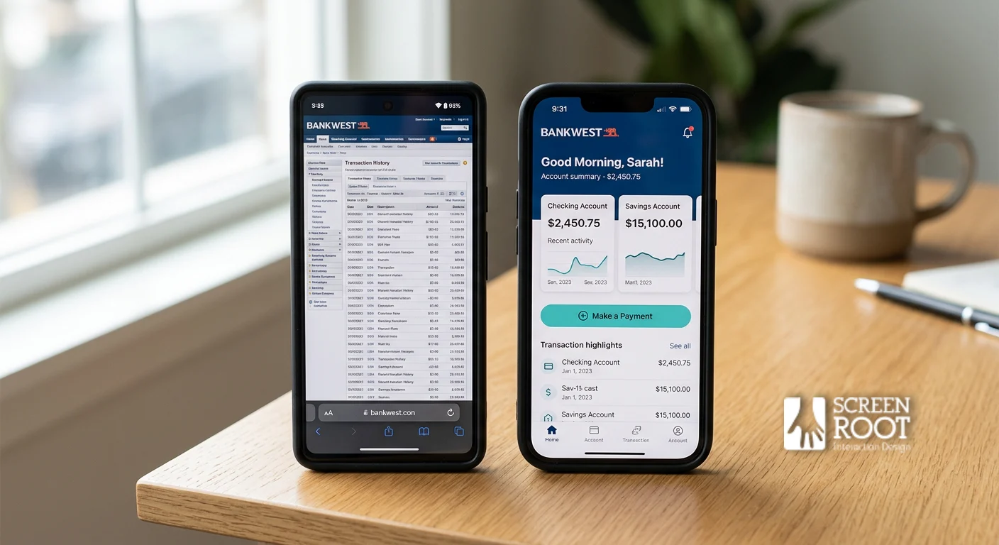
When ScreenRoot worked on a large banking redesign, the challenge wasn’t cosmetic. Retail and corporate banking workflows had accumulated years of layered complexity: dense data tables, multi-step navigation trees, and interfaces that assumed users were sitting at a desktop with time to spare. For a bank serving millions of customers, that friction wasn’t just inconvenient, it was a trust problem baked directly into the product.
The core insight driving the redesign was simple: complex financial data doesn’t require a complex interface. ScreenRoot approached the project with a mobile-first methodology, stripping workflows back to their essential actions and reorganizing information hierarchies around what users actually needed to do, not what the legacy system happened to surface. The investment platform user experience was treated as a strategic priority, not an afterthought.
The specific design changes implemented across the redesign included:
- Simplified navigation structures that reduced cognitive load for both retail and corporate users
- A mobile-first layout system that prioritised thumb-friendly interactions and scannable data displays
- Consolidated dashboards replacing fragmented screen flows
- Clearer visual hierarchy that guided users toward high-priority actions without overwhelming them with secondary information
And the results reflected something that goes beyond aesthetics. When millions of users can complete transfers, review accounts, and manage finances without friction, trust in the platform compounds with every successful interaction. Clean design isn’t decoration, it’s the mechanism through which a bank signals competence.
That same principle applies even more acutely when users are mid-transaction. Which raises a pointed question: what happens to trust when the payment journey itself introduces doubt?

Reducing Friction in the High-Stakes Payment Journey
Payment flows are where fintech trust is won or lost. One moment of friction, confusion, or doubt can undo every positive impression your platform has built.
The trust gap in most checkout and transfer flows isn’t a technical failure, it’s a design failure. Users encounter unclear confirmation screens, ambiguous error messages, and security badges that feel bolted on rather than integrated. Baymard Institute research on checkout abandonment finds that a meaningful share of users abandon purchases specifically because they don’t trust a site with their credit-card information. In high-stakes financial contexts, that hesitation can climb even higher.
Visible security vs. invisible speed is the central tension designers must resolve. Users want to feel protected, but they also want transactions to feel effortless. Overloading a payment screen with security warnings and verification steps signals anxiety rather than confidence. The better approach is embedding trust cues – masked card fields, real-time validation, subtle lock icons without slowing the flow. The lesson consistently borne out in mobile banking work is the same: streamlining transfer flows reduces drop-offs while maintaining compliance integrity.
Error handling is one of the most underutilized trust-building opportunities in fintech UX. A vague “transaction failed” message erodes confidence immediately. But a clear, calm explanation “Your bank declined this transfer. Try a different card or contact your bank directly.” – preserves user agency and keeps them in the funnel. Errors handled well actually strengthen trust rather than damage it.
And the cost of abandonment is real. Every incomplete payment represents lost revenue, a frustrated user, and a potential churn point. When platforms treat friction reduction as an afterthought, they’re not just losing transactions. They’re losing relationships. That dynamic becomes even more critical when the stakes extend beyond simple payments into investment and wealth management contexts.

Designing for Consequences in Investment Platforms
Investment platforms carry a weight that most digital products never face. Every interface decision can directly influence a user’s financial future.
Onboarding sets the tone for that entire relationship. When users arrive at a wealth management or lending platform, they’re not just creating an account; they’re deciding whether to trust you with their financial life. Digital lending and investment onboarding must move beyond simply selling toward sustaining long-term user confidence. That shift in framing from conversion to commitment, changes every design decision that follows.
Data visualization is where “designing for consequences” becomes most tangible. Complex portfolio data, market fluctuations, and projected returns can easily overwhelm users if presented without hierarchy or context. The goal isn’t to display all available information; it’s to surface the right information at the right moment. Well-designed finance products consistently show that progressive disclosure, revealing detail on demand rather than all at once – keeps users informed without triggering decision fatigue.
Error prevention and transparency may be the most consequential design layer of all. Fee structures and risk disclosures are often buried in dense legal copy, which erodes trust even when the underlying product is sound. And mistakes in investment workflows aren’t just frustrating, they can be financially damaging. Well-designed systems build guardrails: confirmation steps, plain-language risk summaries, and clear exit points that help users pause before committing to high-stakes actions.
Getting these elements right doesn’t just improve user satisfaction. It builds the kind of durable trust that keeps users engaged through market volatility, life changes, and product evolution. Which brings us to why design decisions need executive-level commitment to truly take hold.

Winning Executive Buy-in for Research-First Design
Getting UX on the boardroom agenda means speaking the language executives already trust, revenue, retention, and competitive resilience.
Research-driven design isn’t a creative preference; it’s a risk management strategy. When product heads frame it that way, the conversation shifts fast. Winning executive buy-in requires linking UX improvements directly to digital-first banking strategies – not pitching them as polish on top of an existing product.
Connecting UX metrics to business KPIs is the most direct path into that conversation. Churn rates, lifetime value, and cost-per-support-ticket are numbers the C-suite watches closely. When usability gaps map directly onto those figures — say, a confusing onboarding flow correlates with a measurable drop-off in activated accounts, design suddenly has a seat at the strategy table, not just the delivery queue.
Research over gut feeling is where the real executive argument lives. Intuition-led design in financial products is expensive to undo. Usability testing before a major digital transformation in banking exposes failure points while they’re still cheap to fix, rather than after a full-scale rollout has baked them into the product. One round of moderated testing can surface the kind of friction that would otherwise take months of support escalations to identify.
Design as a competitive moat is the closing argument. Fintech disruptors aren’t winning on features alone, they’re winning on experience. When a traditional institution can demonstrate that its UX is grounded in validated user research, that’s a durable advantage that’s genuinely hard to replicate quickly. It signals organizational maturity, not just aesthetic intent.
That kind of institutional commitment to research-led thinking applied consistently across complex, regulated products — is exactly what separates a disciplined UX practice from a project-by-project design service.
The ScreenRoot Methodology: 16+ Years of Regulated UX
Regulated industries don’t forgive guesswork, and that’s precisely where deep domain expertise separates credible design partners from generalist agencies.
Research-driven strategy isn’t a phase; it’s the foundation. ScreenRoot’s approach treats discovery not as a project formality but as the lens through which every interface decision gets made. In practice, that means conducting user research before wireframes are drawn, mapping compliance constraints before visual systems are built, and stress-testing assumptions against real behavioral data, not assumptions borrowed from adjacent industries.
Domain expertise in highly regulated sectors like banking, insurance, and capital markets is genuinely difficult to replicate. What makes BFSI design uniquely demanding is that the stakes of a poorly designed flow aren’t just UX friction, they’re regulatory exposure, eroded user trust, and measurable financial loss.
With 16+ years working in regulated digital products, ScreenRoot has developed a methodology that treats compliance as a design input rather than a post-production constraint. That distinction changes everything about how a product gets built.
“Balancing user needs with business outcomes isn’t a compromise — it’s the craft.”
Nowhere is this balance more visible than in complex BFSI portfolios that span retail banking, wealth management platforms, insurance portals, and institutional dashboards. Each surface area carries its own regulatory requirements, its own user mental models, and its own tolerance for design risk. A methodology that works across all of them consistently, requires both breadth of exposure and a structured research framework that scales.
The mobile-first banking engagement discussed earlier in this article is one example. But it’s one example within a broader body of work that reflects the same core discipline: research first, business outcomes always, user trust never compromised.
And that discipline is exactly what shapes a trust-first product roadmap, which is where we’ll turn next.
The Bottom Line: Building a Trust-First Roadmap
Trust in fintech UX isn’t a soft outcome, it’s the measurable result of deliberate design decisions stacked across every screen, interaction, and error state.
Visual polish and functional clarity aren’t optional extras; they’re the twin pillars that earn user trust before a single transaction is made. Consistent, transparent design is the foundation of trust in digital finance. That consistency has to live in the details – typography hierarchy, loading states, confirmation microcopy, not just in a brand style guide. When users can predict what a button will do or instantly understand a balance summary, anxiety drops and engagement rises. That’s the direct link between craft and conversion.
UX as strategic asset is the reframe that changes everything for organizations still treating design as a finishing step. Research-led design decisions compound over time, reducing support costs, improving onboarding completion rates, and strengthening retention. Those are infrastructure-level returns, not cosmetic ones.
Legacy banking modernization follows the same logic. Mobile-first, research-led redesigns don’t just refresh a visual layer; they restructure how products communicate value. And as covered earlier, executive buy-in follows naturally when design teams translate friction points into revenue impact. Abandoned flows, failed authentications, and support tickets all carry dollar figures that resonate in the boardroom.
- Trust is built incrementally through consistent, predictable interfaces, not through a single bold redesign
- Research-led UX reduces operational costs while improving retention and conversion
- Legacy platforms can be modernised without rebuilding from scratch when design is treated as infrastructure
- Executive sponsorship accelerates when UX outcomes are framed as business metrics, not design deliverables
As your organisation moves from understanding these principles to acting on them, the next question becomes: how do you sustain that trust as technology, regulation, and user expectations continue to evolve?

Future-Proofing Your Digital Banking Experience
The digital economy moves at the speed of trust and platforms that fail to earn it don’t get second chances. Users who encounter friction, confusion, or opacity in a financial interface don’t file complaints. They leave. And in a market where alternative fintech products are multiplying rapidly, “good enough” UX is simply a slower path to irrelevance.
The first step is an honest audit. If you lead a fintech product team, take a hard look at your current platform and ask where users slow down, where they abandon flows, and where your support tickets cluster. Those friction points aren’t minor inconveniences, they’re trust deficits compounding in real time. Friction is visible in your data long before it shows up in churn.
Research-driven design is the only sustainable answer to that audit. Not aesthetic refreshes. Not feature additions layered onto a fragile foundation. In practice, the platforms that maintain user loyalty through market shifts and regulatory changes are the ones that treat UX as strategic infrastructure – built on behavioral research, tested assumptions, and iterative refinement rather than intuition.
That’s the work ScreenRoot was built to do. With a mission to transform human-screen interactions into seamless, outcome-driven experiences, ScreenRoot brings 16+ years of regulated-industry expertise to every engagement. If you’re ready to turn trust from an aspiration into a measurable design outcome, explore ScreenRoot’s portfolio and see what that transformation looks like in practice.
Frequently Asked Questions
How quickly do users judge a fintech interface?
Research on web credibility suggests users form a first impression of a site’s visual appeal and trustworthiness in roughly 50 milliseconds – before they’ve read anything. In finance, that snap judgment is effectively a judgment about whether to trust you with money.
What does “UX as strategic infrastructure” mean?
It means treating design as a foundational system that every transformation effort depends on, not a finishing layer. Framed that way, UX reduces friction across onboarding, migrations, and support, and speaks the boardroom language of risk and efficiency.
How do you reduce friction in payment flows without weakening security?
By embedding trust cues – masked card fields, real-time validation, subtle lock icons, rather than stacking visible warnings. Calm, plain-language error handling keeps users in the funnel instead of scaring them out of it.
Why is UX especially high-stakes on investment platforms?
Because mistakes there can be financially damaging, not just frustrating. Progressive disclosure, plain-language risk summaries, and confirmation guardrails help users make confident, defensible decisions.
Written by Team ScreenRoot. 16+ years leading enterprise UI/UX research for BFSI, SaaS, and Healthcare clients.
When you’re ready, let’s talk.
📞 Call us (Toll-Free): 1800 121 5955 (India)
✉️ Email us: [email protected]



