
 1800 121 5955
In short: UX debt is the cumulative cost of poor design decisions that slow workflows, increase error rates, and erode user trust. In enterprise and BFSI environments, it compounds silently across release cycles until it shows up as churn, inflated support costs, and stalled deals. The fix begins with a structured audit, a research-first methodology, and leadership that treats UX as a financial liability rather than a design concern.
Enterprise revenue rarely disappears in a single dramatic failure. It leaks. A confusing onboarding flow here, a compliance-critical workflow that users route around there, a dashboard that requires three clicks to find what should be one tap away. Individually, these friction points look like minor inconveniences. At enterprise scale, they are measurable revenue losses hiding inside product metrics that most leadership teams never directly connect to design quality.
This guide explains what UX debt is, how to spot it before it scales, and what a structured response looks like in regulated, high-stakes environments.
What Is UX Debt?
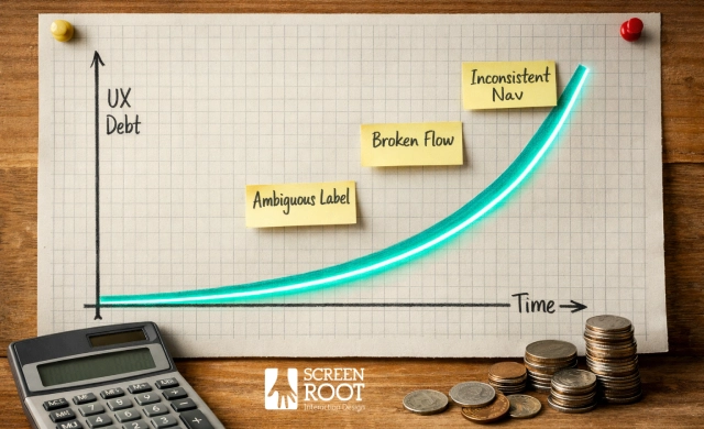
UX debt is the accumulated cost of design decisions that were made quickly, made under constraint, or never revisited as a product scaled. Like technical debt, it compounds. Each workaround, ambiguous label, or inconsistent navigation pattern adds friction that users absorb until they stop absorbing it and start looking elsewhere.
The business impact of UX debt is rarely captured in a single incident report. It surfaces instead in churn rates, support ticket volume, low task completion rates, and sales cycles that stall because a prospect could not complete a trial without calling your team. McKinsey research shows that design-led companies achieve 32% more revenue growth and 56% higher total returns to shareholders. Forrester’s analysis of UX ROI puts the return at roughly 100 dollars for every dollar invested. Those are not design metrics. They are shareholder value metrics.

The Invisible Revenue Leak: Why UX Debt Is a Boardroom Issue
Regulated industries like Banking, Financial Services, and Insurance are especially exposed to UX debt. Legacy systems, often decades old, carry layers of design decisions made for a different era, bolted together with newer interfaces that create inconsistent, high-friction experiences. Compliance requirements further constrain how fast teams can modernize, meaning debt accumulates faster than it gets resolved.
What makes this a boardroom issue is not the design quality in isolation. It is the financial magnitude of leaving it unaddressed. When UX is treated as a strategic design investment rather than a creative function, it directly moves the numbers executives care about. The harder question is not whether UX debt matters. It is whether your platform is already showing the early warning signs.

Early Warning Signs Your Platform Is Eroding Customer Trust
Behavioural red flags in a platform surface long before revenue dashboards show a decline. Knowing what to look for is the first step toward stopping the leak.
High drop-off rates in critical funnels.
Abandonment spikes at a checkout step, a loan application screen, or an onboarding flow are not marketing problems. They are UX problems. Teams that conduct structured UX friction analysis consistently find that drop-off concentrates at points where users encounter ambiguous labels, unexpected form fields, or slow load states. Fixing a software defect after release costs up to 100 times more than addressing it during the design phase, according to the IBM Systems Sciences Institute. Early detection is not optional.
The good clicks versus bad clicks paradox.
More engagement is not always better. When users repeatedly click a non-interactive element, reload a page, or open and close the same modal, that engagement signals confusion rather than interest. In regulated environments like banking or insurance, these rage clicks can point to compliance-critical workflow failures hiding in plain sight.
Users building workarounds around your UI.
When customers export data to spreadsheets, screenshot screens to share context, or use external tools to complete tasks your platform should handle natively, they are voting with their behavior. This pattern is a direct signal that the interface is not meeting real workflow needs. Improving customer retention by just 5% through better UX can increase profits by 25% to 95%, according to Bain and Company. Workarounds are precisely the friction that drives customers toward alternatives. A thorough review of your product’s usability data can surface these patterns before they calcify into churn.

The ROI of Usability Testing in High-Stakes BFSI Environments
In regulated industries, poor UX is not just a friction problem. It is a compliance liability that compounds with every release cycle.
Usability testing conducted before launch consistently costs less than regulatory remediation after it. Post-launch fixes in BFSI environments routinely involve legal review, accessibility audits, and re-certification cycles. Those expenses dwarf any upfront research investment. A thorough UX site audit conducted early in the design process can surface compliance gaps before they become change-request tickets.
Banking workflows are also genuinely complex, and treating simplicity as the universal goal misses the point entirely. A loan origination flow must collect precise regulatory data, surface disclosures at legally mandated moments, and still feel navigable to a first-time applicant. As UX researcher Wolé Adaramoye, PhD, puts it:
“UX is not about fewer clicks. It is about the right clicks in the right context.”
That distinction matters enormously when a misplaced step can trigger a compliance failure.
Domain expertise is what separates generic usability research from research that actually moves the needle in BFSI. Researchers who understand how rigorous user research intersects with regulatory constraints can identify the friction points that matter most, rather than optimising for surface-level metrics.

Case Study: Reimagining the Yes Bank Digital Experience
Modernising a large-scale banking app is not a design refresh. It is a trust exercise that directly addresses the early warning signs of poor UX before they compound into revenue loss.
The Challenge
Yes Bank needed to serve a diverse, digitally active user base spanning multiple demographics and device types. The existing interface had accumulated layers of UX debt: inconsistent navigation patterns, cluttered information hierarchies, and workflows that did not reflect how real users actually banked. These were not cosmetic problems. They were friction points quietly eroding engagement and pushing users toward alternative channels.
The Approach
ScreenRoot led with research before touching a single pixel. The team mapped user journeys, identified drop-off points, and analyzed behavioral patterns to understand where the interface was working against users rather than for them. This evidence-first methodology, the kind that relies on tracking the right UX metrics throughout the process, replaced assumption-driven design decisions with validated insights. Navigation architecture was rebuilt around actual user mental models, not internal product logic.
The Outcome
The result was a mobile experience that balanced usability with the compliance and security requirements that are non-negotiable in banking. The redesign delivered intuitive navigation backed by research-driven interface decisions. A research-first approach does not just fix today’s friction. It builds a foundation that scales without breaking.

The Strategic UX Audit: A Roadmap for Digital Transformation Leads
A structured UX audit for enterprise platforms is the clearest path from identifying revenue leakage to actually stopping it before friction compounds into churn.
The difference between a cosmetic review and a deep-dive usability analysis is significant. A cosmetic review flags visual inconsistencies and broken layouts. A deep-dive analysis examines user behavior flows, task completion rates, cognitive load at critical decision points, and where compliance requirements create unintended friction. A rigorous UX audit identifies areas where technical debt and usability friction are actively costing the business revenue. That makes it a financial instrument, not just a design exercise.
A professional audit without behavioural data is just an opinion.
For CIOs evaluating their platform’s UX health, the audit should cover these core components:
| Audit Component | Business Impact | Risk of Ignoring |
| User flow analysis | Reduces drop-off at high-value conversion points | Invisible revenue leakage at scale |
| Heuristic evaluation | Surfaces compliance and usability conflicts | Regulatory exposure and support overhead |
| Usability testing sessions | Validates assumptions with real task behaviour | Shipping solutions to the wrong problems |
| Accessibility review | Expands addressable user base | Legal liability and brand damage |
| Information architecture audit | Improves task discoverability | User abandonment on complex workflows |
The most effective way to use an audit is as a diagnostic rather than a report card. The goal is not to grade the product. It is to build a prioritized remediation roadmap that connects UX gaps directly to business outcomes. That distinction shapes how leadership responds to the findings and where budget gets allocated next.

The Bottom Line: What Decision-Makers Need to Know
UX debt is a financial liability. Like any debt, it compounds the longer it goes unaddressed. The case studies, audit frameworks, and friction patterns in this article all point to the same conclusion: poor usability is not a design inconvenience. It is a revenue problem hiding in plain sight.
Small, research-backed improvements to onboarding flows, navigation logic, or error handling can meaningfully shift retention rates. In regulated sectors like BFSI and healthcare, where switching costs are high and trust is everything, even a marginal retention gain translates to significant profit at scale.
Here is what that means in practice for decision-makers:
- UX debt accumulates silently. What starts as a clunky form or a confusing dashboard quietly erodes conversion rates, inflates support costs, and pushes users toward workarounds or competitors.
- Research-first design is not optional for complex products. Guesswork-driven redesigns create new friction while solving old problems. Validated prototyping and iterative testing are what separate durable improvements from expensive rework.
- Regulated industries demand specialised expertise. Balancing compliance requirements with genuine usability is a narrow discipline where generalist design approaches routinely fall short.
- Small UX wins compound. A 5% improvement in task completion or a reduction in drop-off at a critical funnel step does not just improve metrics. It directly impacts revenue recognition quarter over quarter.
The question is not whether your platform has UX debt. It almost certainly does. The real question is whether your organisation has the tools and the right design and research partner to surface it before it scales into something much harder to fix.

Securing Your Digital Future with Research-First Design
The most expensive UX strategy is a reactive one. Waiting for churn data, support tickets, or a failed audit to reveal what proactive research would have caught months earlier is a pattern that costs enterprises significantly more than the research itself.
For BFSI and healthcare platforms specifically, that shift from reactive to proactive is not optional. Regulatory complexity, high-stakes workflows, and zero tolerance for user error mean that bad UX does not just frustrate users. It erodes trust, triggers compliance risk, and accelerates churn in markets where switching costs are already high.
With 16 years of domain expertise designing intuitive interfaces for complex sectors including banking, insurance, and healthcare, ScreenRoot brings a research-first methodology to platforms where the stakes are highest. If you are ready to evaluate your platform’s UX health honestly, a structured consultation is the right starting point. Do not let debt you can see become damage you cannot reverse.
Frequently Asked Questions
What is UX debt and how does it affect enterprise revenue?
UX debt is the accumulated cost of poor or unresolved design decisions. In enterprise platforms, it compounds over time through increased support costs, higher drop-off rates, lower task completion, and reduced user trust, all of which translate directly into revenue loss.
What are the early warning signs of UX debt?
The most common signals are high drop-off rates at critical funnel points, repeated rage clicks on non-interactive elements, and users building workarounds outside the platform to complete tasks it should handle natively.
Why is usability testing especially important in BFSI?
In regulated industries, UX failures carry compliance risk in addition to usability cost. Usability testing conducted before launch identifies compliance-critical friction points before they require expensive legal review, accessibility audits, or re-certification cycles.
What does a UX audit cover in an enterprise context?
A comprehensive enterprise UX audit covers user flow analysis, heuristic evaluation, usability testing sessions, accessibility review, and information architecture analysis, each mapped to specific business outcomes rather than design preferences.
How does research-first design prevent UX debt from scaling?
Research-first design replaces assumption-driven decisions with validated insights at every stage of the product lifecycle. This prevents new debt from being introduced with each release and ensures that improvements address root causes rather than surface symptoms.
Author: Written by Team ScreenRoot, 16+ years leading enterprise UI/UX for BFSI, SaaS and Healthcare clients.
When you’re ready, let’s talk.
📞 Call us (Toll-Free): 1800 121 5955 (India)
✉️ Email us: [email protected]



