
 1800 121 5955
In short: You conduct a UX audit on a live SaaS product by combining heuristic evaluation, behavioral analytics (session recordings, funnel data, support tickets), and workflow-level review of high-stakes flows — then converting the findings into a prioritized roadmap tied to retention and support metrics, not a report that sits on a shelf.
When conducting a UX audit on a live SaaS ecosystem, the process must bridge the gap between technical functionality and user psychology. It isn’t just about spotting broken links; it’s a systematic diagnostic that evaluates how the interface stands up to the pressures of enterprise-level workflows. By grounding the audit in a mix of heuristic principles and behavioral analytics, you can identify the high-friction zones where users disengage, effectively turning a subjective review into a strategic roadmap for product health.

The Business Case for Auditing Live SaaS Ecosystems
In competitive SaaS markets, winning on features alone is no longer a strategy — it’s a liability. The conversation has shifted from feature parity to experience parity, where the product that feels intuitive, coherent, and frictionless wins the renewal — not necessarily the one with the longest capabilities list.
For C-suite executives, a rigorous SaaS UX audit methodology reframes what might look like a design exercise into a risk mitigation strategy. Usability gaps compound quietly. What starts as a confusing onboarding flow or an overloaded dashboard becomes churn — and churn, as any CFO will tell you, is a revenue problem, not a product problem. Widely cited Forrester research holds that a well-designed user interface can lift conversion rates by up to 200%, and superior end-to-end UX design by as much as 400%. That’s not a design metric. That’s a business outcome.
There’s also a less visible threat worth naming: UX debt. Much like technical debt, it accumulates silently in the background — inconsistent interaction patterns, redundant steps, and workarounds baked into daily workflows. Left unaddressed, UX debt quietly drains enterprise revenue through reduced adoption, increased support costs, and accelerated churn.
As Dr. Ralf Speth, former CEO of Jaguar Land Rover, once put it: “If you think good design is expensive, you should look at the cost of bad design.” Understanding that equation is the first step. But knowing where the debt lives in your product — and what it’s actually costing you — requires more than a checklist. It starts with knowing the most common places enterprise products break down.

Three Critical UX Mistakes Eroding Enterprise Product Success
Most enterprise SaaS products don’t fail because of missing features — they fail because the experience quietly pushes users away before value is ever demonstrated. According to research cited by Toptal, 88% of online consumers are less likely to return to a site or application after a single bad user experience. In enterprise contexts, where renewal decisions hinge on adoption metrics, that statistic carries serious financial weight. A thorough enterprise product usability assessment surfaces exactly these fault lines before they become churn events.
Over-complicated onboarding is the most common first failure. Enterprise teams often inherit bloated setup flows built to accommodate edge cases, leaving the average new user stranded in a maze of configuration steps they don’t yet understand. What should feel like a guided introduction ends up reading like a technical manual.
Neglecting the first-mile experience compounds that problem. Product teams frequently deprioritize initial activation moments in favor of polishing deep-funnel features used only by power users. But if new users can’t find value within the first session, those advanced features never get touched.
Cognitive overload in data-heavy dashboards is another consistent blind spot. Dashboards designed to surface everything simultaneously often communicate nothing clearly. Without deliberate information hierarchy, users scan, stall, and disengage.
Accessibility and compliance gaps round out the pattern, particularly for teams selling into regulated industries like Healthcare or finance. Overlooking WCAG standards or sector-specific requirements doesn’t just create legal exposure — it signals to enterprise buyers that the product wasn’t built with their environment in mind. Understanding where these failures cluster is precisely what a structured audit methodology makes visible — which is where the next step begins.

A Research-First SaaS UX Audit Methodology
A rigorous SaaS UX audit starts with a structured, evidence-driven methodology — not gut instinct or a generic checklist borrowed from a simpler product context.
The foundation of any credible audit is a heuristic evaluation grounded in established usability principles. As outlined by the Nielsen Norman Group, this means assessing your product against criteria like visibility of system status and error prevention — principles that become especially consequential in complex enterprise environments. These aren’t abstract ideals. They translate directly into whether a user understands what the system is doing, or panics because they don’t.
From there, the methodology shifts to behavioral analysis. Reviewing session recordings, funnel drop-off data, and support ticket patterns reveals exactly where the “happy path” fractures. In practice, the gap between what teams assume users do and what users actually do can be significant — and it’s often hiding in plain sight inside your analytics dashboard.
Complex workflows deserve their own scrutiny. Subscription management screens, billing transparency flows, and permission hierarchies are frequent friction points in enterprise SaaS. Auditing these workflows requires mapping each interaction against user intent — not just technical function. A checkout that “works” but confuses still fails.
This same research-first approach becomes even more critical when you’re conducting a UX audit for regulated industries, where workflow errors carry consequences well beyond a frustrated user. That’s exactly the terrain the next section explores.

Navigating UX Audits in Regulated Industries
Regulated industries demand a fundamentally different approach to UX — one where friction isn’t always a flaw, and removing it without careful consideration can create serious risk.
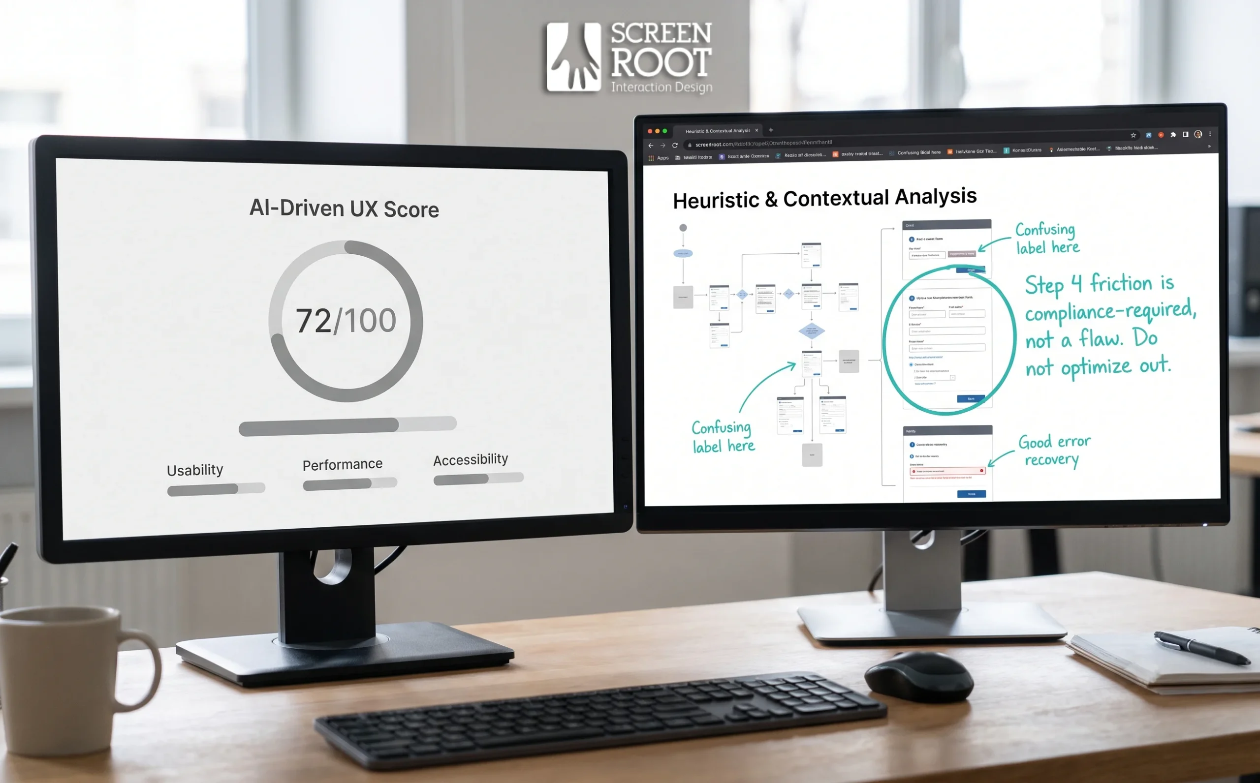
Understanding how to conduct a UX audit for enterprise SaaS in sectors like BFSI (banking, financial services, and insurance) or Healthcare means accepting a core constraint: some compliance-driven friction cannot be eliminated. It can only be optimized. A multi-step authentication flow or a mandatory disclosure screen exists for regulatory reasons, not UX oversights. The goal isn’t to strip friction away — it’s to make necessary friction feel intentional, clear, and as painless as possible.
Data visualization clarity carries particular weight in these environments. A portfolio manager or a clinical decision-maker working under time pressure can’t afford ambiguous charts or unclear status indicators. Every visual element in a high-stakes dashboard must communicate with precision, because a misread data point here has consequences that go well beyond a frustrated user session.
Accessibility standards add another layer of complexity. WCAG compliance in regulated products isn’t optional, but meeting those standards while preserving dense, functionality-heavy interfaces requires deliberate design judgement — not automated fixes.
And that’s precisely where automated tools start to show their limits. In sensitive sectors, audit findings carry legal, financial, and ethical weight. A heatmap or a performance score can surface what is happening, but it can’t tell you whether a particular friction point is a regulatory necessity or a genuine design failure. That distinction requires experienced human judgement — something worth examining more closely as we consider what AI-powered audit tools can and can’t reliably do.
The Limitations of AI-Powered UX Audit Tools
AI audit tools can accelerate surface-level discovery, but they can’t replace the strategic depth a well-structured SaaS product health check framework demands.
Speed without context is a liability.
Automated tools scan UI patterns, flag accessibility gaps, and generate heuristic scores quickly. But as we argued in our analysis of UX debt, AI audit tools lack the context to evaluate complex business logic in enterprise SaaS. A six-step approval workflow might look redundant to an algorithm — but in a regulated environment, every step exists for a compliance reason. Removing it based on an automated recommendation could introduce serious risk.
Generic scores mislead specialized teams.
Many AI tools reduce nuanced product experiences down to a single performance metric. For a SaaS product serving niche enterprise workflows, that score is almost meaningless. It can’t distinguish between friction that’s harmful and friction that’s intentional — a critical distinction covered in the previous section on regulated industries.
Human-led research uncovers the why.
Senior designers and UX researchers ask the questions no algorithm can formulate on the fly: Why do users abandon this step? What workaround have they built around this feature? Those answers come from contextual interviews, behavioral observation, and pattern recognition built over years of practice.
The right approach treats AI as a starting point — useful for surfacing where to look, not for determining what to do. That distinction matters enormously when you’re ready to translate audit findings into business outcomes.
The Bottom Line: Transforming Audit Findings into ROI
A UX audit only delivers value when its findings translate into prioritized, measurable action — not a report that sits on a shelf.
The most effective audits produce a roadmap, not just a diagnosis. In ScreenRoot’s methodology, successful audits result in a prioritized roadmap that balances quick wins with long-term structural improvements. That balance matters because not all UX debt carries the same weight. Prioritization should account for both business impact and technical effort — fixing a confusing onboarding flow that’s driving churn deserves a different urgency than a visual inconsistency in a rarely-used settings panel.
Roadmap alignment is where audit findings either gain traction or lose momentum. The practical move is to map discoveries directly onto your next two quarters of product planning. This keeps the work grounded in delivery capacity and ensures UX improvements aren’t competing with features for resources — they’re woven into the same sprint cycles.
Measuring success means tracking outcomes, not outputs. Improved retention rates and a reduction in support tickets are two of the clearest signals that UX changes are working. These metrics connect design decisions to revenue impact in language the C-suite understands.
Here are four takeaways you can act on immediately:
- Triage UX debt by impact and effort — not by what’s easiest to fix first.
- Anchor findings to your roadmap — align improvements with the next two quarters to maintain execution momentum.
- Track retention and support volume — these are your most reliable post-audit success metrics.
- Choose a research-first partner — objective, expert evaluation surfaces the issues internal teams are too close to see.
That last point sets up a broader question worth considering: how do you build a process that catches UX debt before it accumulates again?
Future-Proofing Your SaaS Through Continuous Evaluation
A single UX audit is a snapshot — but a scaling SaaS product is a living system that evolves with every feature release, user segment shift, and market pivot. UX debt accumulates quietly. What passes a health check today can become a friction point within 12 months as your product grows more complex and your user expectations rise. That’s why treating a UX audit as a recurring, annual discipline — rather than a one-time remediation exercise — is what separates products that compound their quality gains from those that repeatedly reset at square one.
The iterative nature of SaaS UX means your evaluation framework needs to evolve alongside your product. Each audit cycle should build on the last: tracking resolved issues, surfacing newly introduced friction, and stress-testing the experience against your current growth stage. In practice, this creates a feedback loop that keeps UX debt from quietly compounding in the background.
Choosing the right partner matters as much as choosing the right methodology. Enterprise SaaS products sit at the intersection of complex technical architecture, diverse user roles, and high-stakes workflows — and not every UX consultancy is equipped to operate at that level. Look for a team with demonstrated depth in enterprise environments, not just consumer-facing design sensibilities.
With 16+ years of experience crafting intuitive digital interfaces for leading global brands across complex sectors, ScreenRoot brings the strategic and technical rigor your product health check deserves. If your SaaS is scaling, stalling, or somewhere in between — don’t wait for churn to tell you something’s wrong. Schedule a strategic UX audit and turn your product’s potential into measurable performance.
Frequently Asked Questions
What does a SaaS UX audit include?
A credible audit combines heuristic evaluation against established usability principles, behavioral analytics (session recordings, funnel drop-off, support tickets), workflow-level review of high-stakes flows, and an accessibility check — all converted into a prioritized, business-mapped roadmap.
How is a UX audit different from a redesign?
An audit is the diagnostic; a redesign is the treatment. The audit identifies and prioritizes what’s actually broken so the redesign fixes root causes instead of repainting symptoms.
Can AI tools run a UX audit on their own?
No. They’re useful for surfacing where to look — pattern scans, accessibility flags, heuristic scores — but they can’t judge whether friction is a design failure or a compliance necessity. That judgement requires experienced human researchers.
How often should a SaaS product be audited?
Treat it as a recurring discipline — annually at minimum, with lighter monthly usability-testing cycles in between. Each audit should build on the last, tracking resolved issues and newly introduced friction.
What metrics prove an audit paid off?
Improved retention, reduced support-ticket volume, faster time to value on core workflows, and higher adoption of the features the audit prioritized.
Written by Team ScreenRoot. 16+ years leading enterprise UI/UX research for BFSI, SaaS, and Healthcare clients.
When you’re ready, let’s talk.
📞 Call us (Toll-Free): 1800 121 5955 (India)
✉️ Email us: [email protected]



