
 1800 121 5955
In short: Fintech users drop off when onboarding, KYC, and verification feel too long, too unclear, or too demanding. The biggest conversion wins usually come from reducing cognitive load, sequencing compliance better, and removing unnecessary manual entry.
Poor fintech UX does not just frustrate users. It quietly drains the pipeline that acquisition spend is working hard to fill. In most cases, the revenue leak is not happening in marketing. It is happening inside the product, where users encounter friction before they reach value.
This is why fintech UX must be treated as a growth lever, not a cosmetic layer. If your app is losing users during registration or verification, the problem is usually not demand. It is the experience.
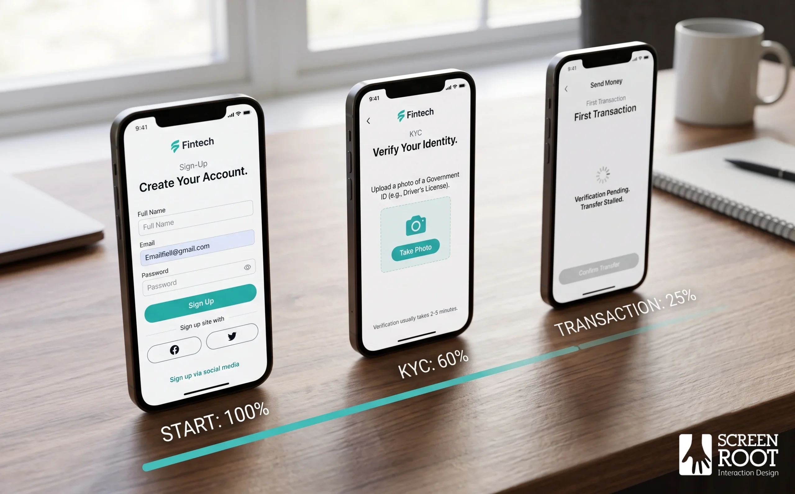
What Causes Fintech Users to Drop Off?
Fintech drop-off is usually the result of two things: cognitive overload and verification friction. Users are often asked for sensitive information before they have seen enough value to trust the platform. When that happens, hesitation turns into abandonment.
Common causes include:
- Too many fields in the first screen or first flow.
- Unclear security steps that do not explain why data is needed.
- Repetitive identity checks across multiple screens.
- Manual document entry on mobile when pre-fill could do the job.
- Compliance language that feels legal rather than helpful.
The faster users understand what is happening and why, the more likely they are to continue. In fintech, trust is built through clarity.

Why Registration and KYC Fail
Registration and KYC are where many fintech journeys stall. Users often open a flow expecting a quick sign-up, then run into a long form, document upload, or identity check before they have seen any product benefit.
That creates a psychological problem as much as a usability problem. The user has not yet committed, so every extra step feels like risk. If the process is not clearly explained, the platform feels harder to trust.
Time matters too. Research from identity-verification providers consistently shows that long or complex identity checks increase abandonment. In practical terms, if verification takes too long, too much effort, or too many screens, users leave.

How to Balance Security and Usability
Not every friction point is bad. Some friction builds trust. The challenge is knowing which steps protect the user and which steps only slow them down.
A better fintech flow uses progressive disclosure. That means users see only what they need at each moment, instead of being hit with every requirement upfront. It also means security steps are explained in plain language, so users understand why they matter.
| Unnecessary Friction | Trust-Building Friction |
| Asking for all documents upfront before showing product value | Progressive KYC that collects only what’s needed at each stage |
| Generic error messages that don’t explain next steps | Clear, contextual prompts that guide users through verification |
| Repeating identity questions across multiple screens | Biometric verification that confirms identity in a single step |
| Manual document review with no status updates | Background checks with real-time progress indicators |
Progressive disclosure is the most practical tool here. Rather than front-loading every compliance requirement, reveal each step as it becomes relevant — so the user always knows what is being asked, and why.
A useful rule is simple:
- Ask only for the minimum needed to begin.
- Reveal the next step after intent is established.
- Use biometric verification or pre-fill where possible.
- Show progress clearly so users know how much is left.
This approach keeps compliance intact without making the journey feel hostile.

Why UX Debt Hurts Fintech Conversion
UX debt is the buildup of small design problems that were never fully resolved. In fintech, that debt compounds quickly because every extra step or unclear interaction affects trust and completion.
It usually shows up in three ways:
- Users hesitate at sensitive steps.
- Support tickets rise around the same screens.
- Drop-off happens at the same points in the funnel.
This is why a fintech product cannot rely on acquisition alone. If the product experience does not hold the user after the click, the pipeline leaks.
A structured UX audit is often the fastest way to identify where that friction is hiding.

Case Study: Reducing Financial Inertia for LXME
Designing for a specific demographic forces you to confront friction points that a generic platform would never surface, and LXME is a strong example of that principle in action.
LXME set out to build India’s first financial platform designed exclusively for women, with the explicit goal of addressing the unique barriers this audience faces when entering the investment space. That meant confronting not just technical onboarding hurdles, but deeply rooted confidence gaps and financial literacy gaps that standard UX playbooks don’t account for.
Reducing friction in digital banking isn’t only about shortening forms — it’s about reshaping the entire emotional arc of a user’s first experience.
The design team identified several friction points specific to this demographic:
- KYC complexity that felt gatekeeping rather than empowering, discouraging first-time investors from completing verification.
- Jargon-heavy interfaces that assumed prior investment knowledge, creating anxiety at the point of decision.
- Absent goal visualisation tools, leaving users without a clear sense of why they were investing or what progress looked like.
- Lack of community context, which reduced trust in a platform users were encountering for the first time.
In practice, the solution centred on simplifying the KYC flow into guided, confidence-building steps rather than front-loading compliance requirements. The team also introduced visual goal-tracking features that let users see projected outcomes tied to their personal milestones, turning abstract investing into something tangible and motivating. As the ScreenRoot LXME case study shows, the platform was intentionally built to help women navigate investments with confidence, not just complete transactions.
What LXME illustrates is that demographic-specific friction is real and measurable. Solving it requires research-driven design decisions, not assumptions.

How to Fix Fintech UX Debt
Most fintech products do not fail because of bad technology. They fail because accumulated UX debt quietly erodes conversion at every step of the journey.
A practical improvement process looks like this:
1. Audit the onboarding and transaction journey. Identify where users stall, where support requests cluster, and where drop-off spikes.
2. Test with real users. Session recordings and analytics show where the problem happens, but usability sessions show why.
3. Act on outcomes, not features. Track time to activation, completion rate, and drop-off by segment instead of only shipping new functionality.
This is where balancing security and usability in fintech platforms becomes a strategic lens, not just a design concern. Compliance does not need to mean clunky flows, but fixing the tension requires dedicated UX thinking.

What Fintech Leaders Should Prioritize
If conversion is falling, start with the first experience a user has with the product. That usually means registration, identity verification, and the first money-moving action.
Focus on these priorities:
- Reduce the number of fields in the first step.
- Explain security checks in plain language.
- Remove repeated data entry.
- Use pre-fill where possible.
- Keep progress visible.
- Audit the screens where users hesitate most.
These changes do not just improve usability. They improve completion, trust, and revenue.

Why Specialist Design Matters
Fintech UX is not a general design problem. It is a specialised discipline where regulation, trust, and conversion have to work together.
A team that understands BFSI constraints can design flows that are clearer without becoming weaker. That matters because the user is not only deciding whether to continue. They are deciding whether to trust the platform with identity, money, and personal data.
ScreenRoot brings over 16 years of research-driven digital product strategy to exactly these kinds of regulated environments. That experience matters because the right fix is rarely obvious from the interface alone. It comes from understanding user behaviour, business pressure, and compliance together.
Frequently Asked Questions
What is the biggest conversion problem in fintech UX?
The biggest issue is usually friction in onboarding or verification. If users do not see value quickly, they leave.
How does progressive disclosure help fintech apps?
It reduces cognitive overload by showing only the next relevant step, instead of overwhelming users with every requirement at once.
Why is KYC such a common drop-off point?
Because it often asks for sensitive information before trust is established. If the process feels too long or unclear, users abandon it.
How does UX debt affect fintech revenue?
It increases abandonment, slows completion, and pushes users toward support or competitors. Over time, that directly reduces conversion.
Written by Team ScreenRoot. 16+ years leading enterprise UI/UX research for BFSI, SaaS, and Healthcare clients.
When you’re ready, let’s talk.
📞 Call us (Toll-Free): 1800 121 5955 (India)
✉️ Email us: [email protected]



