
 1800 121 5955
In short: Every marketing dollar ends at a digital experience that either converts or doesn’t — UX is the final mile of the funnel. Five avoidable mistakes quietly drain enterprise acquisition budgets: skipping deep research in regulated sectors, high-friction onboarding, no scalable design system, desktop-first thinking, and measuring only business KPIs without experience metrics. Each has a research-led fix.

The High Cost of Friction in Enterprise Digital Acquisition
Every dollar your marketing team spends driving traffic ends at the same place: a digital experience that either converts or doesn’t. UX is the final mile of the marketing funnel, and in enterprise contexts, the gap between “almost converted” and “converted” is worth millions. Checkout and onboarding research (for instance from the Baymard Institute) consistently shows that a large share of abandonment is design-driven and recoverable — a finding that hits differently at enterprise scale.
Conversion-rate optimization isn’t a nice-to-have for enterprise brands in BFSI and Healthcare — it’s a structural necessity. These sectors carry regulatory complexity, risk-averse users, and trust barriers that generic UX patterns weren’t built to handle. A friction point that costs a retail brand a few abandoned carts can cost a bank or health insurer thousands of dropped applications a month.
What separates brands that scale efficiently from those bleeding budget is methodology. A research-first approach — one that maps real user behavior before a single wireframe is drawn — systematically eliminates the assumptions that quietly kill conversion.
The five mistakes ahead each represent a specific, avoidable point where enterprise digital acquisition breaks down — starting with the one that undermines everything else: skipping deep UX research.

1. Neglecting Deep UX Research in Regulated Sectors
Assumption-based design is one of the costliest mistakes an enterprise brand can make — and it’s especially damaging in regulated industries like banking, insurance, and healthcare. When teams skip rigorous discovery and build on internal assumptions, they create experiences that feel intuitive to stakeholders but confusing to the actual users they’re meant to serve.
Effective UX research for digital acquisition in regulated sectors isn’t a checkbox activity — it requires usability testing that accounts for compliance constraints, trust signals, and the specific anxieties users bring to high-stakes transactions. A patient scheduling a procedure or a small-business owner applying for a line of credit carries a very different mental model than someone adding a product to a cart. Ignoring that leads to drop-off no amount of paid traffic can offset.
Three core gaps emerge when research is deprioritized:
- Missing mental models — users in banking and healthcare expect specific terminology, flow logic, and reassurances generic patterns don’t provide
- Untested compliance friction — disclosures and verification steps get bolted on without usability review, creating confusion at critical moments
- Stakeholder-driven design — internal preferences override actual user behavior, producing interfaces that look polished but perform poorly
Investing in research-driven UX before a single wireframe is drawn is what separates digital transformation that delivers ROI from one that simply ships.

2. High-Friction Checkout and Onboarding Flows
Friction doesn’t announce itself — it accumulates quietly across every form field, loading delay, and confusing prompt until a user simply leaves. For enterprise brands in BFSI, insurance, and financial services, that departure is rarely just an abandoned cart; it’s a lost relationship worth thousands.
Identifying leaky steps starts with mapping each stage of your multi-page application or checkout against actual drop-off data. An enterprise UX audit for conversion reveals precisely where cognitive load peaks — often where users must gather documents, re-enter data, or decode jargon-heavy field labels. Optimizing the checkout experience is consistently one of the highest-leverage interventions available, reducing abandonment without additional marketing spend.
Reducing cognitive load in complex data-entry flows typically involves:
- Breaking multi-page forms into clearly labelled, progress-tracked stages
- Auto-populating fields from verified data sources wherever compliance permits
- Surfacing inline validation — not end-of-form error summaries
- Redesigning mobile input sequences to minimize typing through smart defaults
A practical reference point: mobile flow redesigns in fintech consistently show measurable lifts in retention when friction is removed from the first authenticated session — not just the sign-up screen. Restructuring interaction sequences in high-traffic flows directly improves completion rates.
Fix the leakiest step in your onboarding flow first — it compounds faster than any acquisition channel you’re optimizing.

3. Lack of Scalable Design Systems for Multi-Brand Entities
Fragmented interfaces are a silent conversion killer. In sectors like healthcare and finance, where users already approach digital touchpoints with heightened scrutiny, inconsistent typography, mismatched palettes, and conflicting interaction patterns across sub-brands send an unmistakable signal: this organization isn’t trustworthy. That erosion of brand authority directly shapes how UX design affects marketing ROI — campaigns drive traffic, but inconsistent experiences bleed it right back out.
The business case for a unified design system is compelling. A design system is a scalable business asset that bridges user needs and business goals, letting product and marketing teams move in the same direction. Rather than rebuilding components from scratch for every new product line or regional launch, standardized design tokens, component libraries, and documented patterns reduce time-to-market — and for enterprises managing multiple properties, that speed advantage compounds fast.
The brands that get this right treat their design system as a living product, not a one-time deliverable. ScreenRoot’s approach to global enterprise clients focuses on building future-proof frameworks that scale across brand families without sacrificing local relevance or regulatory compliance.
A design system isn’t just a developer’s convenience — it’s a strategic asset that protects brand equity at every touchpoint.

4. Ignoring Mobile-First Realities in Complex Transactions
Enterprise brands — especially those navigating UX design for regulated industries like BFSI and Healthcare — still default to desktop-first thinking, then retrofit mobile as an afterthought. That approach is no longer viable. Users are initiating loan applications, insurance claims, and multi-step account setups from their phones. When the mobile experience is clunky, they abandon — quietly, without filing a complaint. These are among the most consequential UX mistakes hurting conversion at the enterprise level, precisely because they’re invisible until the drop-off data makes them undeniable.
Common mobile UX failures compound quickly in complex flows:
- Small touch targets that force repeated mis-taps on CTAs or dropdowns
- Poor form legibility from font sizes below 16px triggering unintentional zoom
- Unoptimized input types that surface the wrong keyboard for numeric or date fields
Treating mobile as its own intentional surface — not a scaled-down desktop — is what produces a seamless flow built around real usage patterns rather than assumptions.
Mobile ROI is direct and measurable. Faster, frictionless mobile flows reduce drop-off at the highest-exit steps, and fewer abandoned sessions mean more completed transactions per visit.
Treat mobile as the primary transaction surface and you’ll stop losing users at the exact moment they’re ready to convert.
5. Failing to Measure Experience Metrics Beyond Conversions
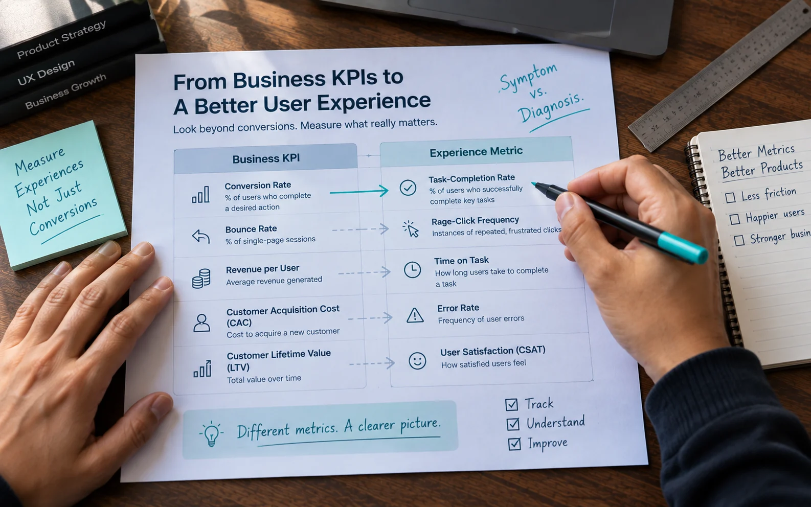
Enterprise brands often track what’s easy — revenue, leads, cost-per-click — while overlooking the behavioral signals that explain why those numbers move. The gap between business KPIs and experience metrics is where silent conversion killers hide.
| Business KPI | Experience metric |
| Conversion rate | Task-completion rate |
| Bounce rate | Rage-click frequency |
| Revenue per visit | Time-on-task |
| Cart-abandonment rate | Form-error rate |
| Session duration | User-frustration score |
Business KPIs tell you what happened. Experience metrics tell you why. A dropping conversion rate is a symptom; a rising form-error rate is the diagnosis. Without both layers, you’re optimizing in the dark.
Usability testing surfaces friction analytics alone can’t detect. A user who silently abandons a loan application after a confusing field validation never shows up as a “pain point” in your dashboard — they just disappear from your funnel. Measuring success through experience metrics lets brands identify friction before it hits final revenue numbers. That upstream visibility separates reactive teams from high-performing acquisition programs.
Start tracking at least one experience metric alongside every business KPI you report — it’s the only way to build acquisition strategies that hold.
Key Takeaways for Digital Leaders
The mistakes above share a common thread: they treat UX as an afterthought rather than a core driver of acquisition performance. If you lead digital strategy for an enterprise brand, anchor your roadmap to these principles:
- UX is a strategic investment, not a design cost. Every dollar spent on research-backed design compounds into lower cost-per-acquisition and stronger lifetime value.
- Research-first is non-negotiable in regulated sectors. Skipping research risks compliance, trust, and brand equity simultaneously.
- Design systems are your scalability engine. Without them, enterprise transformation stalls under inconsistency, redundant work, and slow releases.
- Mobile optimization is table stakes. Complex sites that aren’t built mobile-first turn away qualified traffic before a single field is touched.
- Continuous usability testing protects conversion over time. User behavior shifts; what worked last year may be quietly losing conversions today.
Recognizing where your current experience falls short is the first step — and knowing which partner to trust with fixing it is the second.
Future-Proofing Your Conversion Strategy
The five mistakes covered here aren’t isolated technical failures — they’re strategic blind spots that compound over time, quietly eroding acquisition performance while teams chase the wrong metrics. Fixing them takes more than a redesign sprint; it takes a committed, research-led approach sustained by partners who understand the stakes.
Choosing the right partner matters more than choosing the right tool. In complex sectors — financial services, healthcare, enterprise SaaS, large-scale e-commerce — UX decisions carry regulatory, accessibility, and brand-equity implications generalist agencies routinely underestimate. Deep domain expertise isn’t a differentiator; it’s a prerequisite.
A UX audit is the fastest path to immediate ROI. Rather than overhauling everything at once, a focused audit surfaces the highest-impact friction points — the ones costing you conversions today — and creates a prioritized roadmap grounded in evidence, not assumption.
If your acquisition numbers aren’t reflecting your investment, the answer is almost certainly buried in your user experience. Stop guessing what’s hurting your conversion rates — start with a UX audit and let the research show you where to focus.
Frequently Asked Questions
What’s the most damaging UX mistake for enterprise conversion?
Skipping deep user research in regulated sectors. It underpins the other four — assumption-based design produces onboarding friction, inconsistent systems, poor mobile flows, and the wrong metrics, all at once.
How does UX affect marketing ROI?
UX is the final mile of the funnel. Marketing drives traffic; UX determines how much of it converts. Inconsistent or high-friction experiences bleed away paid traffic no matter how good the campaign is.
What’s a UX audit and why start there?
A focused review that maps friction against real drop-off data and produces a prioritized, evidence-based fix list. It surfaces the highest-impact problems fast, without committing to a full rebuild.
Why measure experience metrics if conversions already tell the story?
Because conversions tell you what happened, not why. Metrics like task-completion rate, form-error rate, and rage-clicks diagnose the cause behind a dropping number — letting you fix it before revenue is hit.
Written by Team ScreenRoot. 16+ years leading enterprise UI/UX research for BFSI, SaaS, and Healthcare clients.
When you’re ready, let’s talk.
📞 Call us (Toll-Free): 1800 121 5955 (India)
✉️ Email us: [email protected]



