
 1800 121 5955
In short: Insurers that treat UX as a finishing touch keep funding their own churn, one abandoned quote form at a time. The biggest problems aren’t technological; they’re clarity problems: opaque policy comparison, high-friction claims, and legacy platforms rebuilt for feature parity instead of customer outcomes. The fix is research-first, journey-centric design that reduces cognitive load at the moments that matter most.
Insurance carriers that treat UX as a finishing touch, rather than a foundational strategy, are quietly funding their own irrelevance, one abandoned quote form at a time.
The industry is undergoing a significant shift. Customers who once relied on agents to walk them through coverage now expect to research, compare, and bind policies on their phones without calling anyone. That shift has redrawn what a digital insurance journey looks like, and most legacy systems weren’t built for the territory. Clunky portals, redundant data entry, and opaque policy language aren’t just inconvenient; they’re conversion killers.
Legacy infrastructure is part of the problem, but rarely the whole story. Carriers frequently retrofit digital interfaces onto processes designed around paper workflows and in-person handoffs. The result is a veneer of modernity over an outdated engine, and customers notice immediately. When the UX breaks down, trust breaks down with it, and a prospective policyholder has every incentive to open a competitor’s app instead.
The financial stakes aren’t abstract. Customer-experience research from firms like McKinsey has consistently linked strong CX in insurance to materially better shareholder returns over time, enough to reframe “invest in better UX” from a design recommendation to a strategic priority. UX isn’t a cosmetic layer applied after the product is built. It’s a business lever that directly influences retention, acquisition cost, and long-term market position.
What makes or breaks that position, though, is rarely the technology. It’s the clarity or lack of it, that customers encounter when they try to understand what they’re actually buying. That’s where the deeper challenge begins.
Closing the Transparency Gap in Policy Comparison
The single biggest UX failure in insurance isn’t a broken form or a slow load time; it’s the moment a customer stares at two coverage options and genuinely can’t tell what they’re buying.
That confusion isn’t accidental. Policy language has historically been written for legal protection, not customer comprehension. When that same dense, qualifier-heavy text migrates into a digital interface without rethinking how it’s presented, you haven’t digitized the experience, you’ve just moved the friction online. Any serious insurance digital transformation strategy has to treat this transparency gap as a structural problem, not a copywriting footnote.
The impact of fine print is a specific kind of trust erosion. When users hit walls of conditional language, they don’t read more carefully, they disengage, or make selections on price alone. Industry analysis has repeatedly found that insurers underestimate how deeply opacity in the buying journey undermines downstream satisfaction and retention. Customers who feel confused during purchase are more likely to dispute claims later, simply because their expectations were never clearly set.
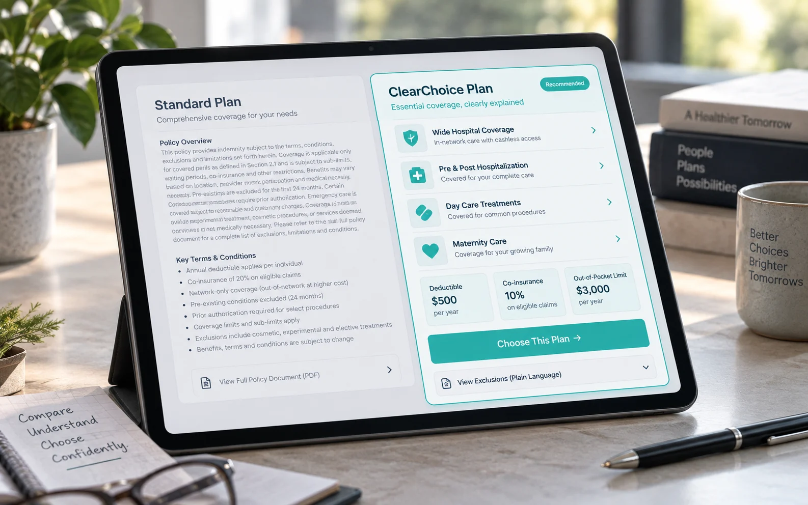
Information hierarchy is the practical antidote to information density. The goal isn’t to show users less; it’s to sequence what they see so critical coverage details surface first and edge-case exclusions stay accessible without competing for the same visual weight as core benefits. In practice, this means:
- Leading with plain-language summaries before showing policy specifics
- Using progressive disclosure to reveal detail on demand, not all at once
- Visually distinguishing “what’s covered” from “what’s not” through layout, not just labels
Designing for clarity in multi-layered coverage also means rethinking comparison UI. Side-by-side plan views should anchor on the decisions customers actually care about – deductibles, network restrictions, out-of-pocket limits, rather than reproducing the full certificate of coverage verbatim. That purposeful reduction is what separates a tool that builds confidence from one that generates abandonment. And that same discipline becomes even more critical at the most emotionally charged moment in the journey: filing a claim.
Reducing Cognitive Load During the Claims Process
The claims experience is the single moment that either cements or destroys customer loyalty, and most insurers are still getting it wrong.
When a policyholder files a claim, they’re often dealing with stress, loss, or urgency. That emotional context makes good UX not a convenience but a necessity. Effective insurance customer journey mapping reveals exactly where that stress compounds, typically at confusing multi-page forms, redundant data entry, or vague status messages. Customer-experience research consistently finds that a large share of policyholders will switch carriers over a poor digital experience, and nowhere is that risk higher than during a claim.
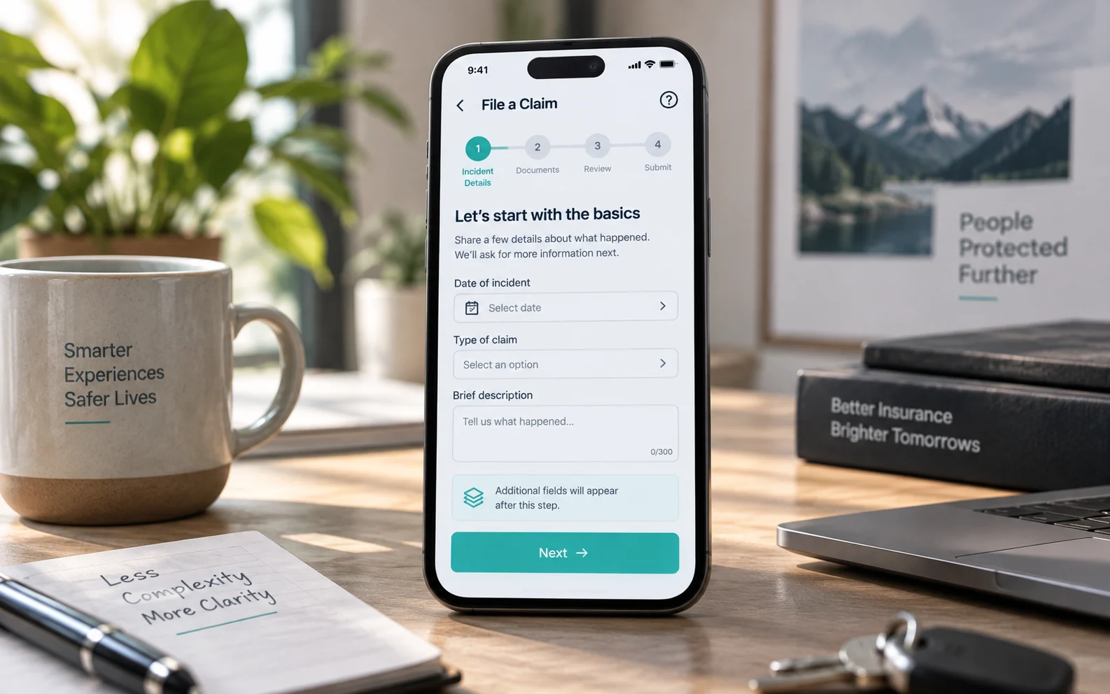
Progressive disclosure is one of the most practical tools for managing that friction. Rather than presenting every required field upfront, which triggers abandonment – well-designed claims flows surface requests incrementally, tied to what the user has already confirmed. Show the most essential fields first, then introduce detail-level questions as context builds. It mirrors how a skilled agent guides a conversation: naturally, without overwhelming.
Form field reduction matters just as much as sequencing. A common pattern in high-performing claim flows is auditing every field against one question: is this data strictly necessary at this stage, or can it be collected later? Cutting even a few unnecessary fields from a mobile claims form can meaningfully improve completion.
The same logic that governs other high-stakes digital transactions applies here: layered, multi-step flows become far more manageable when designed around user confidence rather than system requirements. When the interface communicates clarity and control, customers push through.
That challenge translating complex backend processes into seamless experiences, connects directly to a deeper operational question most insurers are quietly wrestling with.

Modernizing Legacy Platforms Without Disrupting Operations
Insurance platform modernisation often fails not because of technology limitations, but because teams optimise for feature parity instead of customer outcomes.
The logic behind feature parity seems reasonable: rebuild what you have, just faster and cleaner. But that thinking locks your new platform into the same structural problems that made the old one frustrating. You replicate a dozen workflows customers never liked, assuming familiarity equals usability. In practice, it just moves technical debt from one codebase to another while leaving the experience unchanged.
A growing number of insurance CIOs now rank customer experience among their top transformation priorities, a meaningful shift away from the backend-first thinking that dominated modernization roadmaps for the past decade. That reordering reflects a hard-won recognition: customers don’t care whether your infrastructure runs on a modern stack. They care whether the quote flow is clear, the claims process is fast, and the policy documents make sense.
Incremental vs. radical redesign is the strategic fork every enterprise faces when a legacy platform reaches its limits. Radical redesign offers a clean slate but introduces significant operational risk, especially in regulated environments where continuity matters. Incremental modernization, rebuilding one journey at a time – lets you test, learn, and adjust without disrupting the broader operation. For most insurers, the incremental path is more defensible, provided each phase is anchored in research rather than assumption.
And that’s the piece most roadmaps skip. Integrating research into the development lifecycle, through usability testing, journey mapping, and structured feedback loops – ensures each incremental release actually improves the experience rather than just updating its surface. The difference between transformation that stalls and transformation that compounds often comes down to whether research is embedded from the start or bolted on at the end.

The ROI of Research-First Digital Strategy
The ROI of UX in insurance isn’t a soft metric; it’s a measurable revenue and retention lever that separates leaders from everyone else.
The financial case for research-driven UX becomes hard to ignore once you connect it to outcomes. Transformation outperformers, those who move beyond surface-level digital upgrades – tend to see stronger premium-revenue growth than their peers. That gap doesn’t come from technology alone. It reflects a disciplined commitment to understanding what policyholders actually need before a single screen is designed.
Self-service portals are one of the clearest areas where research-first design pays off. When an insurer invests in usability testing before launching a portal, not after; it can find friction points that would otherwise drive users to phone support. Every call-center interaction replaced by a completed self-service transaction cuts operational cost and raises satisfaction at once. The maths compounds quickly at scale.
Usability testing also connects directly to conversion. A form that confuses users during quote or renewal doesn’t just create a poor experience, it creates abandonment. Even modest improvements to task completion on key workflows translate into measurable lifts in policy conversions. And in a regulated sector like BFSI, where design changes must pass compliance review, front-loading research means fewer costly revision cycles late in the build.
The most effective digital teams treat research as infrastructure, not a phase. That distinction between organizations that guess and those that validate, is ultimately what the bottom line reflects.

What You Need to Know: The Bottom Line
UX is no longer a finishing touch in insurance; it’s the primary differentiator in a market where products are increasingly commoditized and loyalty is fragile.
Transformation efforts that treat design as secondary to systems integration tend to plateau. They deliver new technology without new experiences, and policyholders notice the gap almost immediately, especially navigating a claim under stress.
- Journey-centric UX, not feature parity, determines whether digital transformation delivers lasting value.
- Cognitive load reduction during claims is the fastest, most measurable path to improved retention. Simplified language, logical sequencing, and clear progress indicators cut abandonment and support-call volume.
- Transformation strategies that ignore policyholder psychology consistently underperform, regardless of the technology stack. People are making high-stakes decisions at vulnerable moments; ambiguity erodes trust faster than any pricing decision.
- Specialised design partners with regulated-industry expertise are essential for balancing compliance with usability at scale.
Choosing the right partner to execute that balance is what separates a successful transformation from a costly rebuild.
Partnering for Future-Proof Insurance Experiences
Insurance digital transformation succeeds when domain expertise meets design rigor, a combination generalist firms rarely deliver.
Generalist agencies can build digital products. But when the stakes involve claim denials, policy renewals, or underwriting decisions, “functional” isn’t enough. BFSI and Healthcare environments carry regulatory complexity, emotional weight, and trust requirements that demand practitioners who have worked inside those constraints before. A team that understands why a user hesitates before submitting a claim, and designs to reduce that friction is categorically different from one that simply ships a form.
Domain knowledge isn’t a nice-to-have. It’s the difference between a digital experience that looks polished in a demo and one that actually reduces abandonment at the moments that matter. Specialized teams bring pattern recognition from prior engagements, they’ve already solved the edge cases that will surface in your rollout. That institutional knowledge compresses timelines, reduces rework, and protects your investment.
ScreenRoot’s approach is grounded in discovery before design: mapping actual customer journeys, identifying where complexity collapses the experience, and building interfaces that simplify without oversimplifying.
For leaders ready to modernize, the first move isn’t a full platform overhaul. It’s a structured workshop, an honest audit of where your current digital experience breaks down and what a research-first redesign would prioritize.
Frequently Asked Questions
What is the biggest UX problem in insurance platforms?
Clarity. The most damaging failure isn’t a slow form; it’s policy comparison so opaque that customers can’t tell what they’re actually buying, which pushes them to decide on price alone or abandon entirely.
How do you reduce claims abandonment?
Reduce cognitive load at the moment of stress: sequence requests with progressive disclosure, cut unnecessary fields, pre-fill known data, and show clear status and progress so people always know what happens next.
Why do insurance platform modernizations fail?
Because teams rebuild for feature parity instead of customer outcomes – replicating disliked workflows on a newer stack. Modernizing one journey at a time, anchored in research, is more defensible than a risky big-bang rebuild.
Does research-first UX actually pay off in insurance?
Yes. Testing before launch reduces call-center load, lifts task completion on quote and renewal flows, and in a compliance-reviewed sector, cuts costly late-stage revision cycles.
Written by Team ScreenRoot. 16+ years leading enterprise UI/UX research for BFSI, SaaS, and Healthcare clients.
When you’re ready, let’s talk.
📞 Call us (Toll-Free): 1800 121 5955 (India)
✉️ Email us: [email protected]



