
 1800 121 5955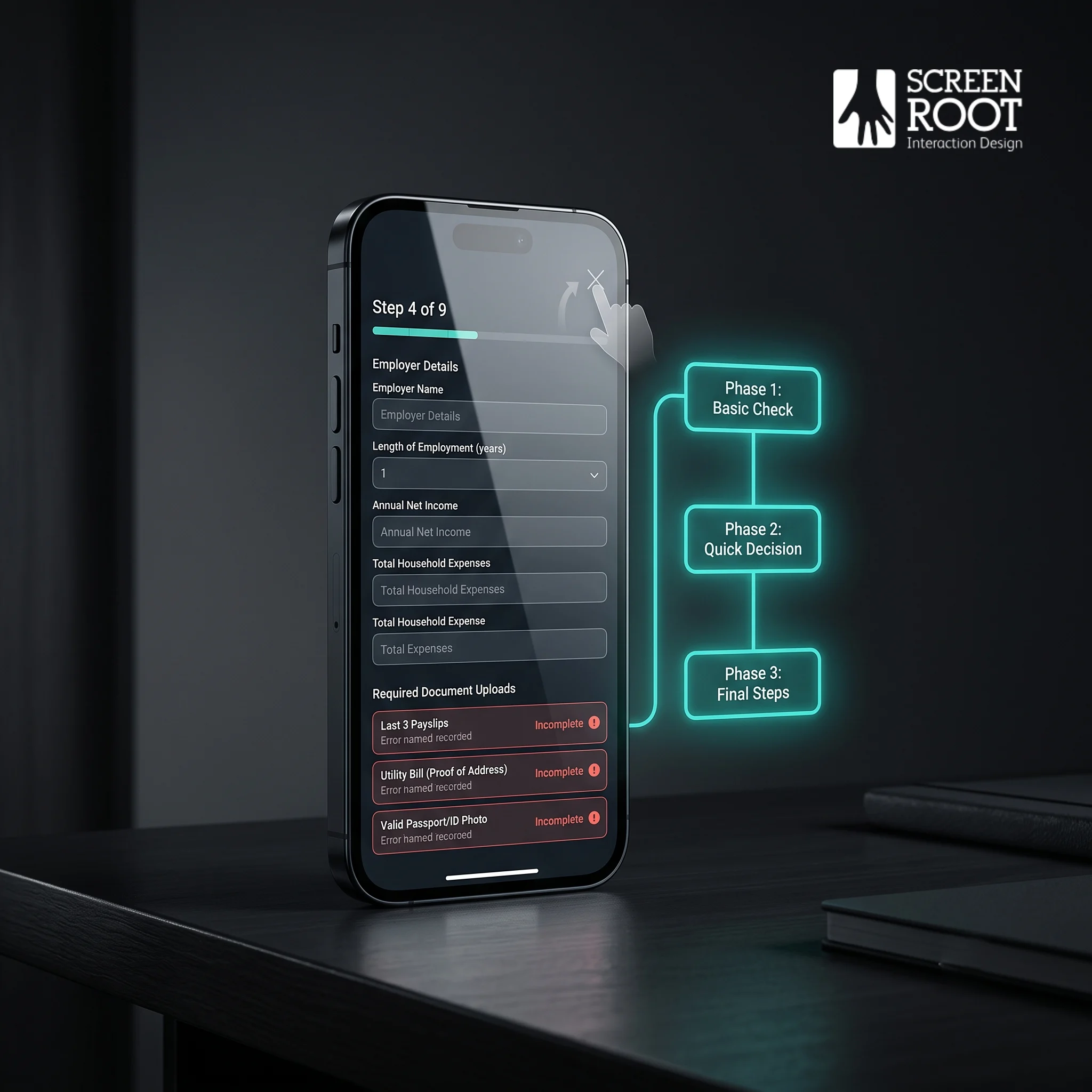
Digital loan applications lose qualified borrowers when long forms, repeated data entry, document-upload friction, and unclear progress make borrowing feel harder than it should. The fastest path to higher completion rates is a research-led, mobile-first experience that pre-fills verified data, breaks complex applications into clear stages, validates errors in real time, and keeps compliance working quietly in the background.

The Hidden Cost of Digital Friction in Modern Lending
Roughly 68% of consumers abandon online financial service applications before completing them, meaning most of your marketing budget is funding a waiting room, not a conversion.
That number should stop any CIO or Product Head cold. Lenders spend aggressively to drive qualified traffic through search, social, and email campaigns, yet a significant portion of high-intent applicants quietly exit before submitting. The disconnect isn’t a demand problem. It’s a design problem, and it carries a very real revenue cost.
Traditional friction is where established banks lose the most ground. FinTech’s have spent years engineering the “last mile” of the application, the moment a motivated borrower decides whether to push through or close the tab. Where a legacy institution might require document uploads, branch verification, or multi-step identity checks, a digitally native lender routes the same applicant through an experience that feels effortless by comparison. The psychological impact is significant: friction signals risk to applicants. A clunky form doesn’t just inconvenience, it erodes confidence in the institution itself.
This is why financial services conversion rate optimization naturally has moved from a marketing metric to a boardroom conversation. UX isn’t decoration; it’s infrastructure. Every unnecessary field, confusing error message, or unexplained delay represents measurable revenue leakage. And as digitization continues to reshape borrower expectations, the gap between institutions that treat UX as a core revenue driver and those that don’t is only going to widen. A shift the next section explores in depth.

How Digitization Is Disrupting Collateral-Based Lending
Digitization is fundamentally rewriting the rules of collateral-based lending, shifting the burden of proof away from applicants and toward automated, data-driven verification systems.
Traditional verification meant borrowers gathered paper pay stubs, bank statements, and property appraisals, then physically submitted them to a loan officer who manually reviewed each document. That process was slow, error-prone, and critically it created the kind of friction that drives abandonment. Today, automated data fetching pulls verified income, asset, and property data directly from authoritative sources, compressing what once took days into minutes.
Borrower expectations have shifted just as sharply as the technology. Consumers who book flights, open investment accounts, and transfer money instantly now expect the same speed from credit assessment. When a loan application demands the same effort as filling out a tax return, you’re fighting against a baseline expectation set by every other digital experience in a borrower’s life. The average mortgage rejection rate reached 20.7% in 2023, and sluggish, document-heavy processes almost certainly contribute to incomplete applications that never reach a decision.
Regulatory compliance remains the real tightrope. Lenders can’t simply remove verification steps, they must satisfy KYC, anti-money laundering, and fair lending requirements. But compliant doesn’t have to mean cumbersome. The most effective loan application abandonment reduction strategies effectively thread this needle by embedding compliance checks invisibly into the digital workflow, so the applicant experiences speed while the lender maintains full audit readiness.
The question isn’t whether to digitize collateral verification; it’s how to connect those verification systems seamlessly into the application itself. That’s precisely where the next challenge begins.

Bridging the Digital Connectivity Gap in Loan Origination
Closing the gap between fragmented data systems and a seamless applicant experience is one of the most effective ways to increase digital loan pull-through rates.
API-first architecture is foundational here. When lenders build integrations that pull verified data, such as income records, credit bureau information, and employment history, directly into the application, they eliminate the manual entry that causes so many drop-offs. Applicants who see fields already populated on their behalf feel the process is working for them, not against them. And that trust directly reduces abandonment.
Cognitive load is the quieter friction point. Long, undifferentiated forms overwhelm applicants before they’ve even reached the income section. Breaking the application into logical, bite-sized stages, identity, then financials, then collateral, then review, keeps users oriented and moving forward. According to the Federal Reserve’s 2023 household financial survey, digital adoption in credit applications is rising, which means the competitive cost of a clunky interface has never been higher.
Real-time validation adds another layer of confidence. Rather than flagging errors at submission, a moment that feels like failure, inline validation catches formatting issues, missing fields, and inconsistencies as the user types. It’s a small design decision with an outsized impact on completion rates.
UX research ties all of this together. Heatmaps, session recordings, and exit surveys pinpoint exactly where users stall or abandon. In practice, lenders who invest in regular usability testing don’t just fix obvious bugs, they uncover assumption gaps that no internal team would have spotted independently. That kind of evidence-driven iteration is what separates incremental improvement from genuine transformation, and it points directly to the UX best practices worth adopting next.

UX Best Practices for Reducing Application Abandonment
Applying digital lending UX best practices effectively isn’t optional anymore; it’s the clearest lever banks have for converting intent into completed applications.
The sections above made clear how fragmented systems and disconnected data create friction. But even a well-integrated back end can hemorrhage applicants if the front-end experience is poorly designed. The design layer is where institutional complexity either gets absorbed gracefully or gets dumped directly onto the user.
Progressive disclosure is one of the most effective tools for managing that complexity. Rather than presenting every required field upfront, a well-structured application surfaces only what’s needed at each stage. This reduces cognitive load, keeps momentum going, and prevents applicants from abandoning the process the moment they see a 12-field form staring back at them.
Mobile-first design matters just as much, particularly for document uploads and e-signatures. These two steps consistently spike drop-off rates on desktop-optimized forms. Designing these interactions for a small screen first ensures they’re intuitive for the majority of users who are completing applications on their cell phones, often on the go.
Clear progress indicators are a small addition with an outsized impact. When applicants can see that they’re on step 3 of 5, they’re far less likely to abandon than when they’re navigating what feels like an endless form.
And applying these principles at scale is what separates theory from results. ScreenRoot’s research-first methodology has helped leading banks simplify complex human-screen interactions, translating these design principles into interfaces that reduce friction for real users across global banking platforms.
The question isn’t whether these principles work. It’s whether your institution has the urgency to act on them, and that’s exactly what the next section addresses.

Why Now Is the Time to Embrace Digital Lending Transformation
The window for banks to act on digital lending transformation is narrowing, and the cost of delay is measured in lost applicants, not just lost revenue.
Only 36% of U.S. adults applied for credit in 2023, a decline from pre-pandemic levels. That shrinking pool of applicants makes conversion rate everything. When fewer people are entering the funnel, every abandoned application represents a proportionally larger hit to loan volume. Traditional institutions can’t afford to bleed traffic through preventable UX friction anymore.
“Consumer behavior has shifted permanently. Borrowers now expect the same seamless digital experience from their bank that they get from retail apps, and they’ll switch lenders to find it.”
Competitive pressure from digital-native lenders is accelerating that shift. These platforms were built without legacy infrastructure, which means they’ve optimized every touchpoint from the ground up. Established banks and credit unions are competing against products that treat UX as a core business function, not an afterthought. Closing that gap requires more than a visual refresh, it demands genuine investment in UX research for digital banking transformation to identify where your specific flow breaks down.
Long-term ROI is also a compelling argument for action. A research-driven UX overhaul reduces support costs, shortens decisioning cycles, and lifts completion rates across the loan lifecycle. And future-proofing matters too, the next generation of borrowers will conduct nearly all financial activity on mobile, with even less tolerance for clunky multi-step forms. Building for them now is building for your institution’s survival. That’s precisely what product leaders need a concrete strategy to execute, which is where the next steps come in.
The Bottom Line: Key Strategies for Product Leaders
With credit rejection rates rising across structured finance markets, every completed loan application carries more weight than it did even two years ago, and friction is the silent force driving qualified borrowers away before they finish.
Product leaders can’t afford to treat UX as a cosmetic layer on top of existing lending infrastructure. The strategies covered throughout this article point toward a clear set of priorities worth cementing before your next product cycle:
- Run UX research first. Assumptions about where applicants drop off are often wrong. Qualitative research and session analysis reveal friction points that analytics dashboards alone won’t surface.
- Automate collateral verification. Manual document uploads and repeated data entry are among the most common abandonment triggers. Reducing that burden through automation directly improves completion rates.
- Commit to mobile-responsive design across the full loan lifecycle, not just the front door. Applicants who start on mobile expect to check status, upload documents, and sign agreements without switching devices.
- Partner with specialists who understand both BFSI regulations and design. Compliance requirements don’t have to create UX debt. But navigating that intersection takes experience in both disciplines, not just one.
The right partner brings that dual expertise to the table, and that’s exactly what the next section addresses.
Partnering for Success in Digital Banking Transformation
The difference between a digitized loan application and a user-optimized one isn’t cosmetic; it’s the difference between an applicant who completes and one who abandons.
As covered throughout this article, friction doesn’t announce itself. It accumulates quietly in redundant fields, unclear progress indicators, and mobile experiences that weren’t designed so much as defaulted into. Fixing it requires a research-first approach, one that starts with understanding real user behavior before a single interface decision is made. That means usability testing, drop-off analysis, and a willingness to question assumptions that have calcified into “standard practice.”
Experience in regulated industries matters here more than general UX expertise. The constraints that shape financial product design – compliance requirements, security protocols, accessibility standards aren’t obstacles to good design. They’re the context in which good design has to operate. With 16+ years working across regulated environments, ScreenRoot brings the kind of institutional fluency that keeps solutions both user-friendly and audit-ready. You can explore that track record directly in ScreenRoot’s work.
The shift from digitized to user-optimized isn’t a one-time project. It’s an ongoing discipline, and it compounds. Every friction point resolved is a recovered applicant. Every recovered applicant is a relationship that didn’t start with frustration.
If your digital lending platform is due for an honest look, start with a UX audit or consultation. The friction tax is real, but it’s also fixable.
Written by Team ScreenRoot. 16+ years leading enterprise UI/UX research for BFSI, SaaS, and Healthcare clients.
When you’re ready, let’s talk.
📞 Call us (Toll-Free): 1800 121 5955 (India)
✉️ Email us: [email protected]



