
 1800 121 5955
In short: In enterprise SaaS, every added feature is a quiet trade between capability and clarity, and complexity usually overcharges. Speed, flow-first architecture, and onboarding that delivers value fast beat feature-rich roadmaps on retention. In regulated industries especially, the goal is to design around compliance intelligently, not to bury users in it.
Every feature you add to a SaaS platform is a silent negotiation between capability and clarity, and complexity almost always overcharges.
In enterprise SaaS, the instinct to build more, more integrations, more dashboards, more configuration – is understandable. But feature-rich products routinely fail the speed-to-value test. A user who can’t reach their goal in a few clicks isn’t experiencing your product’s depth; they’re experiencing its friction. And friction, compounded across thousands of enterprise users, translates directly into support costs, churn risk, and weaker renewal leverage.
Cognitive load is where complexity does its quietest damage. In high-stakes environments like BFSI, banking, financial services, and insurance – users aren’t leisurely exploring a tool. They’re making decisions under time pressure, regulatory scrutiny, and accountability risk. When an interface asks them to hold too many variables in working memory at once, errors multiply and trust erodes. Reducing cognitive burden isn’t a cosmetic concern; it’s a performance and compliance issue.
The C-suite is feeling this acutely. Capital efficiency has replaced growth-at-all-costs as the defining measure of enterprise software value. When a CFO evaluates a renewal, the question isn’t “does it have enough features?” It’s “how fast does it deliver measurable outcomes?” Digital customer journey optimization sits at the center of that conversation, because a streamlined, low-friction experience is the most visible proof of operational ROI. Which brings us to a deeper question: what does “fast” actually mean to a user, and why does it matter more than you might think?

Why Speed is the Ultimate Conversion Metric
Speed in enterprise SaaS isn’t just a performance benchmark, it’s the psychological state your users are in when they decide whether to trust your platform or abandon it.
Slow software doesn’t just frustrate users; it signals incompetence. When a workflow feels sluggish, the user doesn’t think “the server is busy.” They think “this tool isn’t built for me.” That’s the gap between actual latency and perceived reliability, and in regulated industries like finance, healthcare, and legal tech, that gap carries real consequences. A platform that hesitates at a critical decision point erodes the confidence users need to complete high-stakes actions. Journey speed and user trust are inseparable.
The data makes this concrete. Google’s research with SOASTA found that improving mobile load time by a single second can meaningfully lift conversion, while a one-second delay can reduce conversions by as much as 20% in some contexts.
For enterprise SaaS accessed on mobile, including by field sales reps, remote approvers, and on-site operations teams, that single second compounds across every touchpoint in a workflow, every session, and every quarter. A one-second mobile delay can cost you a meaningful share of conversions – before a user ever reads a single word of your interface.
A distinction worth making clearly:
- Fast design reduces friction at every step, loads predictably, and builds confidence through speed while keeping things clear.
- Hurried design skips steps without context, rushes users toward completion, and sacrifices clarity for throughput, creating anxiety instead of trust.
Delivering frictionless UX for enterprise SaaS means designing workflows that feel immediate without cutting corners on the information users need to act confidently. Fast and clear aren’t in conflict, but achieving both takes intentional architecture. Which raises the next question: what does it actually look like to redesign a platform around the path to completion rather than the depth of its feature set?
Pivoting from Feature-Rich to Flow-First Architecture
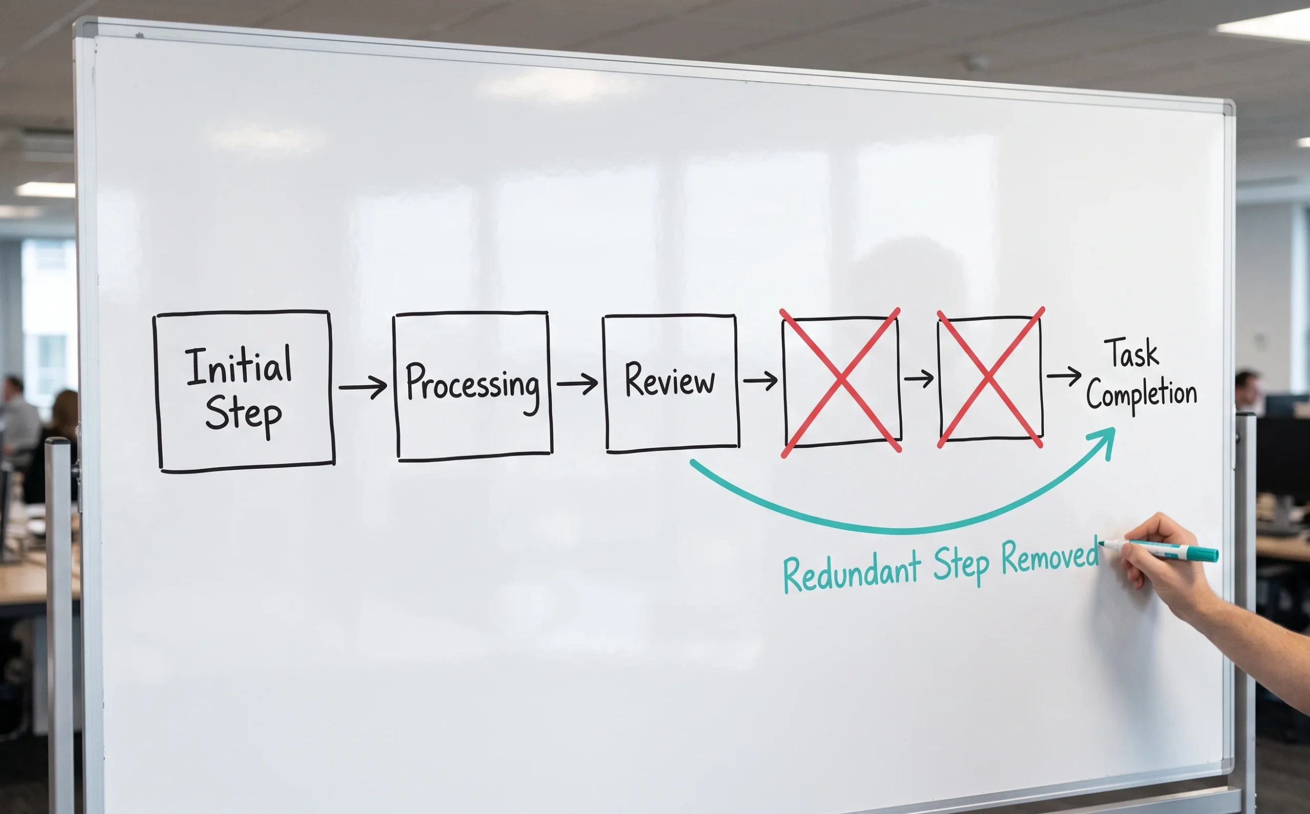
Flow-first architecture isn’t about stripping your platform down; it’s about ruthlessly prioritizing the path to completion over the mere presence of capability.
Most enterprise SaaS teams build around features because features are legible. They’re easy to roadmap, easy to sell, easy to demo. What’s harder to measure and far more damaging when ignored is how those features pile up into journeys users can’t complete without friction, confusion, or a support ticket. Feature bloat doesn’t just slow users down; it erodes trust in your product. A platform that makes people work to accomplish basic tasks signals poor design, not sophistication, no matter how technically powerful it is.
Auditing for friction is the first structural move in any flow-first pivot. In practice, that means mapping every critical journey and asking a pointed question at each step: does this moment accelerate task completion, or delay it? Redundant confirmation screens, multi-step forms that could be collapsed, and navigation built around internal org charts rather than user goals are the friction points that compound silently. The gap between what teams think users do and what users actually do is almost always wider than expected.
Research-first methodology closes that gap. ScreenRoot’s approach to research-driven product strategy is grounded in exactly this principle. Understanding critical user paths before designing solutions, not after. When it comes to optimizing SaaS onboarding for retention, the highest-leverage insight usually isn’t a UI tweak; it’s the discovery that users are dropping off at a step the team assumed was frictionless.
That tension between assumption and reality becomes even sharper in high-stakes, regulated environments, where the cost of a broken flow isn’t just churn, but compliance risk and user harm.
Simplifying High-Stakes Journeys in Regulated Industries
Regulated industries like BFSI and Healthcare face a design paradox: the workflows that most demand simplicity are the ones most burdened by compliance requirements. Here, SaaS UX decisions carry real consequences. A confusing onboarding screen doesn’t just frustrate users; it triggers drop-off exactly when trust matters most.
The challenge isn’t removing compliance; it’s designing around it intelligently.
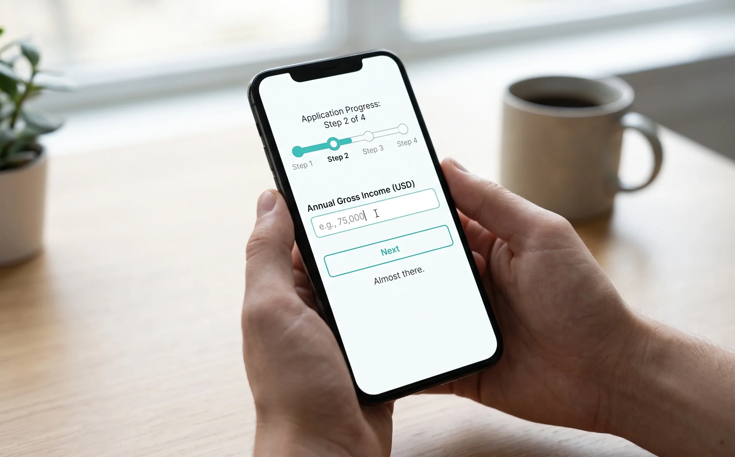
A ScreenRoot engagement with a digital lending platform illustrates what this looks like in practice. The platform was asking users to navigate a complex, multi-step lending application on mobile. A context where attention spans are short and anxiety around financial decisions runs high. The problem wasn’t the process itself; it was how that process was presented.
Problem: A fragmented credit-application flow with too many decision points, excessive form fields, and no clear progress indicators – leading to confusion and abandonment.
Solution: ScreenRoot restructured the journey into a smoother mobile experience, breaking the application into digestible stages, surfacing only what the user needed at each step, and communicating progress in a way that reduced uncertainty.
The lessons translate across regulated verticals:
- Chunk complex forms – break multi-field applications into focused steps rather than presenting everything at once.
- Show progress explicitly – users tolerate friction better when they know how far they’ve come and how close they are to finishing.
- Separate data collection from decision points – don’t ask users to make a choice mid-form; resolve compliance requirements in the background where possible.
- Design for hesitation – in high-stakes flows, users pause; build in reassurance copy and contextual help to reduce anxiety.
The balance between regulation and experience isn’t a compromise, it’s a design constraint that, handled well, actually builds user confidence. And that confidence is what carries users through the rest of your platform, which is where the conversation goes next.
The Role of Connected Processes in User Retention
A fragmented digital customer journey doesn’t just frustrate users, it actively drives them toward the exit.
When handoffs between channels break down, users absorb the cost. They re-enter data they’ve already submitted. They switch between portals that don’t share state. They reach support agents with no visibility into what just happened in the self-service flow. Each moment adds cognitive load, and cognitive load compounds into churn. The problem isn’t any single broken step; it’s the accumulation of disconnection across the whole journey.
70% of customers say connected processes are very important to winning their business (Salesforce, State of the Connected Customer) – which means fragmentation isn’t a UX nuisance, it’s a revenue risk.
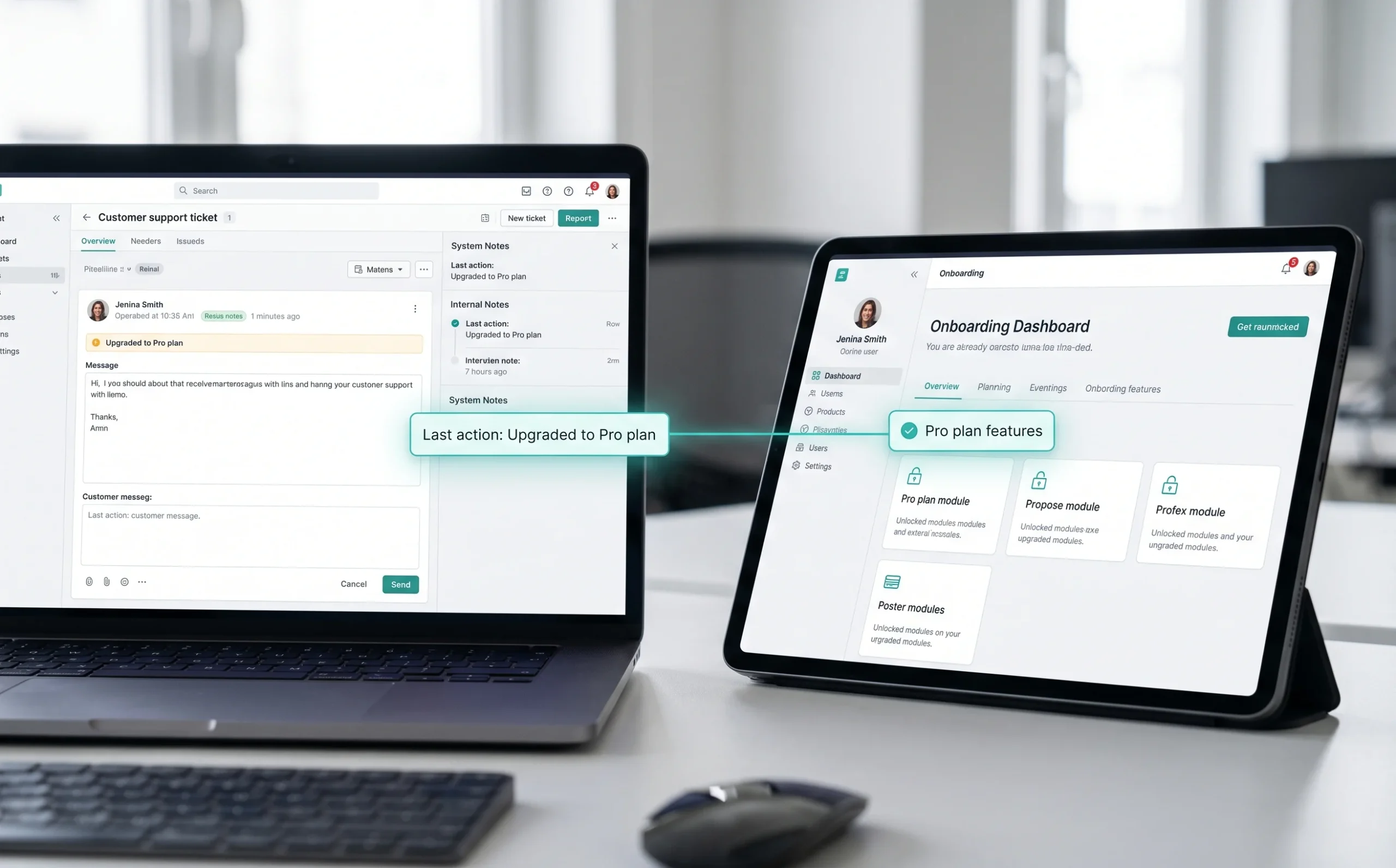
Seamless handoffs take more than good UI. They demand that every system in a user’s journey – CRM, billing, onboarding, support – shares context in real time. When a user upgrades a plan, onboarding should already know. When a support ticket opens, the agent should see the user’s last few product actions. That continuity is what turns a collection of features into a coherent experience.
Product leaders are uniquely placed to orchestrate this. Unlike teams that own a single layer, a Product Head sees across the full ecosystem, and can spot where handoff gaps are bleeding retention. The practical approach: map every transition point in the journey, flag where data or context gets dropped, and prioritize those gaps on the roadmap.
Connected processes also work as a competitive signal. Users don’t consciously think “this product has strong system integration” – they just feel like the platform gets them. That feeling is what keeps them renewing. And that logic applies with even greater intensity during onboarding, where the stakes of a disconnected moment are highest.

Optimizing SaaS Onboarding for Immediate Value
Onboarding is the single moment that determines whether a new user becomes a loyal customer or a churn statistic, and most SaaS products still get it wrong.
Retention only becomes a conversation if users make it past the first session. Poor onboarding kills retention before the relationship even begins. Users who don’t experience meaningful value in their first interaction rarely return. That’s the core challenge behind reducing Time to First Value (TTFV), getting users to their “aha” moment as fast as possible.
Progressive disclosure is one of the most effective tools here. Rather than presenting every feature upfront, you surface functionality in layers, showing users only what’s relevant to their immediate goal. This respects cognitive load and builds confidence incrementally. A new user doesn’t need to understand your entire platform on day one; they need to complete one meaningful action that makes the product feel worth their time.
ScreenRoot’s work on a communication-platform onboarding experience demonstrates the principle: stripping the experience down to its essential interactions so users could orient themselves quickly, without friction. In a product where complexity is inevitable, that restraint in the onboarding layer made a measurable difference to comprehension and momentum.
To audit your own onboarding, use a simple three-step framework:
1. Map the critical path.
Identify the single action that delivers first value and ruthlessly remove every step that doesn’t serve it.
2. Track TTFV as a metric.
Measure how long it takes new users to complete that action, then judge every redesign decision through that lens.
3. Layer complexity gradually.
Introduce advanced features only after the user has shown baseline engagement, not before.
Simplicity at the entry point isn’t a constraint, it’s a conversion strategy. And as enterprise workflows increasingly shift to mobile, that principle of doing more with less becomes even more important to get right.

Designing for Mobile-First Enterprise Workflows
Enterprise users no longer accept a watered-down mobile experience, they expect the same speed, clarity, and control they get on desktop, optimized for a smaller screen.
The gap between consumer-grade mobile UX and enterprise mobile UX is closing fast. Employees carry expectations shaped by daily use of polished consumer apps, and when your product falls short on a phone or tablet, trust erodes quickly. Enterprise products can’t treat mobile as a secondary viewport any longer; it has to be a primary design consideration from day one.
Repeated, time-sensitive actions are where this bites hardest. When users complete the same task many times a day, even minor friction compounds across thousands of sessions. A checkout or approval workflow that works beautifully on desktop but stumbles on mobile becomes a retention liability.
Maintaining power on smaller screens takes deliberate constraint. Progressive disclosure helps surface the most critical actions upfront and tuck advanced controls behind a second tap, keeping the interface clean without stripping out functionality power users rely on. And when you design touch targets, bigger is almost always better; a target smaller than 44×44 pixels creates frustration users may not consciously register but will still feel.
Low-friction, touch-friendly design also means rethinking data entry. Dropdowns, auto-complete, and smart defaults reduce the cognitive and physical effort of mobile input in ways desktop users rarely notice but mobile users depend on. These decisions aren’t isolated from broader product strategy, they connect directly to how product leaders build retention-focused roadmaps that scale.
Key Takeaways for Product Leaders
before designing a single screen is the discipline that separates thoughtful product evolution from expensive guesswork.
Complexity carries a real financial cost. Bloated interfaces slow adoption, inflate support costs, and quietly erode confidence, all before a renewal conversation even starts. Simplicity isn’t a trade-off; it’s a growth lever that compounds over time.
What to carry forward:
- Complexity is a financial drain.
Every unnecessary step is friction that costs you. Streamlined experiences reduce training overhead, lower support volume, and accelerate time-to-value, all of which affect the bottom line directly. - Flow-first architecture outperforms feature-rich roadmaps.
A product that does fewer things seamlessly retains users longer than one packed with hard-to-navigate capabilities. Retention depends on how effortlessly users reach their goals, not how many features they’re offered. - Research-driven design is non-negotiable in regulated industries.
In healthcare, finance, and legal, assumptions are dangerous. With 16+ years of domain expertise, a research-first approach isn’t optional; it’s the foundation every design decision rests on. - Speed has two dimensions.
Technical performance matters, but perceived speed, how fast a product feels – shapes trust just as powerfully. Measure both; don’t assume either. - Connected journeys drive long-term loyalty.
Isolated touchpoints break trust. When onboarding, daily use, and support feel like one coherent experience, users stay.
The question isn’t whether your product needs to be simpler. It’s whether your organization is ready to build that way.
Building the Future of Frictionless Enterprise Design
Simplicity in enterprise SaaS is no longer a design preference, it’s a competitive necessity that separates products users champion from ones they quietly resent.
The shift is structural, not cosmetic. Enterprise buyers have grown used to consumer-grade experiences, and they bring those expectations into regulated, high-stakes workflows. Products that can’t match that fluency lose ground, not in feature comparisons, but in daily trust. Every unnecessary click, every confusing modal, every workflow that needs training to complete is friction that compounds into churn.
A research-first methodology turns that challenge into an advantage. Understanding why users struggle before designing a single screen is the discipline that separates thoughtful product evolution from expensive guesswork. Even the language inside your product shapes how confidently users move through it. Research surfaces the hidden friction that roadmap reviews simply don’t catch.
The most practical question a product leader can ask right now is direct: where does your current journey create hesitation? Not in user-testing sessions, but in real workflows, on real deadlines, inside regulated environments where errors carry consequences. That’s the audit worth running.
ScreenRoot exists precisely for these stakes. Working at the intersection of complex systems and human behavior, the team transforms human-screen interactions into seamless, outcome-driven experiences. A mandate that matters most when a product has to perform under pressure. If you’re leading a SaaS product where UX friction carries measurable business cost, the next step is a design audit or workshop built around your actual users and workflows.
The flow-first mandate isn’t a trend. It’s the new baseline and the time to build toward it is now.
Frequently Asked Questions
What does “flow-first” mean in SaaS UX?
It means designing around the path to completion rather than the breadth of features. Instead of showcasing everything a product can do, flow-first architecture prioritizes getting users to their goal quickly, with the fewest friction points.
Why does speed matter so much for SaaS retention?
Because perceived speed shapes trust. Sluggish workflows read as “this tool isn’t built for me,” and in regulated, high-stakes contexts that hesitation erodes the confidence users need to act. Faster journeys feel more reliable and keep users engaged.
How do you reduce onboarding drop-off in enterprise SaaS?
Focus on Time to First Value. Map the single action that delivers first value, remove everything that doesn’t serve it, and use progressive disclosure to layer in advanced features only once users are engaged.
How do you simplify UX without removing compliance?
Design around compliance rather than stripping it out. Chunk complex forms into stages, show progress explicitly, resolve regulatory checks in the background where possible, and add reassurance copy at moments of hesitation.
Written by Team ScreenRoot. 16+ years leading enterprise UI/UX research for BFSI, SaaS, and Healthcare clients.
When you’re ready, let’s talk.
📞 Call us (Toll-Free): 1800 121 5955 (India)
✉️ Email us: [email protected]



