
 1800 121 5955
In short: For most customers, the claim is the first time their insurance becomes real, and it’s the moment your brand is judged. Jargon, redundant data entry, over-long intimation flows, and unhandled error states quietly drive people away when they’re already stressed. The fix is plain language, mobile-first intimation, pre-filled data, and error recovery designed as carefully as the happy path.
Most customers pay their insurance premiums for years and never file a single claim. Then one day, something goes wrong, and suddenly the policy they’ve been quietly funding becomes very real.
That single interaction is everything. As McKinsey & Company has described it, the claim is the “moment of truth” for an insurance brand; if the digital experience fails here, the brand promise breaks. Years of careful messaging, loyalty programs, and polished campaigns can unravel in the time it takes a frustrated customer to abandon a confusing claims portal.
A significant share of insurance customers say they would switch providers for a better digital claims experience. A finding echoed across customer-experience research from firms like Salesforce. That’s not a marginal retention risk; it’s a structural business threat.
For CXOs, this reframes the conversation entirely. Following insurance claims UX best practices isn’t a design-team concern; it’s a revenue-protection strategy. A frictionless claims flow keeps customers who might otherwise quietly leave at renewal. A broken one accelerates that departure and generates word-of-mouth no marketing budget can fully offset.
The good news? Most friction points are identifiable and fixable. One of the most damaging, and most overlooked, is the language you use when customers need clarity most.
The Jargon Trap: When ‘Insurance-Speak’ Halts Progress
Insurance language is one of the biggest silent killers of a smooth claims experience and most insurers don’t even realize it’s happening.
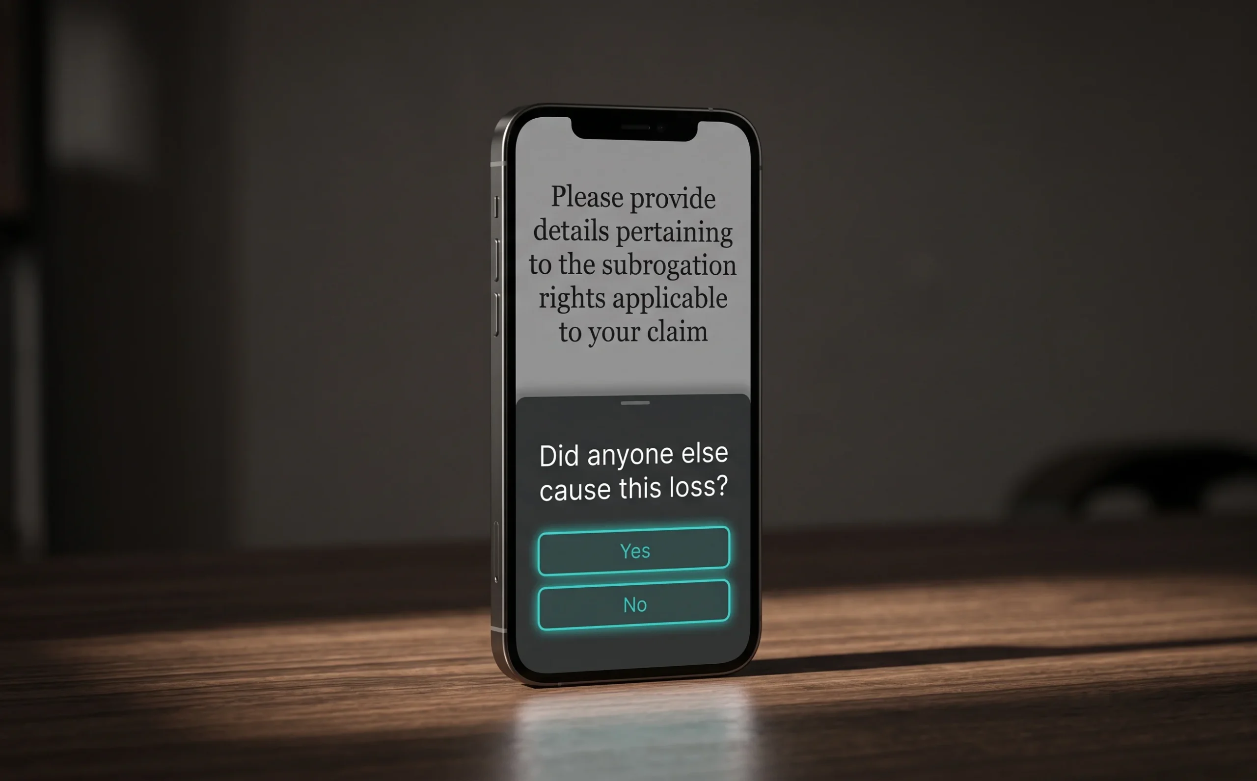
When someone is filing a claim after an accident or a loss, they’re already stressed. Presenting them with terms like subrogation, indemnity, or proximate cause without context doesn’t just confuse them. It stops them cold. Complex jargon in claims forms leads directly to higher drop-off and a surge in support tickets. That’s not just a UX problem; it’s a measurable cost burden on your call center.
Dense legal language in a crisis moment doesn’t inform users, it shuts them down. This is cognitive load in action. People under emotional stress have a significantly reduced capacity to process unfamiliar terminology. When a form asks them to “confirm the basis of indemnity,” most simply don’t know what it means. So they abandon the form, call support, or disengage entirely.
The fix is straightforward and central to any serious digital claims transformation strategy: replace insider language with plain, conversational phrasing, and where a technical term is legally required, add a contextual tooltip or inline explanation. Consider the difference:
- Before: “Please provide details pertaining to the subrogation rights applicable to your claim.”
- After: “Did anyone else cause this loss? If so, we may be able to recover costs from them on your behalf.”
Same meaning. Completely different experience. The second keeps users moving forward instead of reaching for the phone.
Of course, language is only one layer. The structure of the claims flow itself can create just as much friction. Which is what we’ll look at next.
The Friction Point: Over-Complicating the Intimation Flow
Optimizing insurance customer journeys starts with one uncomfortable question: why are you asking customers for information you already have?
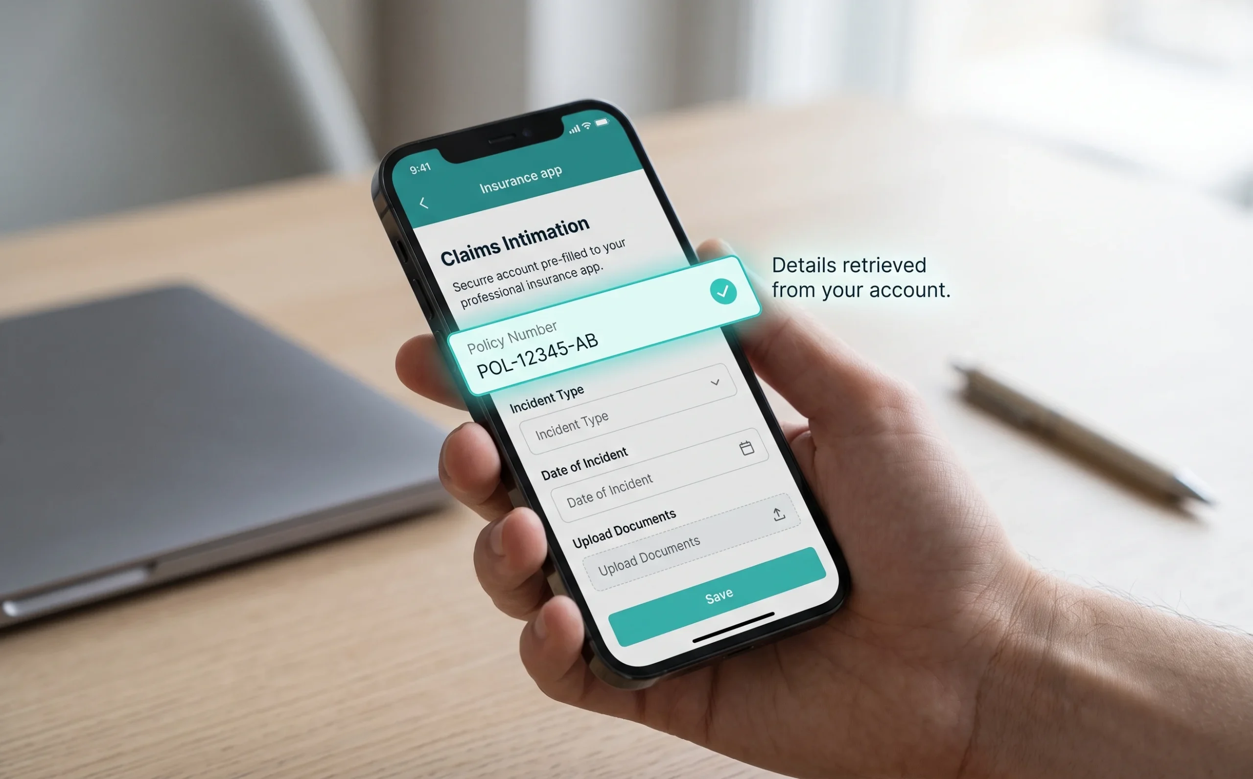
When a policyholder opens a claim, they’re already stressed. Asking them to re-enter their policy number, date of birth, or registered address, data sitting in your system – immediately signals that the process ahead will be painful. It erodes trust before a single document is uploaded.
The structural problems that stall claims at the intimation stage are predictable and fixable:
- Redundant data entry forces users to type information the insurer already holds, adding unnecessary steps and cognitive load to an already difficult moment.
- Desktop-first design creates barriers for users on phones, where most people actually manage urgent tasks. Mobile-first architecture isn’t a nice-to-have, it’s the baseline for any modern claims interface.
- Excessive step counts between “Start a Claim” and “Claim Submitted” give users too many opportunities to abandon the process.
Streamlining the funnel isn’t just good UX, it’s a retention strategy. ScreenRoot’s work restructuring complex policy information into an intuitive, user-centric interface for an insurance client shows this clearly: when the experience becomes something customers can navigate without assistance, completion rises.
The lesson transfers directly to claims. Fewer fields, smarter pre-population, and a mobile-first architecture collapse the distance between “something went wrong” and “my claim is filed.” And once you’ve tightened the happy path, a harder challenge emerges – what happens when users don’t follow it.

The Cost of Neglecting Error Use Cases
Ignoring edge cases in your claims flow isn’t a minor oversight, it’s a direct leak in your revenue pipeline that compounds with every frustrated user who walks away.
Understanding why customers drop off during claims often comes down to one overlooked culprit: the dead end. A user uploads the wrong document format, mistypes a policy number, or simply doesn’t have a required file to hand, and the interface responds with a red error and nowhere to go. No guidance. No alternative path. Just a wall. It’s remarkably easy to overlook error use cases in a major build, and the result is predictable frustration at the worst possible moment.
“The happy path is not the whole product. Design only for the ideal scenario, and you leave the real world and real customers unserved.”
Happy-path design is one of the most dangerous traps in enterprise insurance UX. Teams build and test for the user who has every document ready, knows every term, and completes the flow without a misstep. But that user is the exception. The average claimant is stressed, time-pressed, and often filing during one of the worst moments of their life. When the flow breaks for them, they don’t retry – they abandon. And abandoned claims don’t just hurt retention; they trigger costly manual intervention from operations, quietly draining resources that never show up on a UX audit.
Recovery design is the fix most teams deprioritize. When a claim validation fails, users need a clear, human-readable explanation of what went wrong, what they need, and how to continue – not a generic error code. A save-and-resume function, a direct escalation path, or a simple checklist of required documents can be the difference between a completed claim and a churned customer. The technology to support these paths already exists; the next question is how intelligently it gets deployed.
Evolving Tech: The Challenge of AI and Automation
AI is reshaping insurance claims, but the biggest risk isn’t moving too slowly, it’s moving fast enough to lose the user along the way.
Balancing automation with human empathy is a defining challenge for modern insurers. Machine learning can flag potentially fraudulent claims in seconds, auto-populate policy data, and route submissions intelligently, cutting the processing time that creates so many claim-filing friction points. But speed alone doesn’t build trust. A claimant filing after a car accident or a medical emergency isn’t in the headspace to appreciate a faster algorithm. They need clarity, acknowledgment, and a sense that someone or something is genuinely working on their behalf.
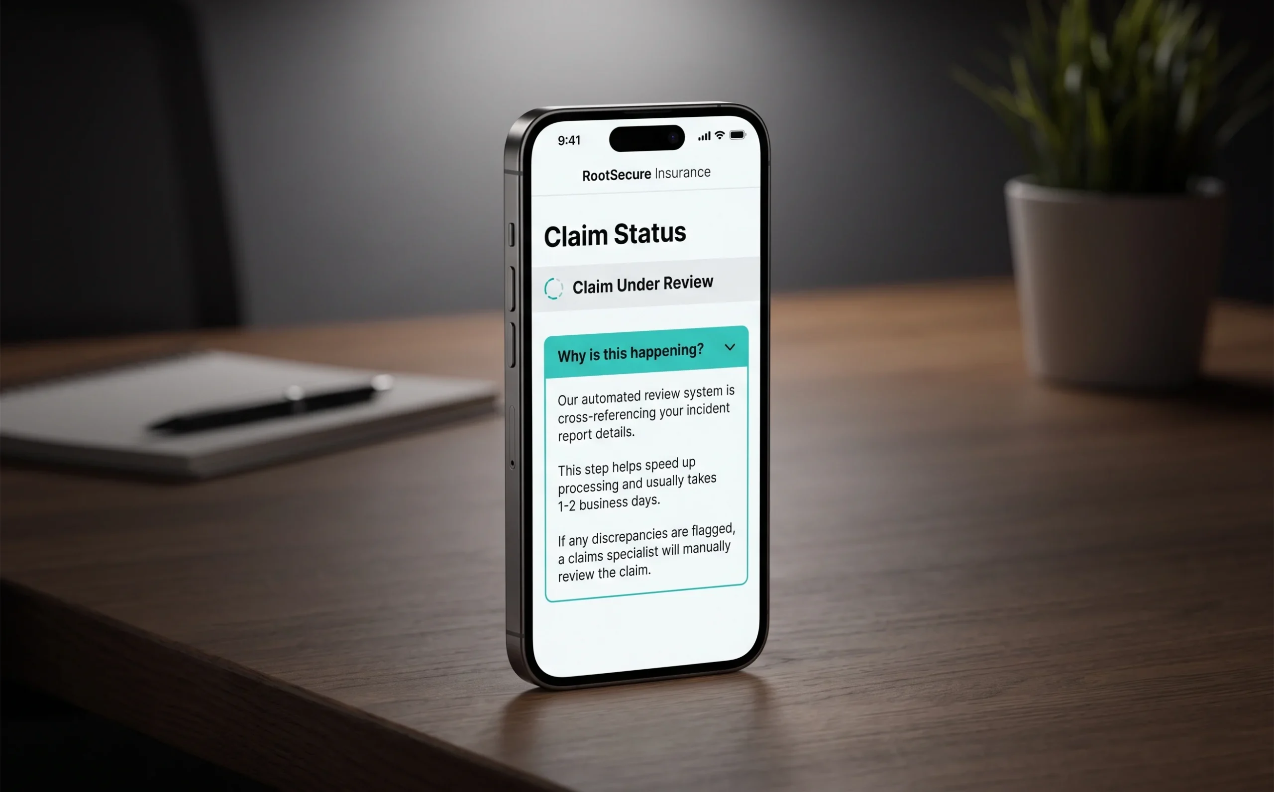
The “black box” problem is where many AI-driven flows quietly collapse. As insurers lean more on automated decisioning, users who can’t see why a claim is pending, approved, or flagged feel powerless, and that powerlessness converts directly into churn. Transparency isn’t optional; it’s a functional requirement.
There’s also the infrastructure reality. Many carriers are layering AI tools onto legacy systems that were never built for them, creating fragmented experiences where automation handles one step and a manual process stalls the next. This patchwork undermines the very efficiency gains insurers are chasing. A smooth transition to intelligent automation means rethinking the full flow, not just bolting on new tools.
Getting this right comes down to a handful of principles that, together, form the foundation of a claims experience worth keeping. The next section breaks them down.
The Bottom Line: 4 Pillars of a Modern Claims Flow
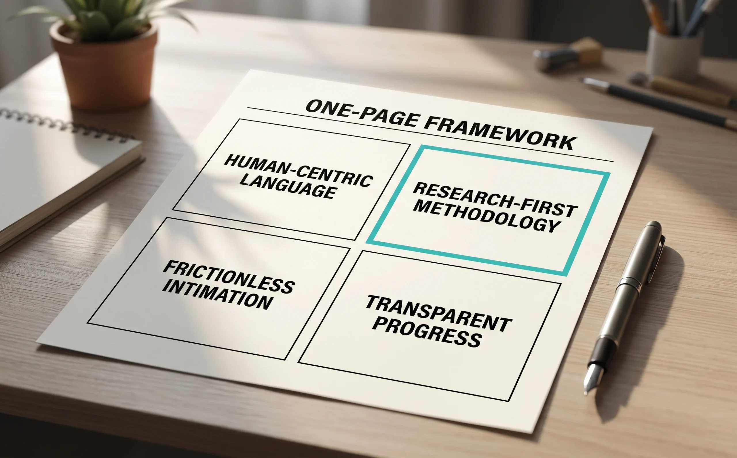
A high-performing claims flow isn’t built on technology alone, it’s built on four principles that put the user’s experience at the center of every decision.
Human-centric language is where it starts. Legal disclaimers and policy jargon may satisfy compliance teams, but they confuse the people who matter most. Replacing dense terminology with plain, direct language reduces inbound support calls and builds the kind of trust that retains policyholders beyond a single claim.
Research-first methodology separates assumptions from evidence. Teams that invest in usability testing before launching or redesigning a claims flow consistently uncover friction points internal stakeholders never anticipated – a confusing field label, a missing progress indicator, an error message that offers no way forward. Understanding real user behavior, not hypothetical journeys, is what drives meaningful improvement.
Frictionless intimation means removing every unnecessary barrier at first contact. Pre-filling known data from the user’s profile, designing for mobile-first interactions, and minimizing required inputs all reduce drop-off at the most critical moment. And because this is BFSI, frictionless still has to mean controlled, balancing user needs with strict business and regulatory outcomes.
Transparent progress closes the loop. Real-time status updates via push notification, SMS, or in-app tracking replace anxiety with confidence. But these pillars don’t operate in isolation. How well you implement them together ultimately determines whether your claims flow becomes a retention asset or a churn accelerator, which is the strategic question the next section addresses.
Future-Proofing Your Digital Claims Strategy
The best claims flow is one the user doesn’t have to think about and getting there means treating UX as a core business strategy, not a design afterthought.
Throughout this article, a clear pattern has emerged: friction in the claims process isn’t a minor inconvenience. It’s a measurable driver of churn, eroded trust, and lost revenue. Modernizing the interface isn’t a “nice-to-have”; it’s a retention strategy. Every drop-off point, every confusing status screen, every redundant data request – these aren’t UX problems. They’re business problems with UX solutions.
Navigating those solutions inside a regulated industry is where sector experience earns its weight. Insurance UX sits at the intersection of compliance requirements, legacy infrastructure, and user expectations shaped by consumer apps far outside your category. Getting that balance right demands more than good intentions. It demands deep domain knowledge. ScreenRoot brings 16+ years of working inside complex, regulated environments, translating that expertise into claims interfaces that reduce friction without compromising compliance.
And if you’re not sure where your own experience is breaking down, that’s the right place to start. Evaluate your current claims drop-off by stage, identify where users are abandoning the flow, and treat those exits as signals rather than statistics. The data will tell you where the friction lives. The question is whether you’re prepared to fix it.
Frequently Asked Questions
Why does claims UX matter so much for an insurance brand?
Because the claim is often the first time a customer’s policy becomes real. It’s the “moment of truth” where the brand promise is kept or broken, and a confusing claims experience can undo years of marketing in a single stressful session.
What are the most common insurance claims UX mistakes?
Unexplained jargon, asking users to re-enter data the insurer already holds, over-long intimation flows with too many steps, and unhandled error states that dead-end the user with no way forward.
How does plain language improve claims completion? Stressed users have limited capacity for unfamiliar terminology. Replacing terms like “subrogation” with a plain question (“Did anyone else cause this loss?”) keeps people moving through the form instead of abandoning it or calling support.
Where does AI help and where does it hurt in claims?
AI speeds up fraud detection, data entry, and routing. But opaque, “black box” decisions leave users feeling powerless. Transparency about why a claim is pending or flagged is what keeps automation from eroding trust.
Written by Team ScreenRoot. 16+ years leading enterprise UI/UX research for BFSI, SaaS, and Healthcare clients.
When you’re ready, let’s talk.
📞 Call us (Toll-Free): 1800 121 5955 (India)
✉️ Email us: [email protected]



