Enterprise banking is at an inflection point. A mobile banking app redesign for enterprises is no longer a periodic refresh or a line item buried in an IT roadmap; it’s one of the highest-stakes strategic decisions a financial institution can make. Get it right, and you compound trust, deepen engagement, and widen your competitive moat. Get it wrong, and you hand your most valuable customers a reason to leave.
This article makes the case that UX isn’t a downstream concern to be addressed after the real decisions are made. It’s the decision. From the first login screen to the final confirmation of a wire transfer, every design choice either earns confidence or erodes it. And in an environment where a fintech competitor is one App Store search away, eroded confidence doesn’t linger; it walks.
What follows is a clear-eyed look at why enterprise banking redesigns fail, what separates a strategic UX partner from a generalist agency, and what the benchmarks actually look like for institutions that are getting this right in 2026. If your mobile experience isn’t actively building loyalty, it’s quietly losing it.

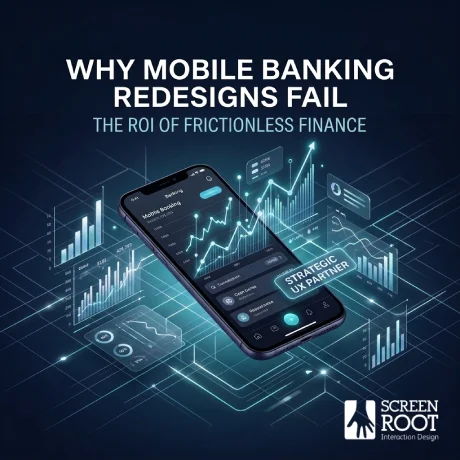
The App is the Bank: Why Your Mobile Banking App Redesign for Enterprises Defines Your Only Identity
There was a time when a bank’s reputation lived in its branches: the marble countertops, the reassuring handshakes, the sense of institutional permanence. That era is over. Today, for the vast majority of customers, your mobile app is your bank. It’s the first touchpoint, the primary relationship, and often the only one.
This shift reframes everything. Mobile banking apps have evolved from simple balance-checkers into full-service financial hubs: handling payments, investments, lending, support, and identity verification in a single interface. Research from BCG confirms that digital engagement is now the primary driver of customer value in modern banking. The app isn’t a channel anymore. It’s the institution.
That reality puts banking app user experience design at the center of every strategic conversation. It’s no longer a downstream concern handed off after the real decisions are made, it’s the decision. Every interaction, from logging in to initiating a wire transfer, either reinforces trust or quietly chips away at it.
Yet a persistent Digital CX Gap separates where traditional banks are from where customers expect them to be. Fintech disruptors didn’t win on rates or features; they won on feel. Speed. Clarity. Confidence.
“Good enough” UX is no longer a defensible position when a competitor is one download away.
This is precisely why a thoughtful mobile banking app redesign for enterprises isn’t a cosmetic exercise; it’s a strategic imperative. And as you’ll see, the cost of getting it wrong extends far beyond frustrated users.
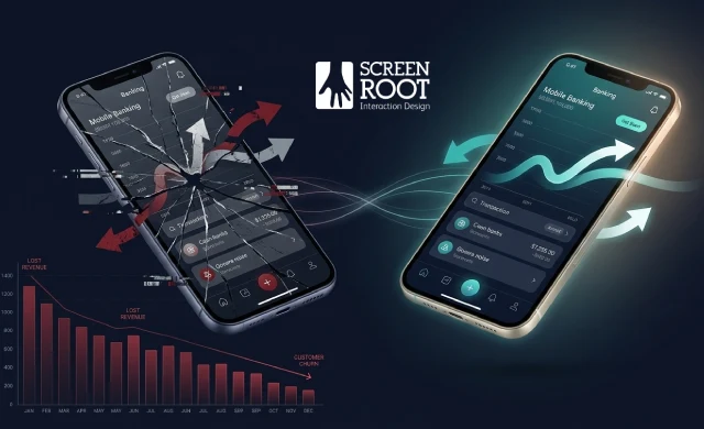
The High Cost of Friction: UX as a Primary Driver of Customer Churn
If the app is the bank, then a broken app is a broken bank. Digital frustration doesn’t just annoy users; it triggers account closures. A clunky login flow, a payment that times out, or a support chat that goes nowhere aren’t minor inconveniences. They’re the moments that push customers to search for alternatives.
Switching costs for financial services have never been lower. This is the reality of what’s sometimes called the Switching Economy: with competing apps offering rapid onboarding and slick interfaces, a frustrated customer can transfer their account and be fully operational elsewhere within minutes. Research on digital account opening confirms that abandonment during onboarding is one of the most significant revenue leakage points for financial institutions. Customers don’t call to complain; they simply leave.
What makes this especially costly is that banking app user experience design isn’t just a usability concern. It’s a retention and revenue mechanism. Poor UX compounds silently: each friction point reduces engagement, and reduced engagement accelerates churn. This is precisely why institutions are increasingly turning to specialized fintech UX design services; not as a reactive fix, but as a proactive investment in customer lifetime value.
The flip side of that equation is striking. According to an analysis by UXDA on digital banking ROI, strategic UX investment carries a potential ROI of up to 9,900% – a figure that reframes design spending from a cost center to a growth driver.
“Treating UX as a luxury line item in a banking technology budget is one of the most expensive mistakes a financial institution can make.”
That kind of return doesn’t happen by accident. It requires a deliberate, expert-led approach; which raises the question of how institutions balance that ambition against the regulatory constraints they can’t ignore.

Designing for the Highly Regulated Paradox: Security vs. Seamlessness
Security and simplicity feel like opposites, but in mobile banking, they have to coexist. The challenge isn’t just technical. It’s a design problem, and solving it poorly is one of the fastest ways to lose users before they ever see your core product.
The ‘Compliance Friction’ Problem
Regulatory requirements like KYC (Know Your Customer), AML (Anti-Money Laundering) checks, and multi-factor authentication aren’t optional. They’re legally mandated guardrails. But every additional step in an onboarding or login flow is another opportunity for a user to abandon the process entirely.
This is where UI UX design for highly regulated industries becomes a distinct discipline, not a variation of standard product design. Teams without deep BFSI experience tend to treat compliance requirements as constraints to work around rather than design problems to solve. The result is verification screens bolted onto existing flows as an afterthought, creating experiences that feel punishing rather than protective.
In practice, institutions that treat compliance as a checkbox exercise don’t just frustrate users, they lose them. Users aren’t opposed to security. They’re opposed to unexplained security that makes them feel like suspects rather than customers.
Invisible Security: Removing Friction Without Removing Protection
Invisible security is the principle that drives the best fintech UX design services today. The goal is to verify identity, flag risk, and satisfy regulatory requirements through design choices that feel natural rather than intrusive. This might mean using progressive disclosure to surface only the most essential steps upfront, leveraging biometric authentication to replace clunky password flows, or applying risk-based authentication that only escalates verification when anomalies are detected.
The most effective security in digital banking is the kind users don’t consciously notice.
From Prototype to Proof
Consider Karnataka Bank, a century-old institution facing a 40% digital onboarding completion rate. Through structured UX prototyping and iterative testing, compliance steps were reorganized around user intent rather than internal workflows, mirroring the goal-based product discovery and streamlined journeys we delivered in their full website redesign. The result is a completion rate that doubles, not by removing any required steps, but by reordering and contextualizing them.
Choosing the right partner for such nuanced work is where many enterprises stumble, and it’s exactly what separates a generalist agency from one built specifically for the BFSI space.

Beyond Aesthetics: What to Look for in a Mobile Banking UI/UX Agency
Having addressed the security-versus-seamlessness paradox, the next challenge is equally strategic: finding the right partner to solve it. Not every agency is equipped to operate in the BFSI space, and choosing the wrong one is an expensive mistake.
Why Generalist Agencies Fall Short
A generalist agency might deliver a visually polished product and still fail your users. Banking interfaces carry regulatory constraints, compliance requirements, and data complexity that general-purpose design teams simply haven’t built expertise around. In practice, a team that excels at e-commerce or lifestyle apps will approach financial product design with the same mental models, often prioritizing visual appeal over functional clarity. The result is an interface that looks modern but behaves poorly under real-world conditions.
Selecting the wrong mobile banking UI UX design agency isn’t just a design risk—it’s a business continuity risk.
UX Governance and Design Systems at Scale
Enterprise banking products span mobile apps, web platforms, internal tools, and third-party integrations. A capable agency must demonstrate strong UX governance, meaning documented standards, component libraries, and scalable design systems that keep experiences consistent across every touchpoint. Without this, redesigns create fragmentation rather than fixing it. Research by RFI Global on digital banking UX consistently highlights consistency as a top driver of user trust in financial apps.
Portfolio Signals That Matter
When evaluating agency portfolios, look beyond dashboard screenshots. Prioritize evidence of:
- Complex data visualization for investment portfolios and transaction history
- Wealth management features designed for diverse user sophistication levels
- Accessibility compliance and multi-platform adaptability
These signals indicate genuine BFSI depth. They’re the foundation for the kind of benchmark-setting experiences that define the industry’s leading apps.
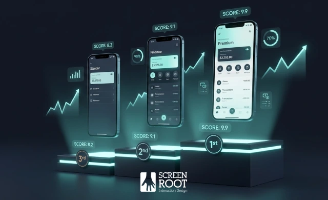
2026 Benchmarks: Learning from the World’s Best Banking Apps
The gap between good and great in banking UX isn’t closing, it’s widening. As institutions that have already nailed the security-versus-seamlessness balance begin raising the bar, the benchmarks for what customers expect are shifting fast. Here’s what’s defining the frontier.
Spatial Banking and Immersive Interfaces
Spatial banking, the integration of depth, motion, and layered visual hierarchy into financial interfaces, is moving from concept to production. Leading apps are replacing flat dashboards with immersive investment views that make portfolio data feel intuitive rather than intimidating. This isn’t aesthetics for its own sake. Effective UI UX design for highly regulated industries demands that complexity be made navigable, and spatial design is proving to be one of the most effective tools for doing exactly that.
Micro-Interactions That Build Trust
Small moments drive big outcomes. A subtle animation confirming a transfer, a haptic response on biometric login, a progress indicator during document upload, these micro-interactions signal competence and care. Research consistently shows that frictionless experiences don’t just improve satisfaction; they rewire spending behavior and deepen platform loyalty.
Personalization at Scale
The benchmark has shifted from “My Bank” to “My Financial Advisor.” Top-performing apps now surface contextual nudges, predictive cash flow insights, and goal-based recommendations tailored to individual behavior. McKinsey’s analysis of AI in banking confirms that personalization at this level requires enterprise-wide data architecture, not just a redesigned front end.
The best banking apps don’t just look modern, they make customers feel genuinely understood. That distinction is increasingly what separates leaders from laggards, and it’s worth examining whether your current experience clears that bar.
Key Takeaways
- Complex data visualization for investment portfolios and transaction history
- Wealth management features designed for diverse user sophistication levels
- Accessibility compliance and multi-platform adaptability
- Mobile banking app redesign for enterprises
- Switching costs for financial services have never been lower.
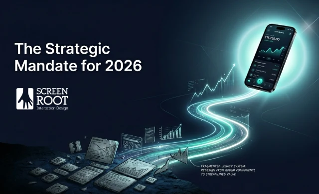
Conclusion: The Strategic Mandate for 2026
The throughline across every section of this article is deceptively simple: mobile banking UX is not a design project, it’s a business strategy. Every friction point you tolerate is a measurable revenue leak. Every onboarding abandonment is a customer who chose simplicity elsewhere. Every confusing interface quietly erodes trust that took years to build.
The good news? These losses are recoverable, but the window is narrowing.
Before your next churn cycle hits, audit your current friction points with clear-eyed honesty. Where do users drop off? Which support tickets reveal interface failures in disguise? Research from NMI confirms that frictionless payment experiences directly rewire consumer spending behavior, meaning the institutions that remove friction first don’t just retain customers, they capture more of their financial lives.
The most durable competitive advantage in enterprise banking isn’t a feature. It’s a governance model that systematically eliminates friction, aligns design decisions with business outcomes, and evolves continuously alongside user expectations.
A strategic UX governance partner brings that discipline, converting one-time redesigns into compounding returns. The benchmarks have been set. The tools exist. What remains is the decision to treat UX as the enterprise mandate it’s always been.
The best banking apps don’t just look modern, they make customers feel genuinely understood. In an era where the app is the bank, the ROI of a strategic UX partner isn’t just measured in pixels; it’s measured in the enduring loyalty of every user who chooses to stay.
Is your mobile experience driving growth or churn? If your mobile banking app isn’t actively building loyalty, let’s change that.
👉 Explore our services and see how we approach enterprise-grade UX design.
Then, when you’re ready, let’s talk.
📞 Call us (Toll-Free): 1800 121 5955 (India)
✉️ Email us: [email protected]
💬 WhatsApp: Reach out directly for a quick conversation here.
📝 Contact Form: Fill in your details on our Website Form and we’ll get back to you promptly
Book a free discovery session today and let’s start building a banking experience your users will trust, and your business will benefit from.