
 1800 121 5955
In short: Healthcare digital products fail to get adopted when friction, fragmented logins, cluttered dashboards, and workflows that ignore clinical reality — accumulates faster than value. The fix is research-first: map the patient journey, reduce clinician cognitive load, and treat UX as the last mile of every digital investment.
Healthcare’s digital transformation has never moved faster, and yet, for millions of patients, accessing care through a digital interface has never felt more frustrating.
The pandemic didn’t just accelerate adoption; it compressed years of roadmap execution into months, flooding health systems with new portals, apps, telehealth platforms, and patient engagement tools. The intent was unambiguously good. But intent and outcome have a complicated relationship in digital health. Industry surveys consistently find that healthcare executives see digital transformation accelerating, while user adoption remains one of their primary hurdles. That gap should give every CXO pause before approving the next platform rollout.
It’s ironic: more technology, deployed faster, often produces more confusion rather than less. A patient navigating three separate logins to access lab results, schedule a follow-up, and refill a prescription isn’t experiencing digital transformation. They’re experiencing digital fragmentation. And fragmentation is the engine that drives abandonment.
This is where the concept of UX as the “last mile” of digital success becomes essential. You can architect the most sophisticated health data infrastructure imaginable, but if the interface fails the user at the moment of need, the entire investment underperforms.
Healthcare UX friction points: those small, seemingly minor obstacles that accumulate across a digital journey are quietly eroding ROI in ways that don’t always surface in a quarterly technology review. They show up instead as low activation rates, poor retention, and patients who quietly return to calling the front desk.
For CXOs, this isn’t a design problem to delegate. It’s a strategic liability sitting at the intersection of technology investment and patient trust. And understanding why it happens requires looking at something counterintuitive: why the most feature-rich health apps are often the first ones patients delete.
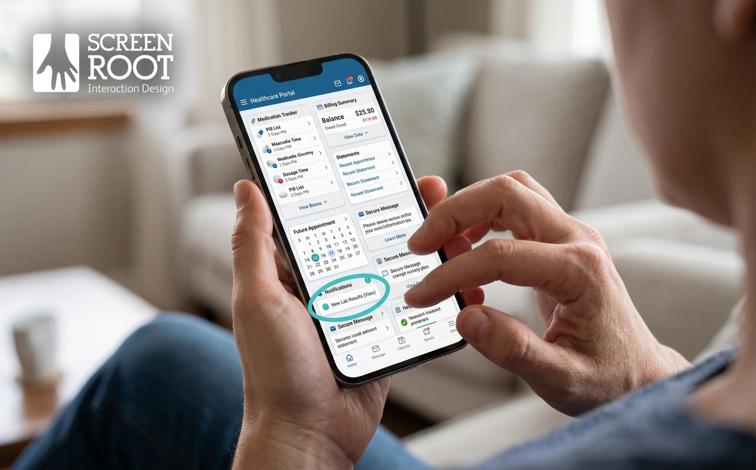
Why Healthcare UX Friction Points in Feature-Rich Apps Drive Patient Abandonment
More features don’t mean better care and in healthcare apps, they often mean the opposite, driving patients away at the exact moments they need support most.
Cognitive overload is one of the most underestimated forces behind app abandonment in digital health.
When a patient logs into a health portal to check lab results after a worrying appointment, they’re not in an exploratory mood. They’re anxious, focused, and looking for a clear answer. Instead, they’re often met with a dashboard crowded with medication trackers, appointment schedulers, billing summaries, and wellness prompts, all competing for attention simultaneously. The mental effort required to navigate that environment isn’t neutral. It compounds the stress already present, and for many users, closing the app feels like the only rational choice.
Fragmented systems make this worse. When a patient’s primary care portal doesn’t sync with their specialist’s platform, or when insurance information lives in a completely separate app, the user is forced to act as their own data integrator during moments that demand cognitive ease. As research published in the Journal of Medical Internet Research notes, the most significant barrier to digital health adoption isn’t the technology itself, it’s the absence of user-centric design that fits naturally into clinical workflows. That finding applies equally to patients navigating fragmented digital ecosystems.
When patients encounter friction at a critical touchpoint, it’s rarely a single design failure, it’s a cascade of disconnected decisions that were never evaluated from the user’s perspective.
A lack of empathy in standard medical interfaces is the quieter culprit. Most health app interfaces are designed around data architecture, not emotional state. They present information clinically, without acknowledgment that the person reading a diagnosis or test result is a human being under stress. And friction, those extra taps, confusing labels, and broken flows, doesn’t just frustrate users. It directly correlates with abandonment rates.
Understanding the true ROI of UX in healthcare digital transformation starts with recognizing that every moment of friction has a measurable cost: a patient who stops engaging, a care plan that goes unmonitored, and outcomes that quietly deteriorate.
This pattern of friction, it turns out, isn’t limited to patients. Clinicians are navigating their own version of the same crisis.

The Clinician Burnout Crisis: A Usability Problem
Poor digital tool design isn’t just an inconvenience, it’s quietly draining clinician capacity, inflating operational costs, and putting patient safety at risk.
“Death by a thousand clicks” is more than a metaphor in clinical settings. A widely cited time-motion study published in the Annals of Internal Medicine found that physicians spend roughly two hours on electronic health record and desk work for every hour of direct patient care. Each redundant prompt, confusing menu, or poorly structured workflow steals minutes that compound across hundreds of daily interactions. And those minutes add up to something far more serious than lost productivity.
Burnout risk is where the stakes get undeniable. Research published in Mayo Clinic Proceedings has linked poor electronic health record usability to significantly higher odds of clinician burnout. That’s not a UX problem in isolation, it’s a workforce crisis. When clinicians are cognitively overloaded by the tools designed to help them, errors increase, morale drops, and turnover accelerates. Industry estimates put the cost of replacing a single physician between $500,000 and $1 million once recruiting, onboarding, and lost revenue are factored in.
Medical errors represent another downstream consequence that’s difficult to ignore. Clunky interfaces push clinicians into rushed decision-making, increase the likelihood of missed alerts, and create documentation gaps that directly affect care quality. On the other hand, when interfaces are intuitive and task flows align with how clinicians actually work, error rates fall and staff satisfaction climbs.
The argument follows naturally: UX investment is a wellness initiative, not just a product decision. Designing tools that respect the cognitive load of clinical work protects both providers and patients. Healthcare organizations that treat interface design as a strategic priority, rather than an afterthought, report stronger retention, lower administrative burden, and measurably better outcomes.
That shift in thinking starts with understanding where friction actually lives in the care experience, which is precisely where patient journey mapping in healthcare becomes an indispensable tool.
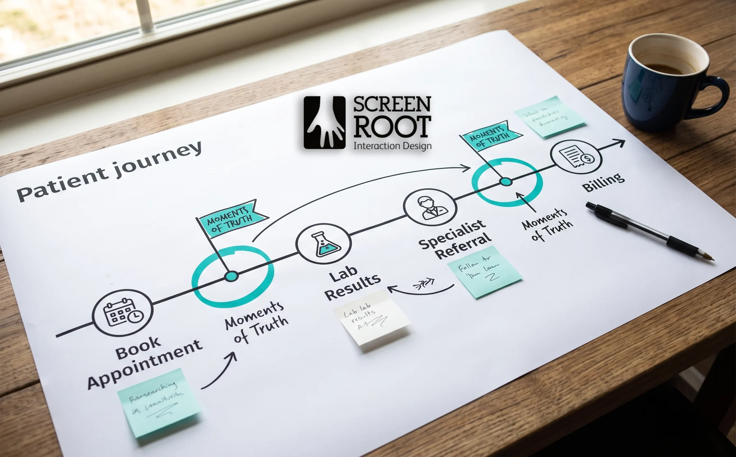
Patient Journey Mapping: The Antidote to Friction
Patient journey mapping is one of the most underutilized tools in healthcare digital transformation, and one of the most powerful for closing the gap between what a product does and what users actually need.
In a healthcare context, journey mapping means charting every interaction a patient has with a digital product, from scheduling an appointment to accessing lab results or following up with a clinician. Journey mapping allows designers to visualize the emotional and functional hurdles patients face from appointment booking to lab result retrieval, surfacing friction that analytics alone can’t explain. It’s not just about clicks and drop-off rates, it’s about understanding frustration, confusion, and the moments where trust breaks down.
A research-first methodology is non-negotiable: without mapping real user behavior across the full care journey, design decisions become educated guesses dressed up as strategy.
Those critical inflection points, often called “moments of truth” — are where users decide whether to continue or abandon. In practice, these moments cluster around tasks like reading a diagnostic report, navigating a specialist referral, or understanding a billing summary. Identifying them requires more than usability testing with a single user group. It demands cross-functional research: patients bring lived frustration, doctors reveal where digital tools interrupt clinical workflows, and admins expose the operational gaps that neither group sees clearly. Each perspective fills in a blind spot the others can’t.
And that’s where mapping earns its ROI. When friction points are documented across all three groups, design teams can prioritize navigation changes with actual evidence behind them, not assumptions. Redundant menu layers get stripped out. Confusing labels get rewritten in plain language. Critical actions get surfaced earlier in the flow. The result is a product that feels intuitive because it was built around real behavior, not idealized user stories.
This research-first approach is exactly what separates reactive redesigns from transformative ones. The Medanta digital experience work offers a concrete look at how this methodology plays out in practice and the outcomes it can drive.

Case Study: How Medanta Redefined Digital Patient Engagement
Medanta’s digital journey is a textbook example of what happens when a healthcare organization stops treating its app as a tech project and starts treating it as a patient experience problem. Before the redesign, Medanta’s digital platform struggled with the same friction points that explain why patients abandon healthcare apps in droves, confusing navigation, multi-step workflows that buried critical information, and consultation booking flows that felt more like administrative hurdles than care access points.
The root cause wasn’t the technology itself — it was the interface layered on top of it.
The team took a research-first approach to understanding where users were dropping off. Rather than defaulting to assumption-driven fixes, they mapped actual patient behaviour across two of the most-used features: lab report tracking and doctor consultations. Lab report access, in particular, was a pain point. Patients had to navigate multiple screens to view results, with no clear visual hierarchy to distinguish critical findings from routine data. The redesign simplified this into a streamlined, single-view dashboard that surfaced relevant results without requiring users to dig.
The doctor consultation workflow received equally deliberate attention. Appointment scheduling and follow-up messaging were consolidated, reducing the number of steps required to connect with a clinician. The result was a faster, more intuitive experience that kept patients inside the app rather than defaulting to phone calls. Medanta’s broader digital-first approach during this period has also been covered in the trade press, as reported by Express Computer.
The specific improvements made during the redesign included:
- Simplified lab report dashboard
Consolidated multi-screen navigation into a single, scannable results view
- Streamlined consultation booking
Reduced friction in the appointment scheduling flow with fewer required steps
- Improved information hierarchy
Prioritized critical health data so patients could act quickly without hunting for context
- Integrated follow-up messaging
Connected post-consultation communication directly within the same workflow
What the Medanta work demonstrates is that digital engagement isn’t a marketing challenge, it’s a design challenge. And the returns extend well beyond patient satisfaction scores. When workflows are optimized, operational load decreases, support requests drop, and clinicians spend less time fielding questions that a well-designed interface could have answered. That chain reaction between better UX and measurable organizational outcomes is worth examining closely and it makes a compelling case for treating interface design as a strategic investment rather than a line item.

The Business Case for UX: Calculating the ROI of Ease
Poor UX isn’t just an inconvenience, it’s a quantifiable drag on every financial metric that CXOs care about, from support costs to clinical adoption rates.
Bad interfaces don’t just frustrate users; they bleed budgets. As research in the Journal of Medical Internet Research suggests, digital transformation leads must realise that a feature-rich product will fail if it adds even thirty seconds of unnecessary friction to a provider’s busy day. Multiply that thirty seconds across hundreds of daily interactions, and you’re looking at hours of lost productivity per clinician, per week.
Support and training costs are often the first place UX debt surfaces on a balance sheet. Confusing interfaces drive help desk tickets, extend onboarding timelines, and inflate training budgets. Organizations that invest in intuitive design typically see measurable reductions in these overhead costs, not because staff become more capable overnight, but because the tool stops working against them. Reduced friction means fewer errors, fewer escalations, and faster time-to-competency for new hires.
Adoption rates are the second lever. A system that clinicians avoid or use inconsistently, produces incomplete data. And incomplete data undermines the very analytics and outcome-tracking capabilities that justified the digital transformation investment in the first place. Better UX drives consistent use, which drives data quality, which drives the insights that actually improve patient outcomes. That’s a compounding return, not a one-time gain.
Competitive advantage is the third dimension. Patients increasingly compare their healthcare digital experiences against consumer apps. A superior experience builds loyalty, reduces churn, and strengthens brand reputation in markets where health systems are competing for the same patient population.
| Friction Point | Business Cost | UX Solution |
| Complex login flows | Abandoned sessions, lost data | Biometric or single sign-on |
| Cluttered dashboards | Training overhead, user errors | Role-based interface design |
| Poor mobile experience | Low adoption, missed engagement | Mobile-first, responsive design |
Finally, UX is a risk mitigation strategy. Failed digital transformations don’t just waste capital, they erode staff trust in future initiatives, making the next rollout even harder to land. Designing for ease from the start reduces that implementation risk significantly. Of course, ease of use can’t come at the expense of data security, which is exactly where the next challenge begins.

Navigating Compliance and Security Without Sacrificing Speed
Security and usability are not enemies, but poor implementation of compliance requirements consistently makes them feel that way in healthcare digital products.
The friction is real, and it compounds fast. Clinicians and patients alike face repeated login prompts, multi-factor authentication flows, and session timeouts that interrupt care at the worst possible moments. A physician mid-consultation shouldn’t have to re-authenticate to pull up a patient’s medication history. Yet this pattern is commonplace across hospital systems and patient portals. Each friction point erodes trust in the platform itself and, by extension, in the organization behind it.
HIPAA compliance doesn’t have to mean a hostile interface. The goal is what practitioners increasingly call “invisible security” — protective architecture that works in the background without forcing users to interact with it constantly. In practice, this looks like context-aware authentication that adjusts session length based on device, location, and role. It looks like biometric login options that replace password fatigue with a fingerprint. And it looks like smart auto-fill that respects data sensitivity without making users manually enter the same information repeatedly.
Ethical design and data privacy aren’t just legal checkboxes, they’re core components of user trust in healthcare apps. That trust gap becomes especially pronounced when AI-driven features enter the picture. Patients and providers are understandably cautious about algorithmic recommendations affecting clinical decisions. The antidote isn’t more disclaimers — it’s transparent UX that shows users how a recommendation was generated, what data it draws from, and how to override it.
Getting this balance right isn’t optional. It’s the foundation on which everything else — adoption, engagement, ROI, ultimately rests. The takeaways for healthcare leaders come into sharper focus once you see compliance and UX not as competing priorities, but as two sides of the same trust equation.

The Bottom Line: Key Takeaways for Healthcare Leaders
Healthcare digital transformation doesn’t fail because of bad technology, it fails because that technology gets deployed without understanding the humans who have to use it every day.
As you bring together the threads from earlier in this article, four principles stand out as non-negotiable for any leader serious about making digital investments pay off:
- UX is the primary driver of adoption and ROI.
A tool that clinicians avoid or actively route around, generates zero return, regardless of its underlying capability. Interface quality isn’t a design preference; it’s a business outcome.
- Research-first design is the only viable approach in complex healthcare workflows.
A research-first methodology turns clunky interfaces into streamlined tools that measurably improve operational efficiency. Skipping discovery to save time almost always costs more in rework.
- Reducing clinician friction is a direct lever against burnout.
When digital tools add cognitive load instead of removing it, the consequences show up in morale, retention, and patient safety. Simplifying the interface is not a cosmetic fix, it’s a workforce strategy.
- Simplification drives engagement, and engagement drives outcomes.
Real-world healthcare deployments consistently show that when you reduce the steps a user must take to complete a task, adoption climbs and error rates fall. That’s not theory; it’s a pattern supported across healthcare digital transformation research.
The good news is that these aren’t abstract ideals. They’re achievable with the right process, the right research methodology, and leadership willing to treat UX as a strategic priority rather than a late-stage deliverable. And that’s exactly where the conversation about future-proofing your digital health strategy begins.

Future-Proofing Your Digital Health Strategy
Healthcare digital transformation succeeds when technology serves people first, and that alignment between user needs and business outcomes isn’t optional; it’s the foundation everything else is built on.
The sections above have traced a consistent pattern: friction at the interface is the silent ROI killer most organizations don’t measure until the damage is done. Dropped workflows, workarounds, and low adoption rates don’t show up in a deployment checklist, they surface months later in productivity data, staff turnover costs, and patient satisfaction scores. Knowing that pattern exists is useful. Doing something about it is what separates high-performing digital health organizations from those still wondering why their investment isn’t paying off.
Start by auditing your current friction points. Where are clinicians clicking the most to complete a single task? Where do patients abandon a self-service flow? Which compliance screens are generating the most workarounds? These aren’t edge cases, they’re signals. And if you haven’t mapped them recently, you’re likely optimizing for the wrong problems. Research on technology acceptance in healthcare consistently shows that usability gaps, not feature gaps, drive adoption failure.
This is precisely where ScreenRoot’s research-driven approach to digital product strategy adds measurable value. With 16+ years of experience working in complex, regulated industries like Healthcare, ScreenRoot brings the kind of domain depth that generic design agencies simply don’t carry. The work isn’t just about making screens look better, it’s about understanding the clinical workflows, compliance constraints, and organizational dynamics that determine whether a product actually gets used.
If you’re serious about closing the gap between what your digital tools promise and what they deliver, the next step is a structured design audit or workshop. Don’t wait for your next implementation cycle to surface the same problems again. Consider partnering with experts who understand where healthcare UX breaks and how to fix it.
Frequently Asked Questions
What are healthcare UX friction points?
They are the small, accumulating obstacles in a digital health journey — fragmented logins, cluttered dashboards, confusing labels, and multi-step workflows, that push patients and clinicians away from digital tools and back to manual channels.
Why do patients abandon healthcare apps?
Most abandonment traces back to cognitive overload, fragmented systems that force users to integrate their own data, and interfaces that ignore the emotional state of someone dealing with their health.
How does poor UX contribute to clinician burnout?
Poorly designed tools add administrative clicks and cognitive load to already demanding clinical work. Research links poor electronic health record usability to significantly higher burnout risk, with downstream effects on errors, morale, and turnover.
What is patient journey mapping?
It is the practice of charting every interaction a patient has with a digital product, from booking to results to follow-up — to surface the emotional and functional friction that analytics alone can’t explain.
How do you balance HIPAA compliance with usability?
Through “invisible security”: context-aware authentication, biometric login, and smart auto-fill that keep protection strong in the background while removing repeated, interruptive security prompts from the user’s path.
Written by Team ScreenRoot. 16+ years leading enterprise UI/UX research for BFSI, SaaS, and Healthcare clients.
When you’re ready, let’s talk.
📞 Call us (Toll-Free): 1800 121 5955 (India)
✉️ Email us: [email protected]



