
 1800 121 5955
Key Takeaways
- Poor lead quality is often a design problem. Friction in forms and pages filters out motivated, time-poor decision makers first and leaves casual browsers behind.
- Speed and accessibility are trust signals. Google found that as mobile page load time rises from one to ten seconds, the probability of a bounce increases by 123%.
- Progressive profiling collects qualification data across visits. Each extra question answered is a signal of intent.
- Privacy microcopy under the submit button can decide whether a banking or healthcare form gets sent. Say plainly who sees the data and what won’t happen to it.
- Judge UX changes against pipeline quality, not form volume. A form that converts less but qualifies better is the winning variant.
UX for lead generation is the practice of designing forms, pages, and journeys so that qualified buyers can raise their hand easily and unqualified contacts filter themselves out. For CMOs in banking, insurance, and healthcare, it is often the fastest fix for a lead quality problem. The bottleneck is rarely the offer. It is the experience in front of it.
Marketing dashboards in 2026 are full of green arrows: sessions climbing, impressions expanding, form fills multiplying. Then sales reviews the pipeline and finds contacts who downloaded a PDF, never answered a call, and had no authority to buy. CMOs pay for that twice, once in media spend and again in sales hours spent chasing contacts who were never going to convert.
Friction is usually the cause. Think of a mortgage pre-qualification flow that demands seventeen fields before showing a rate, a patient intake form that resets when the session times out, or an insurance quote tool that breaks on a phone. Each point of resistance filters out exactly the wrong people: motivated, time-poor decision makers with real intent, who have alternatives and no patience. For financial services and healthcare brands, where a single qualified lead can be worth a great deal over its lifetime, enterprise lead quality is decided by design long before a salesperson picks up the phone.

Why are speed and accessibility trust signals for lead generation?
Speed and accessibility are the first credibility test a prospect runs on your brand, before they read your value proposition. A slow page loses high-intent visitors before they see your offer, and in financial services, slowness reads as instability. Accessible design widens the audience that can actually complete your forms.
Google’s research on mobile page speed found that as page load time goes from one second to ten seconds, the probability of a mobile visitor bouncing increases by 123%.
Consider a wealth management firm buying paid search at premium cost per click. The click is charged the moment it registers, and the abandonment happens afterward. The firm is paying for traffic to a page much of the market never sees, and the visitors who wait are disproportionately those with the most spare time and the least urgency.
In banking, financial services, and insurance, users draw an unflattering inference: if the public site stutters, the transaction layer behind it probably does too. That judgment is unfair, and entirely predictable. Institutions spend decades building trust through branches, compliance, and advisory relationships, then hand visitors a spinning loader as their first impression.
Accessibility carries the same weight. Keyboard navigation, sufficient color contrast, screen reader compatibility, and clear focus states are not a legal-review checkbox. They widen your audience to include older users, people with temporary impairments, and anyone filling in a form one-handed on a bright street. In healthcare, that is often the primary audience.
How does progressive profiling improve lead quality?
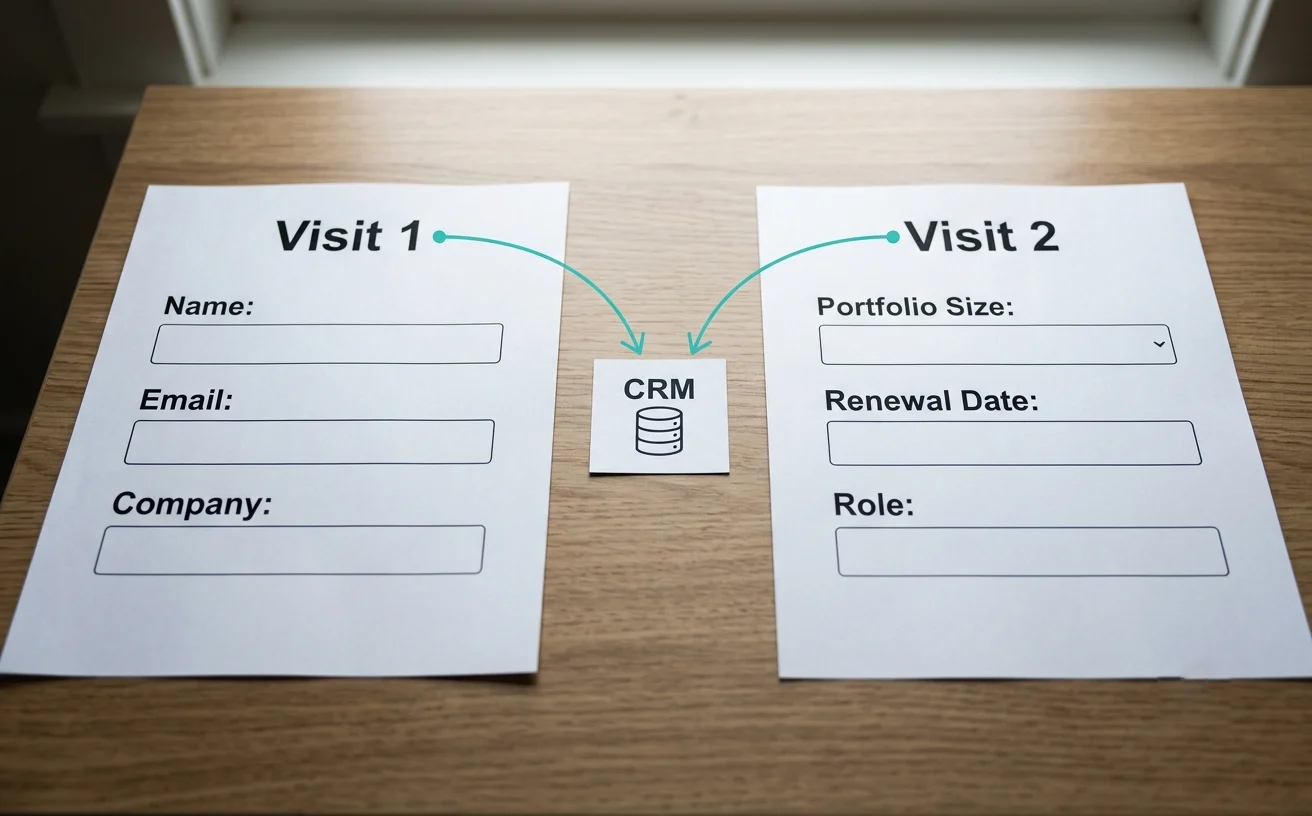
Progressive profiling improves lead quality by collecting qualification data across several visits instead of demanding it all up front. A first-time visitor sees three fields, and a returning visitor sees three different ones. Each additional question a prospect comes back to answer is itself evidence of intent, which a single long form can never measure.
This is where conversion rate optimization UX stops being cosmetic and starts behaving like a scoring engine. Someone who returns to answer a question about asset size or policy renewal date has shown intent that no first-touch form can capture.
Implementation takes three steps:
1. Identify
Map the data points sales actually needs to qualify a lead, and rank them by sensitivity. Job title is easy to ask. Portfolio value or diagnosis category is not. Ask the easy ones first.
2. Integrate
Connect the form layer to your CRM or CDP so known contacts are recognized when they return. Without that link, progressive profiling collapses back into a static form that asks everyone the same questions.
3. Iterate
Test field order, labels, and steps per session against downstream pipeline quality, not raw submission counts. Only sales-stage data will show you that a lower-converting form is actually the better one.
The discipline is resisting the urge to ask everything at once.
ScreenRoot applied a related principle on Medanta’s hospital website: smart forms auto-fill details for returning users, so repeat patients aren’t asked for the same information twice.

How does privacy microcopy affect form conversion in regulated industries?
Privacy microcopy, the short text next to a form’s submit button, often decides whether a banking or healthcare form gets sent. That is the moment a user stops to ask what happens to their data. Copy that plainly says who sees the data and what won’t happen to it builds more trust than generic legal boilerplate.
| Example | Effect | |
| Generic copy | “By submitting this form you agree to our Privacy Policy and Terms of Service.” | Reads as a liability shield written by counsel, for counsel. It links away from the page just when you need attention held. |
| Credible microcopy | “Your details go to a licensed advisor at our firm. We don’t sell your information, and we won’t add you to a marketing list without your consent.” | Says who sees the data, what won’t happen to it, and who controls the next step. |
Both versions can cover the same legal ground and have opposite emotional effects. Healthcare and banking users carry specific fears: cold calls from aggregators, data resold to lenders, medical details surfacing where they shouldn’t. Naming those fears and closing them off is likely to do more for completion than any button-color test.
One caution: every promise in the microcopy has to be literally true of your data practices and approved by compliance. Avoid absolute claims like “100% privacy guaranteed.” In regulated industries they create legal exposure, and informed users distrust them.
Any serious regulated industry digital strategy treats this copy as a designed, tested asset, not boilerplate inherited from compliance and never revisited.

What does conversion centered design look like in regulated industries?
Conversion centered design in regulated industries means earning enough trust at every step that a qualified prospect chooses to raise their hand. There is no impulse purchase. There is a multi-week consideration cycle, a compliance layer that limits what can be promised, and a user who is often anxious and comparing several providers.
This looks nothing like the playbook written for e-commerce checkouts. Getting it right starts with research, not assumption. Stakeholder interviews surface business constraints. User interviews surface mental models: what a first-time home buyer thinks “pre-approval” means, or what a caregiver expects to find when searching for a specialist. Wherever the institution’s vocabulary diverges from the customer’s, funnels quietly fail, and no amount of visual polish closes that gap.
Usability testing carries unusual weight in high-stakes sectors, because a misunderstanding costs more than an abandoned cart. It might be a customer who picks the wrong insurance tier, or a patient who books the wrong appointment type and loses two weeks. Analytics show where people drop off. Testing shows why. In regulated industries, knowing why is the difference between a funnel that generates volume and one that generates pipeline.
The goal is an interface that satisfies the compliance officer and the customer at the same time, a harder brief than either alone.
What is the ROI case for UX that CMOs can take to the CFO?
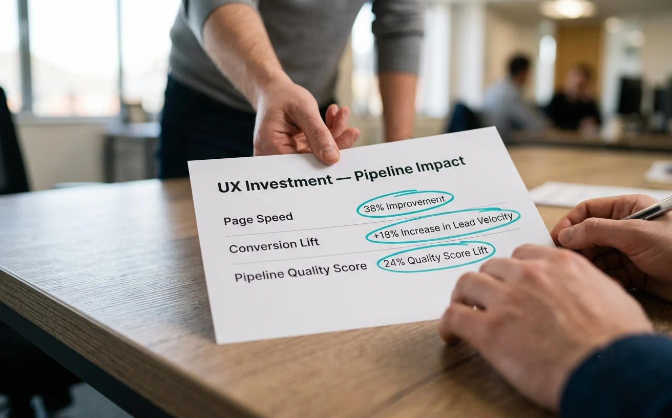
The case for UX ROI for CMOs rests on one mechanism: removing friction from the lead journey improves conversion and qualification at the same time, recovering demand you have already paid for. Unlike adding a channel, it makes every existing channel more efficient.
- UX is among the highest-leverage investments available to marketing. Design that removes friction from a lead journey pays back through better conversion and better qualification at once.
- Speed and accessibility decide whether media spend converts at all. Load time and inaccessible interactions filter out high-intent prospects first, because they have the least patience and the most alternatives.
- Progressive profiling and honest privacy microcopy are the mechanics of lead quality. Short first-touch forms lower the barrier, sequenced follow-up questions qualify over time, and clear data-handling language removes hesitation.
- Research-driven design makes the gains last. Interfaces built on user interviews and observed behavior survive platform migrations, regulatory changes, and leadership turnover.
Performance belongs in the design brief, not just the engineering backlog. On ScreenRoot’s Tata Capital website redesign, page load speed was treated as a core UX requirement, and the site achieved page-speed scores of 80+ on desktop and 60+ on mobile.

How can a CMO audit their lead journey in ten minutes?
Complete your three highest-value conversion paths yourself, on a phone, on a weak connection, as a first-time visitor with no internal knowledge. Count the fields, time the loads, and read the microcopy under each submit button. The friction is usually obvious within ten minutes, and it often explains more than any attribution model.
- Pick the three conversion paths with the highest pipeline value.
- Complete each on a mid-range phone over a throttled connection.
- Count the form fields and note which ones sales actually uses.
- Time the load of each page in the journey.
- Read the privacy microcopy and ask whether it would reassure a stranger.
- Note every point where you hesitated, and fix those first.
From there, the standard is research first: interview real users, test real prototypes, measure against pipeline quality rather than form volume, and build on evidence instead of internal consensus.
ScreenRoot works with CMOs and growth leaders in banking, insurance, and healthcare who need complex digital interactions to produce measurable business results. See how research-driven design meets compliance and revenue targets in our work, or go deeper with our guides to running a UX audit and enterprise website redesign.
Frequently Asked Questions
How does UX affect lead quality?
UX affects lead quality by deciding who finishes your forms. Long, slow, or confusing journeys drive away time-poor decision makers with real intent, while casual browsers push through. Shorter first-touch forms, fast pages, progressive profiling, and clear privacy language reverse that filter, so a larger share of submissions come from qualified buyers.
What is progressive profiling?
Progressive profiling is a form strategy that collects information about a prospect gradually across several visits, rather than in one long form. Known contacts are recognized through a CRM or CDP integration and shown new questions each time. It reduces friction at first contact and turns each additional answer into a signal of buying intent.
What is conversion centered design?
Conversion centered design is an approach that shapes every element of a page or journey around one conversion goal, removing anything that distracts from it. In regulated industries it also means building trust through transparent language, accessible design, and compliance-approved promises, because buyers are cautious and comparing providers over a long decision cycle.
Should enterprise lead forms be short or long?
Short at first contact, then longer over time. Ask only what sales needs to qualify the next step, in order of sensitivity, and gather the rest progressively as the prospect returns. Measure success by pipeline quality rather than submission count, because a longer, well-sequenced form can sometimes qualify better than a very short one.
What should privacy text under a form say?
It should say plainly who will see the information, what will not happen to it (for example, not being sold or added to marketing lists without consent), and what happens next. Every statement must be accurate and compliance-approved. Avoid absolute guarantees, and avoid sending users away to a policy page at the moment of submission.
Written by Team ScreenRoot. 16+ years leading enterprise UI/UX research for BFSI, SaaS, and Healthcare clients.
When you’re ready, let’s talk.
📞 Call us (Toll-Free): 1800 121 5955 (India)
✉️ Email us: [email protected]



