1800 121 5955
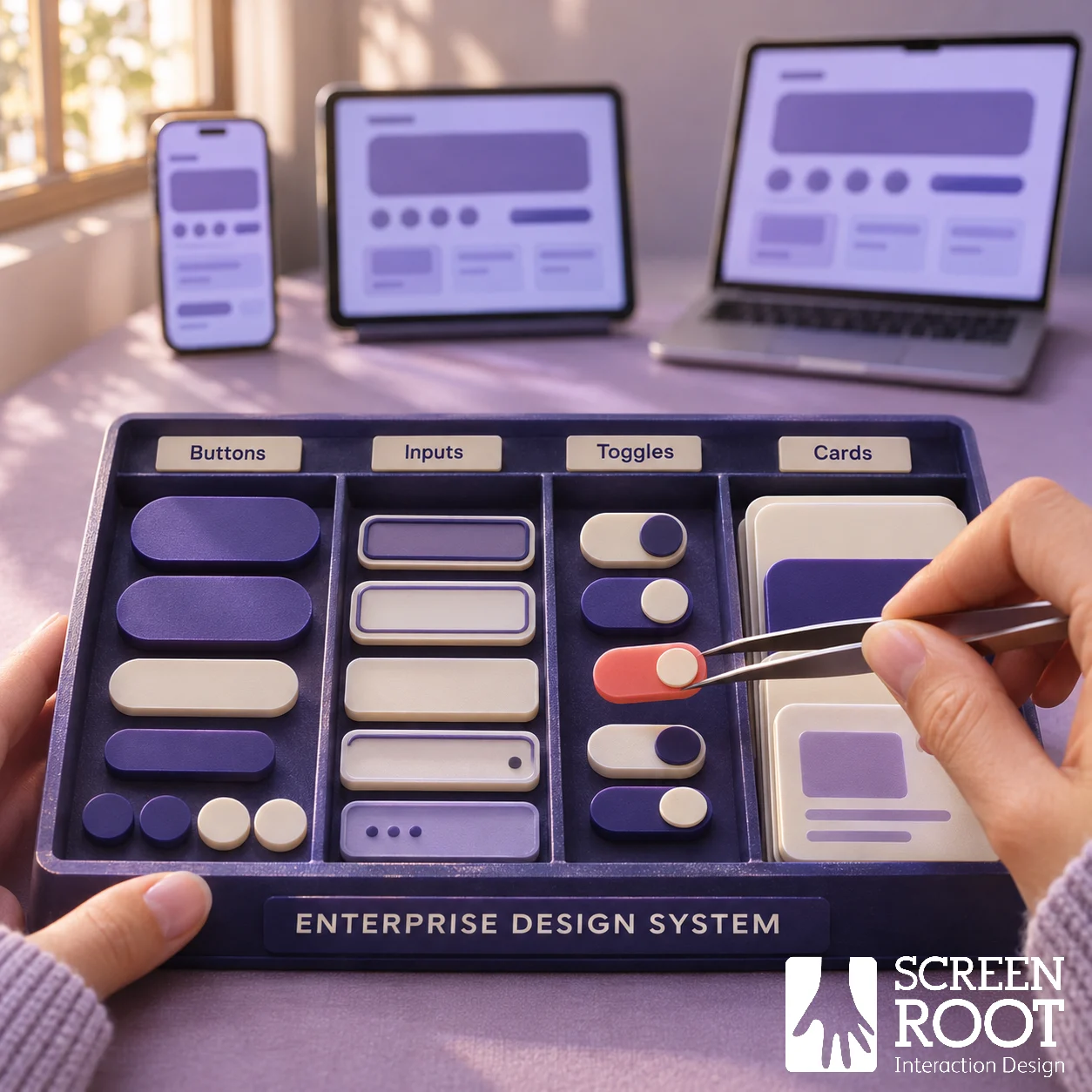
An enterprise design system combines reusable interface foundations, components, patterns and guidance with the ownership needed to maintain them. Its value comes from helping teams make consistent decisions and reuse tested work across products.
A component library is part of that system. The enterprise challenge is deciding what should be shared, how teams contribute and how changes reach the products that already depend on it. Without that operating model, a polished library can remain disconnected from production.
For product and technology leaders, the useful question is whether repeated interface work justifies a shared investment, and whether the organisation can support adoption and maintenance after the first release.
Recognise when a shared system will help
Look for recurring problems: several teams maintain similar form controls, the same accessibility issue appears in different products, or a common change requires separate decisions across every interface. These are candidates for investigation, not automatic proof that a large new system is needed.
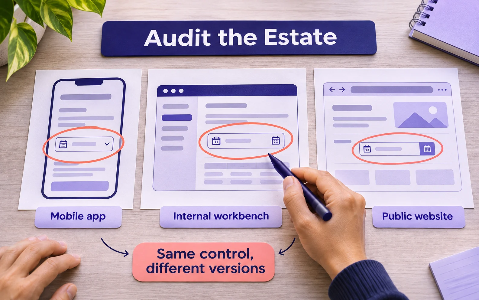
Audit the existing estate before building. Identify which components are already shared, where behaviour genuinely differs and which local variants have a valid user or technical reason. An organisation with one small product may benefit more from a lightweight library or an established framework than a dedicated system programme.
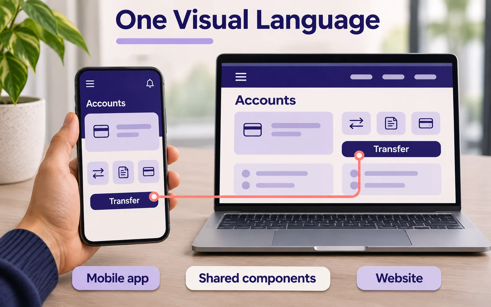
Agree the scope in terms of products, platforms and teams. “Enterprise-wide” can hide major differences between a customer mobile application, an internal desktop workbench and a public website.
Distinguish the assets from the operating model
| Layer | What it should contain |
| Foundations | Typography, colour, spacing, layout and accessibility guidance |
| Tokens | Named values connecting design intent to implementation |
| Components | Reusable controls with documented behaviour and supported states |
| Patterns | Guidance for recurring tasks such as validation, search or review |
| Content guidance | Labels, instructions, error messages and terminology |
| Governance | Ownership, contribution, release, support and retirement processes |
Design files and code should describe the same supported behaviour. Document where they differ and which version is authoritative. A component that looks current in the design tool but is outdated in production creates ambiguity at handover.
Start with components that occur in important journeys. Include the states that users actually encounter: empty, loading, invalid, disabled, permission-restricted and partially complete. A catalogue of ideal screens does not solve those implementation decisions.
Choose ownership that teams can work with
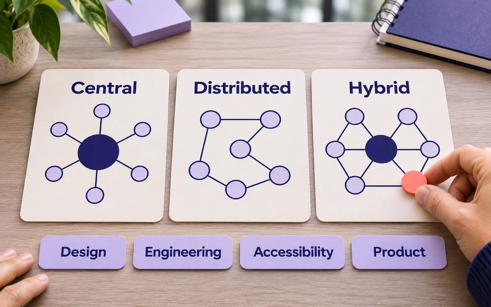
Central ownership can make standards and release decisions clear, but may create a queue. Distributed contribution gives product teams a route to solve their own needs, but needs review to prevent duplication. A hybrid approach can combine central responsibility for foundations with contributions from product teams.
These are operating choices, not a maturity ladder. Select the arrangement that fits your staffing, release cadence and technology estate. Assign accountable people for design, engineering, accessibility and product priorities, even if one person holds several responsibilities.
| Decision | Suggested owner | Evidence required |
| Add a shared component | System product owner with design and engineering review | Repeated need and comparison with existing options |
| Change public behaviour | Maintainer with affected product teams | Compatibility assessment and migration plan |
| Approve accessibility work | Qualified reviewer with implementation team | Relevant test results and unresolved limitations |
| Permit a local exception | Product owner with system review | Reason, owner and a review date |
Define how teams ask for help and how urgent fixes are handled. A contribution process that takes longer than the product release cycle will encourage local workarounds unless there is a practical exception route.
Treat contributions as evidence-based product decisions
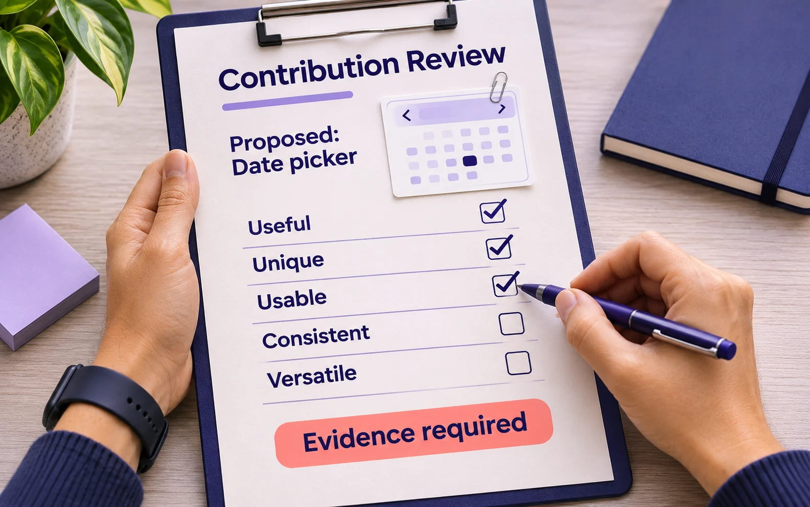
The GOV.UK Design System’s contribution criteria provide a useful public example. Proposed components must demonstrate usefulness and uniqueness; publication also requires evidence of usability, consistency and versatility.
An enterprise can adapt that logic. Before adding another date picker, identify the unmet need, examine existing implementations and test the proposed behaviour. Document supported uses and known limitations. Do not standardise an unsuitable pattern simply because several teams already copied it.
Make changes easy to understand. Release notes should explain what changed, which consumers are affected and what action is required. Breaking changes need migration guidance and a defined support period. Deprecation means helping teams move, not merely attaching an obsolete label.
Support accessibility without promising automatic compliance
A shared component can carry tested keyboard behaviour, focus handling and accessible names. It can also spread a defect if teams reuse it without adequate review. Test the implementation and its use in complete journeys.
WCAG 2.2 conformance applies to full pages and complete processes. A library of accessible controls does not make every product assembled from them conformant. Content, order, custom code and surrounding interactions still matter.
The same distinction applies to legal requirements. A reusable disclosure pattern can help teams present information consistently, but it cannot decide whether a particular disclosure is legally sufficient. Record the scope and owner of any approved content, and review it when product or regulatory conditions change.
Plan adoption and migration as real work
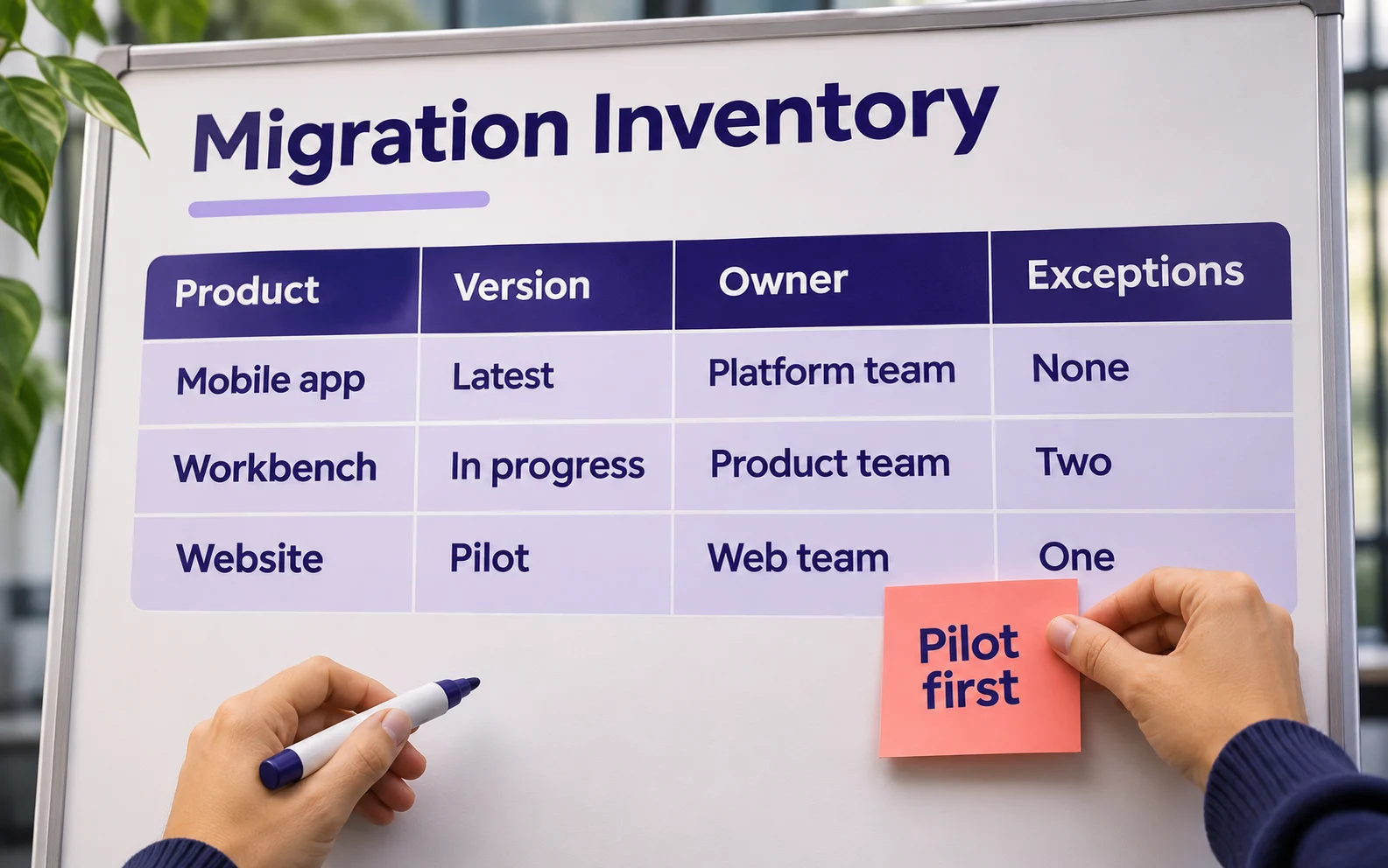
Pilot the system in a representative product before requiring broad adoption. Choose a workflow with enough complexity to reveal gaps and a team able to provide implementation feedback. Record the work needed to replace local components, update tests and train contributors.
Keep a migration inventory showing product, component version, owner and remaining exceptions. Compatibility layers may help teams move gradually, but they also require maintenance. Include that cost in the roadmap.
A token update can simplify some visual changes; it cannot automatically migrate every interaction, third-party integration or disclosure. Test each affected theme and context, including contrast and responsive behaviour.
Measure usefulness and cost of adoption
| Measure | Definition to agree | Why it helps |
| Production adoption | Eligible interfaces using a supported implementation | Separates a downloaded library from real use |
| Delivery time | Comparable work from agreed start to accepted implementation | Tests whether reuse changes delivery effort |
| Defect escape | Relevant UI defects discovered after release | Checks quality alongside speed |
| Upgrade completion | Consumers migrated to a target release | Reveals the practical cost of change |
| Support demand | Requests, resolution time and recurring causes | Shows where documentation or components fail teams |
Establish a baseline and compare similar work. Story points vary by team and are a weak basis for cross-team productivity claims. Reuse is also not automatically a good outcome if the chosen component is unsuitable for the task.
Include maintenance, documentation, support and migration in the cost model. Report capacity released separately from cash savings. A system that saves design effort but creates more implementation work needs investigation, not a favourable headline based on one team’s metric.
Connect the system to real product problems
ScreenRoot’s YES BANK case study describes a revised visual language extended from the banking app to the website. It illustrates a cross-channel consistency challenge; the page does not establish a particular governance model or quantified design-system return.
ScreenRoot also lists design systems within its UI UX design services. Discuss the required design assets, engineering responsibilities and maintenance scope explicitly rather than assuming that every engagement includes a coded library and ongoing governance.
Questions leaders ask about enterprise design systems
Is a design system the same as a style guide?
No. A style guide describes visual or content rules. A functioning design system also addresses reusable implementation, interaction behaviour and the processes that keep shared assets usable.
Should every product look identical?
No. Share foundations and patterns where they serve users, while allowing justified differences for platform, brand or task. Document the boundaries so that flexibility does not become uncontrolled drift.
How large should the central team be?
Size it around the supported estate, release and support workload, and contribution model. A survey average cannot determine the capacity your organisation needs.
Start with a pilot and an owner
Choose an important recurring workflow, name the people responsible for the shared assets and agree how success will be assessed. ScreenRoot’s design workshops can help explore user journeys and product challenges as you define the scope of that investment.
Written by Team ScreenRoot. 16+ years leading enterprise UI/UX research for BFSI, SaaS, and Healthcare clients.
When you’re ready, let’s talk.
📞 Call us (Toll-Free): 1800 121 5955 (India)
✉️ Email us: [email protected]