1800 121 5955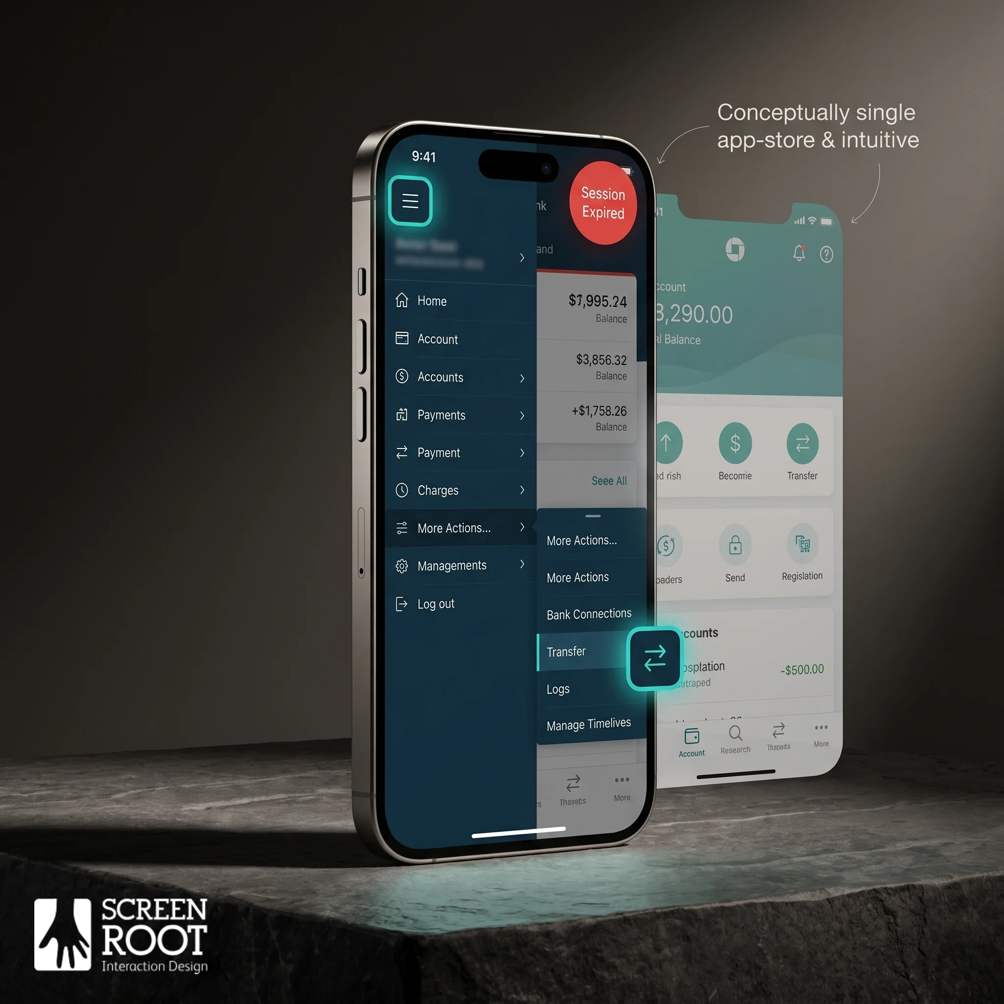
In short: In mobile banking, retention is won or lost inside the app, in seconds. Onboarding friction, desktop-style navigation crammed onto a phone, and confusing menus quietly push customers to competitors. The fix isn’t a visual refresh, it’s research-led, mobile-first design that sequences compliance intelligently and puts the three or four actions people actually use within thumb’s reach.
Customer retention in mobile banking is no longer won at the branch counter – it’s won or lost inside an app, in seconds. The everyday experience your customers move through has quietly become the most consequential battleground in financial services. And there’s usually a stubborn gap between what executives believe their app delivers and what customers actually put up with.
That gap is expensive. Industry research on digital banking has found that a large share of users will abandon a mobile banking app when onboarding feels too long or too complex. Commonly cited at around 40%. That’s not a UX problem. It’s a revenue problem, and it hides in plain sight on the product roadmap.
“Good enough” design is a myth. A friction-heavy interface doesn’t just frustrate users; it trains them to look elsewhere. Even technically functional apps can hemorrhage customers when small friction points accumulate – confusing navigation, slow load states, redundant verification steps. Each feels minor in isolation. Together, they amount to a slow, invisible churn that rarely shows up cleanly on a quarterly dashboard.
The disconnect between executive vision and user reality is one of the most common failure modes in digital banking. Leadership sees polished app-store screenshots and solid feature coverage. Users see three password resets, a buried transfer button, and a session timeout that logs them out mid-task. Both views are true, and that’s exactly what makes the problem so hard to fix without structured, research-first thinking.
This article looks at where that friction starts, how it compounds, and what separates banks that are leaking customers from those building real digital loyalty. But first, it’s worth naming a tempting trap many product teams fall into, treating a small screen like a shrunken desktop.

The Desktop-in-a-Pocket Fallacy
Most mobile banking apps aren’t truly mobile, they’re desktop interfaces squeezed onto a smaller screen, and that distinction is costing banks real customers.
As the Nielsen Norman Group has long argued, the biggest mistake in mobile banking is trying to replicate the desktop experience on a small screen instead of designing for how people actually behave on mobile.
The core problem is cognitive load.
Desktop platforms were built for users who are seated, focused, and navigating with a mouse. Mobile users behave completely differently. They’re checking a balance on a lunch break, transferring funds while waiting for a lift, reviewing a transaction mid-commute. When a banking app surfaces the same sprawling menus and nested navigation that worked in a browser, it overwhelms people at exactly the moments they’re least prepared for complexity. Excessive menu depth is one of the most common mobile banking usability issues and a consistent driver of task abandonment.
Legacy constraints compound the issue.
Many banks built their mobile apps as a front-end layer over infrastructure that was never designed with mobile intent. The result is feature bloat, dozens of options competing for attention when most users only need three or four core actions. This is the paradox of choice in action: more options create less confidence, not more.
Designing for thumb-reach and micro-moments changes the calculus entirely.
Practical mobile-first design means placing high-frequency actions, balance checks, payments, transfers – within natural thumb range, reducing tap depth, and stripping away anything that doesn’t serve an immediate need. Rethinking information hierarchy, not just visual polish, is what measurably improves task completion.
The lesson is clear: mobile banking UX isn’t about shrinking your website. It’s about understanding what users actually need in the moment, and that challenge gets even sharper at the very first screen a new customer sees.
Onboarding Friction and the 40 Percent Churn
The moment a new user downloads your banking app, a countdown starts, and most banks are losing that race before the first screen fades.
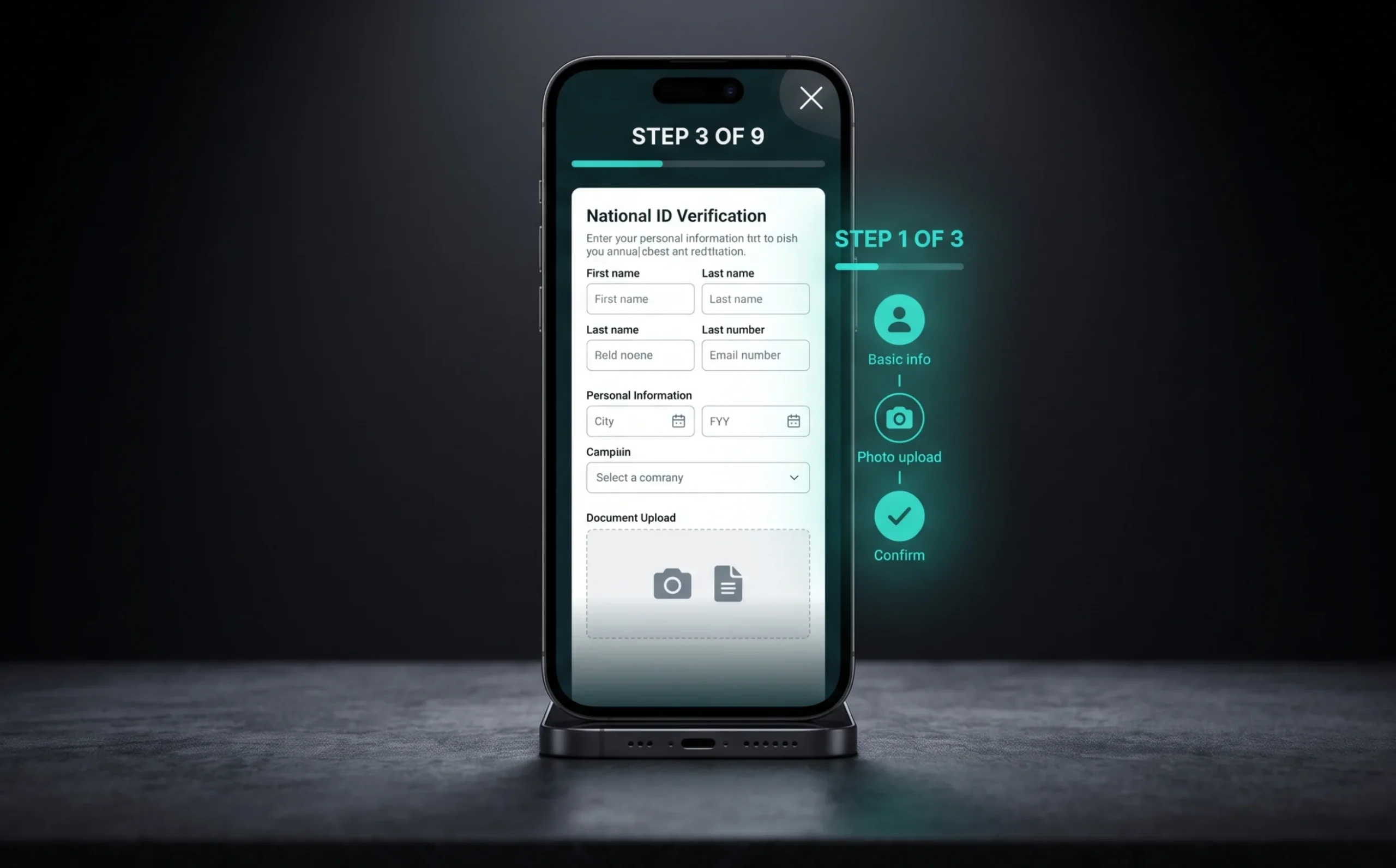
UX friction in digital banking is nowhere more damaging than at the front door. Onboarding sets the tone for everything that follows, and right now the tone most apps set is frustration. The main culprit is the Know Your Customer (KYC) process, a regulatory requirement that’s both unavoidable and, in its current form, deeply user-hostile. Identity verification, document uploads, national ID entry, and security-question gauntlets stack into an experience that feels less like opening an account and more like applying for a security clearance. If registration feels like a marathon, prospective customers walk away before they ever see their balance.
Long forms are conversion killers. What usually happens is simple: a user hits a multi-page sign-up flow, loses confidence midway, and quietly closes the app. They don’t file a complaint. They don’t call support. They just leave and often don’t come back. The problem isn’t that compliance requirements are unreasonable; it’s that most apps front-load every requirement at once, overwhelming people at the exact moment they’re deciding whether to trust you with their money.
The solution isn’t to strip out compliance, it’s to sequence it intelligently. Progressive disclosure offers a practical path: ask only for what’s needed to get a user to their first meaningful moment inside the app, then request further verification as specific features require it. Someone checking a balance doesn’t need a fully verified address on day one. Tiered onboarding, where trust and data collection build gradually – consistently produces higher completion rates.
Balancing compliance with speed is a design problem, not a legal one. Regulatory teams set the requirements; product designers decide how and when those requirements surface. Breaking a 20-field form into contextual micro-steps, using device-based identity verification where permitted, and showing clear progress indicators all reduce perceived effort without touching a single compliance rule. And once users are inside the app, a new set of friction points takes over. Which is where navigation becomes the next battleground.

Navigation Nightmares and Support Ticket Spikes
Poor navigation doesn’t just frustrate users – it drives them straight to your support team, turning a fixable design flaw into a recurring operational expense.
Poorly designed navigation menus and hidden features create friction and push up support-ticket volume for financial institutions. And that cost adds up fast. A single inbound support contact can cost several dollars to resolve, while the UX fix that would have prevented it often costs a fraction of that when addressed early in the design cycle. The math’s unambiguous: fixing navigation is cheaper than staffing around it.
The challenge is especially acute when modernising legacy banking interfaces, where features were built incrementally over years and navigation grew without a coherent plan. The result is a buried, inconsistent information architecture that leaves users guessing. Some of the most common navigation “sins” that push users toward the help desk:
- Unlabelled icon-only menus that obscure what features even exist
- Multi-step paths to high-frequency tasks like fund transfers or bill payments
- Inconsistent placement of key actions across different sections of the app
- Settings buried three or four levels deep, making account management a chore
- No visible search function to help users find features on their own
These aren’t minor inconveniences. For high-stakes financial tasks, moving money, paying a bill on a deadline, disputing a charge – friction creates real anxiety. Users don’t retry; they call. Or they leave.
The fix starts with treating information architecture as a financial asset, not an afterthought. Fund transfers and bill payments should sit within one or two taps of the home screen, clearly labelled and consistently placed. When discoverability improves, support volume drops and that’s a measurable ROI that speaks directly to the business case for UX investment. It’s exactly the kind of outcome a purpose-driven redesign, like the one we’ll look at next, consistently delivers.
A Banking Redesign Built for Clarity
A well-executed redesign doesn’t just improve aesthetics, it directly resolves the common usability issues that quietly erode customer trust and retention.
The challenge in one ScreenRoot banking engagement was familiar to many legacy institutions: an interface that had grown dense and disorganized over time, making it harder for customers to find what they needed. Features were buried under layers of menus, visual hierarchy was inconsistent, and the cognitive load on everyday users was simply too high. What should have been frictionless, checking a balance, starting a transfer required too many decisions per screen.
The solution centered on a research-first methodology that prioritized decluttering above all else. The redesign stripped away excess interface elements and reorganized information so the most-used features surfaced naturally. That approach isn’t incidental, it’s the difference between an app people open daily and one they abandon after a frustrating minute. Visual hierarchy was rebuilt from the ground up, guiding the eye toward key actions without drowning users in competing elements.
The results illustrate what a structured design process can achieve. When teams lead with user research rather than assumptions, the output reflects how real customers actually think and behave. Discoverability improves. Support-ticket volume drops. And retention, the metric every banking product team watches stabilizes. The lesson holds across the industry: clarity isn’t a cosmetic upgrade; it’s a business outcome.
Reducing cognitive load isn’t a design preference, it’s a retention strategy.
That tension between simplicity and safety doesn’t end with navigation. The next layer of friction sits at the intersection of security and usability. A trade-off that shapes every login, every transaction, every moment a user decides whether to trust your app or close it.

Security vs. Usability: The Eternal Tug of War
In mobile banking, security and usability aren’t opposites, but designing them to coexist takes more than good intentions.
The tension is real, but it’s solvable. For too long, banking teams treated every added security layer as a net positive, assuming friction meant protection. In practice, it often meant abandoned sessions, frustrated customers, and a flood of password-reset requests. Clarity and trust go hand in hand and that principle extends directly to security UX.
Biometrics have become the clearest bridge between safety and speed. Fingerprint and facial recognition remove the cognitive load of remembering complex passwords while maintaining strong identity verification. Seamless authentication directly reduces drop-off at login. One of the highest-friction points in the entire journey. When getting in securely is easy, users stop hunting for workarounds.
Communicating security is where many apps quietly fail. Vague messages like “transaction declined for security reasons” create anxiety without context. Users don’t need a technical explanation, they need reassurance that the system is working for them. A brief, human explanation (“We noticed a login from a new device, tap to confirm it’s you”) builds confidence rather than confusion. The emotional tone of security messaging has a real impact on perceived trustworthiness.
Security theatre – adding visible but largely cosmetic security steps that feel protective without meaningfully reducing risk, is its own trap. Mandatory monthly password resets, excessive CAPTCHAs, and multi-step verification for low-risk actions all signal effort without delivering proportional value, and they burn through user patience fast. Regulated industries need a balance where user needs meet business outcomes without compromising compliance, and that balance demands honest risk calibration, not security performance.
Designing for trust in a digital-first environment means making every micro-interaction feel deliberate and safe. Consistent visual cues, clear confirmation states, and transparent data-handling policies all give users a sense of control. And that sense of control, it turns out, is what keeps them coming back, far more reliably than a locked-down interface ever could.
Getting security UX right is a foundation. But it’s only one layer of a larger challenge, especially for institutions carrying the weight of ageing infrastructure beneath a modern interface.

Modernizing Legacy Systems Without Breaking Them
Modernizing a legacy banking system is one of the highest-stakes design challenges a technology leader will face, and the approach you choose at the outset shapes everything downstream.
The instinct to rebuild everything at once is almost always the wrong call. A “big bang” redesign, the entire platform overhauled in a single release. Sounds efficient but routinely collapses under its own weight. Integration failures, user disorientation, and compounding technical debt make it a gamble most institutions can’t afford. An iterative approach, by contrast, lets you modernize in controlled phases, validating each change before the next layer is added. A research-first approach can turn a complex legacy system into a clean, user-friendly tool, without torching what already works.
Technical debt is the silent saboteur of every UI overhaul. When teams restyle the surface without addressing the underlying architecture, you end up with a beautiful interface bolted onto a brittle foundation. The smarter path is to resolve debt in parallel with design work, deciding which legacy components can be refactored, which need replacing, and which are safe to leave alone. It isn’t glamorous, but it’s what separates a redesign that lasts from one that starts degrading within a couple of years.
Usability testing isn’t a final checkpoint, it’s the scaffolding that holds modernization together. Running structured tests at each phase surfaces friction early, when fixes are still cheap. What usually happens in legacy projects is that assumptions about user behavior go untested until launch, and the cost of correction spikes. Bringing real users into the process at every stage keeps the redesign grounded in actual need rather than internal preference.
Future-proofing isn’t a feature you add at the end. Building with modular architecture, accessible design patterns, and scalable component libraries means your next round of improvements won’t demand another ground-up rebuild. When you’re ready to weigh what all of this means for the bottom line, the calculus is clearer than you might expect.
The Bottom Line: What You Need to Know
UX friction isn’t a design inconvenience, it’s a measurable business risk that erodes retention, drives up support costs, and hands competitors a quiet advantage.
The core message across this article is simple: every unnecessary tap, confusing label, or slow-loading screen is a leaking pipe in your revenue model. Streamlining the initial customer journey has become a top priority for digital transformation leads, and that priority reflects a hard-won recognition that friction and growth can’t coexist.
What every banking leader should walk away knowing:
- UX friction is a retention threat, not just a usability complaint. When customers abandon onboarding or can’t find a core feature, they don’t call support, they switch apps. The cost of that churn compounds in ways that far exceed the cost of a proper UX overhaul.
- Mobile-first design is a baseline, not a differentiator. Customers now expect intuitive navigation, fast load times, and seamless flows as table stakes, not premium features.
- Research-driven redesigns deliver measurable ROI. Grounding UX decisions in real user research, not assumptions – produces outcomes you can quantify: higher task completion, lower drop-off, stronger satisfaction.
- Simplicity is the hardest thing to build in enterprise banking. Stripping complexity down to what users actually need, without sacrificing security or compliance, is sophisticated engineering, not a shortcut.
The institutions that treat UX as a strategic asset, rather than a finishing layer, are the ones building durable customer relationships. Which raises the real question: what does it take to stay ahead as user expectations and technology keep evolving together?

Future-Proofing Your Banking Experience
The next 18 months are a defining window for BFSI institutions. Those that invest in research-driven UX now will build loyalty that compounds; those that don’t will spend the next decade playing catch-up.
The gap between friction-free and friction-heavy banking is widening faster than most teams realize. Regulatory shifts, rising expectations set by non-banking digital products, and the accelerating adoption of embedded finance mean standing still is effectively moving backward. What felt “good enough” a few years ago now reads as outdated. The institutions pulling ahead aren’t just adding features, they’re systematically rethinking how people interact with financial screens at every touchpoint.
Domain expertise is the variable that separates meaningful transformation from expensive redesigns that miss the mark. Working in highly regulated industries isn’t something you pick up on the job, it means understanding compliance constraints, accessibility mandates, and the psychological weight users carry when managing their money. ScreenRoot brings 16+ years of that expertise to BFSI engagements, which means the design decisions aren’t just aesthetically sound, they’re commercially defensible and regulation-aware from day one.
Human-screen interaction design is the discipline at the center of this. It isn’t about making buttons prettier. It’s about understanding behavioral patterns, cognitive load, and emotional context to build interfaces users trust instinctively. That trust compounds over time, driving retention, cutting support costs, and increasing adoption in ways that flow directly to revenue.
And the closing thought worth carrying forward: user-centricity isn’t a philosophy you adopt once. It’s an operating discipline. The banks that win the next decade are the ones that treat every tap, swipe, and abandoned session as a data point worth understanding. If you’re ready to turn that understanding into action, a research-driven design workshop is the right first step.
Frequently Asked Questions
Why do users abandon mobile banking apps?
Most often because of onboarding friction and confusing navigation. Long KYC forms front-loaded at sign-up, buried core actions, and desktop-style menus crammed onto a small screen all push people to abandon tasks, frequently without ever contacting support.
What is the biggest mobile banking UX mistake?
Treating a phone like a shrunken desktop. Mobile users act in quick micro-moments, so cramming sprawling menus and deep navigation onto a small screen overwhelms them exactly when they want speed and simplicity.
How do you reduce onboarding drop-off without breaking compliance?
Sequence compliance instead of front-loading it. Progressive disclosure asks only for what’s needed to reach the first meaningful moment, then requests further verification as features require it, keeping every regulatory rule intact while cutting perceived effort.
Does fixing navigation actually save money?
Yes. Poor navigation drives avoidable support contacts, each of which costs real money to resolve. Making high-frequency tasks easy to find is typically far cheaper than staffing a help desk to compensate for a confusing interface.
Written by Team ScreenRoot. 16+ years leading enterprise UI/UX research for BFSI, SaaS, and Healthcare clients.
When you’re ready, let’s talk.
📞 Call us (Toll-Free): 1800 121 5955 (India)
✉️ Email us: [email protected]