
 1800 121 5955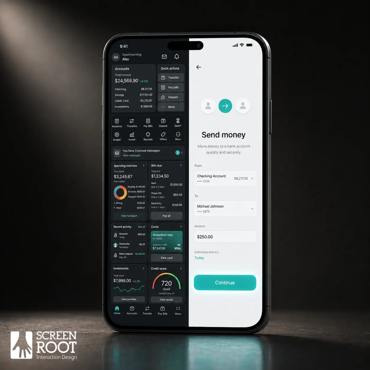
In short: Every abandoned form and mid-journey exit is lost revenue, a “friction tax” that compounds in high-stakes sectors like banking and Healthcare. The fix is a flow-first mindset: measure journey integrity over feature velocity, cut non-essential form fields, design mobile-first, and let usability testing explain what analytics can’t.
Every dropped form, abandoned checkout, and mid-journey exit carries a price tag, and in high-stakes sectors like banking and Healthcare, that price is steep enough to reshape quarterly revenue.

Friction isn’t a UX inconvenience. It’s a silent tax on every dollar your digital product is supposed to generate.
As the Nielsen Norman Group puts it: “The first requirement for an exemplary user experience is to meet the exact needs of the customer, without fuss or bother.” That deceptively simple standard is where most enterprise digital products quietly fail.
Traditional product roadmaps often suffer from a common issue: ship more features, demonstrate more value, justify the next budget cycle. But in practice, each new feature layer adds decision weight to the user journey. What feels like capability from the inside reads as complexity from the outside, and complexity accelerates drop-off. This phenomenon is the friction tax: the cumulative revenue lost when enterprise users abandon journeys before completing them, eroding both conversion and long-term customer lifetime value.
The connection between journey completion and brand trust runs deeper than any single transaction. In banking or Healthcare, an abandoned onboarding flow doesn’t just lose a signup, it signals unreliability to a user who needed confidence most. That reputational cost compounds. And no amount of conversion funnel optimization rescues a product roadmap built on the wrong foundation.
This is where the flow-first mindset enters. For product heads, it means reorienting success metrics away from feature velocity and toward journey integrity, asking not “what can this product do?” but “where does it lose people, and why?” The following sections explore where and how that happens.
Anatomy of Abandonment: Where Digital Strategy Fails the User
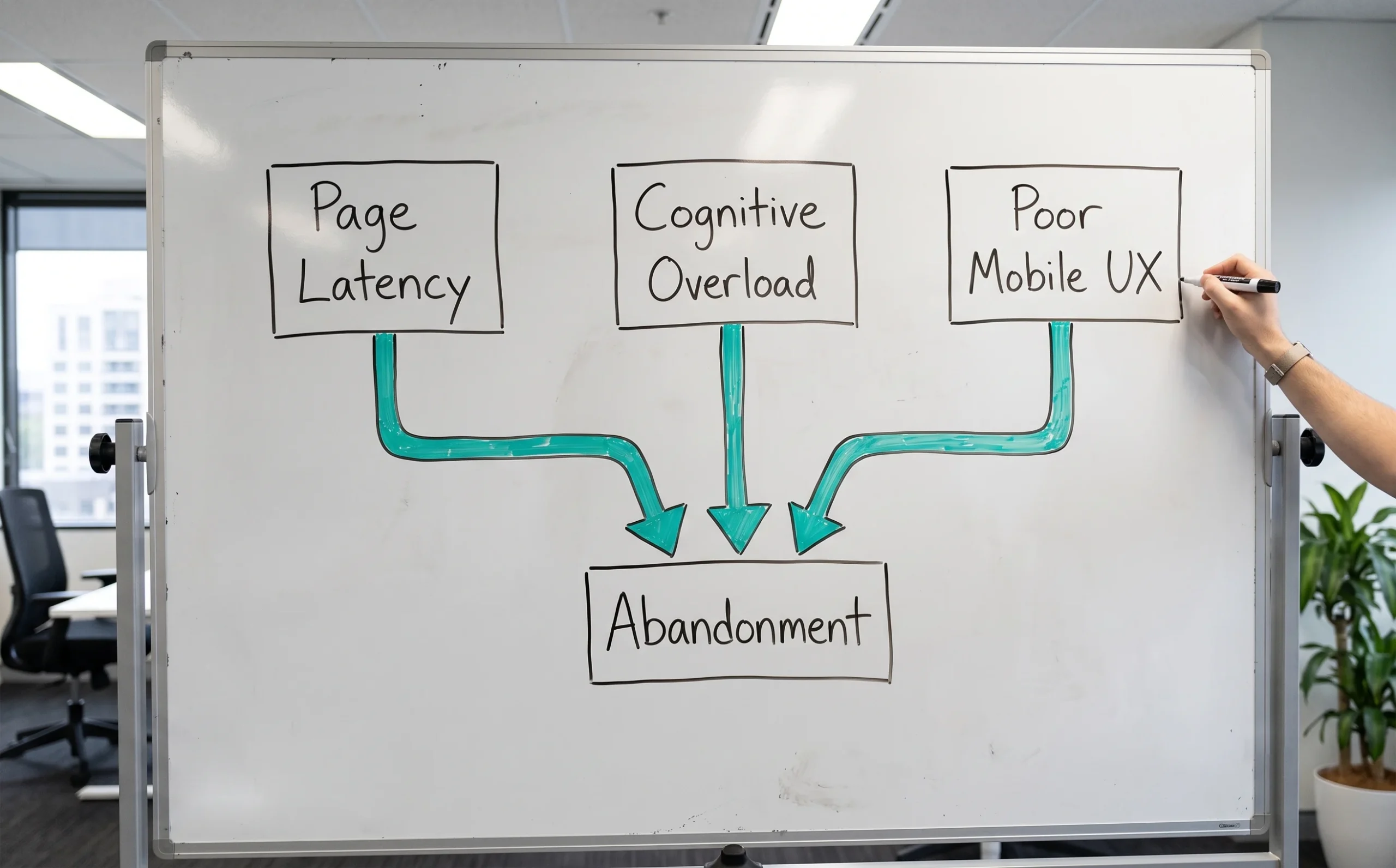
User exits aren’t random, they cluster around predictable friction points that product teams can identify, measure, and fix.
Page latency is the most underestimated conversion killer in enterprise digital journeys. Widely cited web-performance research has found that even a one-second delay in load time can measurably reduce conversions, a number that compounds fast when you’re operating at scale. But the damage isn’t purely mechanical. Slow load times trigger an immediate psychological response, as users interpret latency as a signal that the product is unreliable. And in high-trust sectors like banking or Healthcare, that first impression is rarely recovered.
Cognitive overload operates more quietly, but it’s equally destructive. When users face too many choices at once, such as multiple plan tiers, layered permission screens, or cluttered dashboards, they don’t engage more deeply. They disengage entirely. This is decision paralysis in practice: the brain, overwhelmed by options, defaults to inaction. Product teams that prioritize feature density over clarity are, in effect, building their own exit ramps.
Mobile experience has moved from a nice-to-have to a baseline expectation, even among high-net-worth and enterprise users. A CFO approving a transaction or a wealth manager onboarding a new client isn’t always sitting at a desktop. Touch-unfriendly interfaces, non-responsive layouts, and small tap targets all create friction that erodes confidence in the product itself.
Funnel drop off analysis is what ties all of this together. Without granular visibility into where users exit, and why, teams are left guessing. Mapping session behavior against conversion events, tracking micro-drop points between steps, and segmenting by device and user tier transforms abstract “low completion rates” into actionable design problems. The data doesn’t just tell you where the funnel leaks; it tells you exactly which fix to prioritize first. That diagnostic clarity sets the stage for one of the highest-leverage interventions available: rethinking what you ask users to do right at the start.
Streamlining the Intake: The Power of Minimalist Form Design
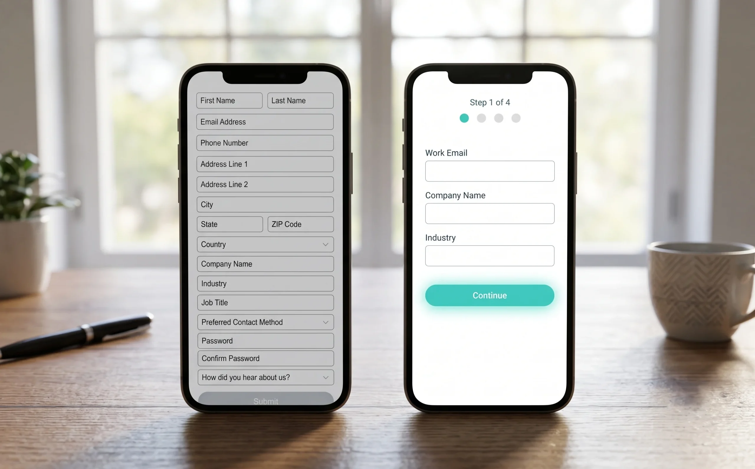
Form design is one of the highest-leverage levers in customer journey optimization, and most enterprises are pulling it in the wrong direction.
The data is consistent: HubSpot’s analysis of tens of thousands of landing pages shows a clear negative correlation between the number of form fields and conversion, with reductions in non-essential fields commonly producing conversion gains in the range of roughly 15–50% depending on the change. That’s not a marginal gain, it’s a structural shift in how many users actually complete the journey you’ve designed for them. Every unnecessary field is a quiet exit door.
The urge to collect more data upfront is understandable, especially in regulated sectors where compliance teams have real requirements. But there’s a meaningful difference between what must be collected and what’s convenient to collect. Progressive disclosure offers a practical middle path, gathering only what’s essential to get the user started, then requesting additional information contextually as trust builds and the user advances through the flow.
Three tactics that consistently reduce drop-off at the intake stage:
- Defer non-essential fields – Separate regulatory requirements from product preferences. Capture identity and consent upfront; surface preference data later.
- Use smart defaults and auto-fill – Pre-populate fields wherever possible to reduce manual effort and perceived friction.
- Sequence questions by user value, not internal logic – Lead with what helps the user, not what’s easiest for your data architecture.
The mental shift that matters most is moving from “what do we need to know?” to “what does the user need to do next?” When your forms are designed to assist rather than interrogate, completion rates follow. That principle becomes especially critical when the users in question are high-net-worth individuals navigating complex financial products. Which is exactly where real-world execution gets tested.

Case Study: Optimising a Wealth-Management Journey
Real-world digital experience optimization rarely happens in a vacuum, it demands domain depth, not just design skill.
The challenge facing the wealth-management platform was significant. High-net-worth investors expect immediate, clear access to complex portfolio data across devices. Cluttered navigation and inconsistent mobile layouts weren’t just aesthetic problems, they were conversion problems. HNI users have zero tolerance for friction when making time-sensitive financial decisions.
The solution centered on a mobile-first design approach that restructured how information was surfaced and prioritized. Rather than compressing a desktop-heavy architecture onto smaller screens, the design team rebuilt the navigation logic from the ground up, creating intuitive pathways that matched how HNI investors actually move through their data. Complexity stayed in the backend; clarity lived at the surface.
The outcome was a seamless, high-conversion journey where portfolio views transitioned fluidly between contexts and devices. Users could act on insights faster, with fewer taps and less cognitive load.
Domain expertise in BFSI is non-negotiable here. A team without deep familiarity with regulatory constraints, investor psychology, and financial data hierarchy would have optimised the wrong variables entirely. This is what separates surface-level redesigns from journeys that actually convert.
And this raises a broader question: even when the experience is well-designed, how you organize and present your content at each stage can either reinforce clarity or undo all that work.
Beyond the Audit: Organising Content for Maximum Clarity
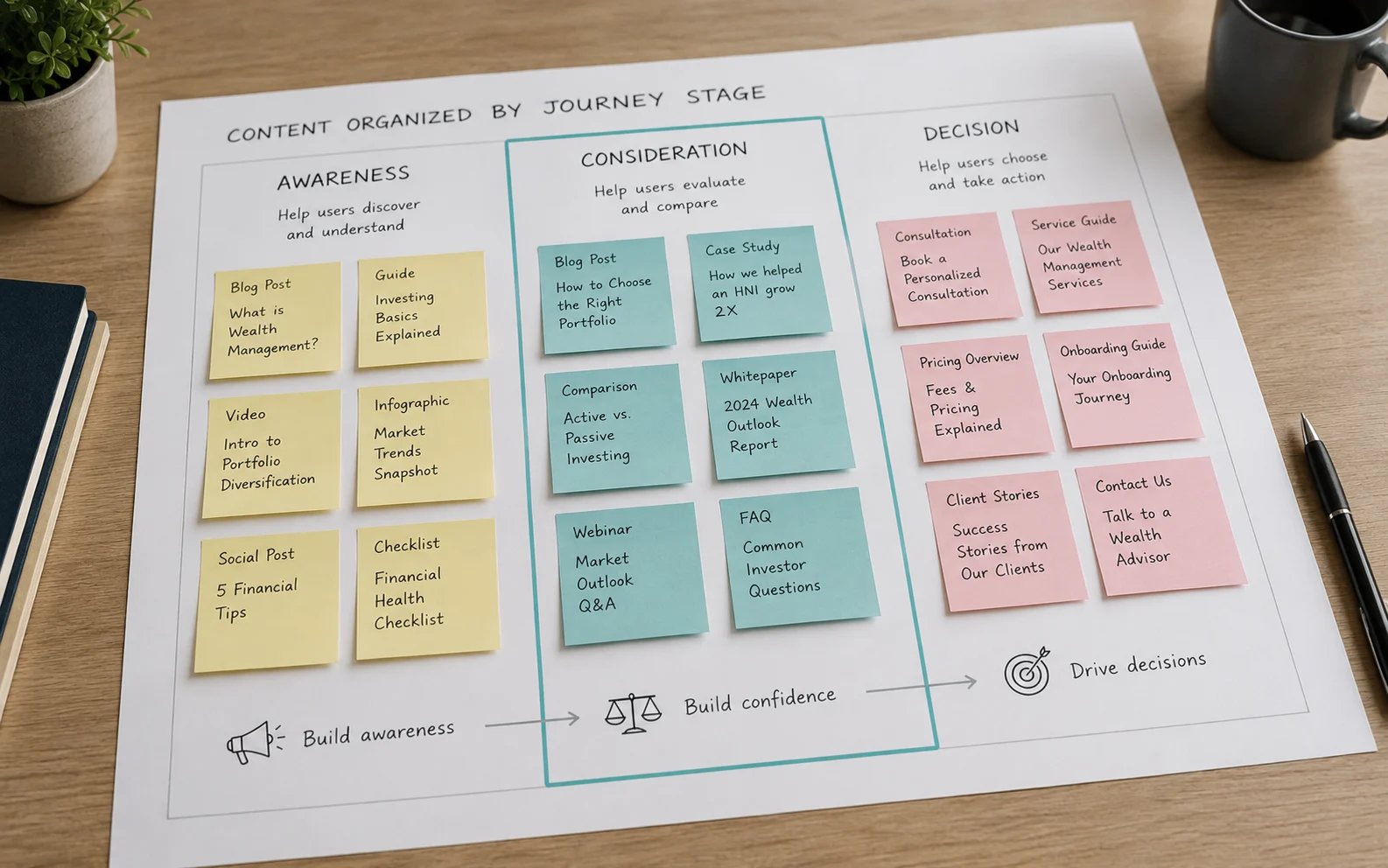
A content audit’s usefulness depends on the organizing logic behind it, and that logic must start with user intent, not file type or publication date.
Most product teams treat content audits as inventory exercises. They categorize assets by format, putting PDFs in one place, videos in another, and landing pages somewhere else, then call it done. But audits deliver far more value when they’re organized by categories that reflect user intent and journey stage. That distinction matters enormously. A wealth management prospect reading a market outlook piece is in a fundamentally different mindset than one who’s just downloaded your app. Treating them the same way is a strategy for mid-funnel abandonment.
The real trap is an unorganized digital strategy, one where content exists in abundance but serves no clear stage of the user journey. When users can’t find what they need at the moment they need it, they don’t search harder. They leave.
This is where aligning content to journey stages becomes operational, not just theoretical. Awareness-stage content should open doors; consideration-stage content should reduce anxiety; decision-stage content should remove the last remaining objection. And for digital financial products specifically, app onboarding best practices demand that this alignment extend into the product itself, not just the marketing funnel that precedes it. Content that’s valuable at the marketing layer but absent or confusing inside the app creates a jarring discontinuity that erodes trust precisely when it’s most fragile.
The fix isn’t more content. It’s smarter sequencing. Audit your assets through the lens of “what is this user trying to accomplish right now?” — and you’ll quickly see which pieces are earning their place and which are adding noise. That clarity of purpose is what separates journeys that convert from journeys that frustrate.
With those principles in place, the next step is distilling them into actionable decisions product leaders can bring back to their teams, which is exactly where the conversation turns next.
The Bottom Line: Strategic Takeaways for Product Leaders
Effective digital journey design demands a balance of technical performance, psychological ease, and industry-specific compliance. Product leaders who internalize that truth will consistently outperform those who don’t.
The case studies and content frameworks covered earlier in this article point toward five concrete principles worth keeping close:
- Prioritize speed relentlessly. Every millisecond of latency is a conversion killer. Users in high-intent moments, comparing wealth products, submitting a loan application – don’t wait. Slow interfaces signal unreliability, and in regulated sectors, that perception is costly.
- Audit every form field for its right to exist. Friction hides in plain sight. Before your next sprint, challenge each input: does it serve the user’s goal, or just your data-collection wish list? Cut ruthlessly.
- Mobile-first is the standard, not the stretch goal. The HNI user reviewing a portfolio rebalancing recommendation is often on a phone. Optimize for that screen first, not as an afterthought.
- Let usability testing surface what analytics can’t. Drop-off data tells you where users leave. Qualitative research tells you why. Both are non-negotiable for informed roadmap decisions.
- Partner with agencies that carry domain depth. In BFSI and Healthcare, compliance constraints, trust signals, and user anxiety patterns require more than general UX instinct – they demand sector-specific expertise.
The flow-first shift isn’t a redesign project; it’s a strategic posture. Product leaders who embed these principles into their team’s operating rhythm will find that the payoff compounds over time. And as the next section explores, building that kind of durable, proactive strategy is what separates teams that react to friction from those who design it away entirely.

Future-Proofing Your Digital Product Strategy
The most durable digital products aren’t built by teams that react to friction, they’re built by teams that architect against it from the start. That distinction matters more than ever in high-stakes sectors where a confusing screen isn’t just an inconvenience; it’s a compliance risk, a churn event, or a missed critical action.
The shift from reactive fixes to proactive journey design is the defining capability that separates competitive digital products from legacy ones. Reactive teams patch drop-offs after they happen. Proactive teams map the full flow before a single line of code is written, stress-testing each decision point against real user behavior and business outcomes. That upstream investment compounds over time, fewer redesigns, faster adoption, and journeys that actually fulfil what users came to do.
In practice, usability testing isn’t a launch checkbox; it’s an ongoing competitive mechanism. Markets shift, regulations update, and user expectations quietly migrate, often before analytics surface the signal. Regular testing keeps your product calibrated to reality, not to assumptions baked in during the last sprint cycle.
ScreenRoot focuses on research-driven digital product strategy for complex enterprise sectors including Banking and Healthcare, environments where the margin for experience failure is genuinely narrow. With 16+ years of navigating BFSI and Healthcare complexity, the work centers on one mandate: transforming human-screen interactions into outcome-driven experiences. If your product roadmap is still organized around features rather than flows, that’s the conversation worth having next.
Frequently Asked Questions
What is the “friction tax”?
It’s the cumulative revenue lost when users abandon journeys before completing them. Each added feature or field increases decision weight, and in high-trust sectors an abandoned flow also signals unreliability, so the cost compounds beyond the single lost transaction.
How much does page speed affect conversion?
A lot. Widely cited web-performance research shows even a one-second delay can measurably reduce conversions, and slow loads also read as a trust signal, users interpret latency as unreliability, which is hard to recover in finance or Healthcare.
Do fewer form fields really increase conversion?
Generally yes. HubSpot’s analysis of tens of thousands of landing pages shows conversion falls as fields rise, and trimming non-essential fields commonly lifts completion by roughly 15–50% depending on the change. Progressive disclosure lets you stay compliant while keeping the intake short.
What’s the difference between reactive and flow-first product design?
Reactive teams patch drop-offs after they appear. Flow-first teams map the whole journey before building, stress-testing each step against real behavior, which means fewer redesigns, faster adoption, and journeys that do what users came to do.
Written by Team ScreenRoot. 16+ years leading enterprise UI/UX research for BFSI, SaaS, and Healthcare clients.
When you’re ready, let’s talk.
📞 Call us (Toll-Free): 1800 121 5955 (India)
✉️ Email us: [email protected]



