1800 121 5955
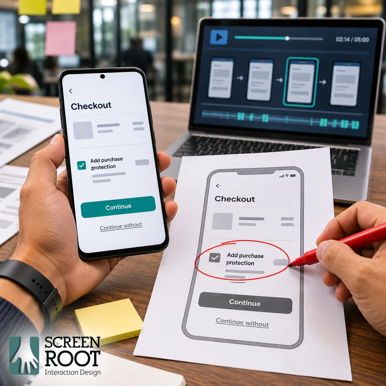
Dark patterns are deceptive interface practices that undermine a person’s ability to make an informed choice. For Indian product teams, the question is practical: can users understand the offer, choose freely and complete the action they intended without being misled?
India’s 2023 dark-pattern guidelines apply to platforms systematically offering goods or services in India, advertisers and sellers. They prohibit dark-pattern practices and operate alongside other applicable laws. The relevant legal assessment depends on the facts of the flow.
For product leaders, this creates a shared design, business and compliance responsibility. Review the complete journey, including offers, defaults, payment and exit paths, rather than limiting the work to the appearance of individual buttons.
What the regulatory timeline means for product teams
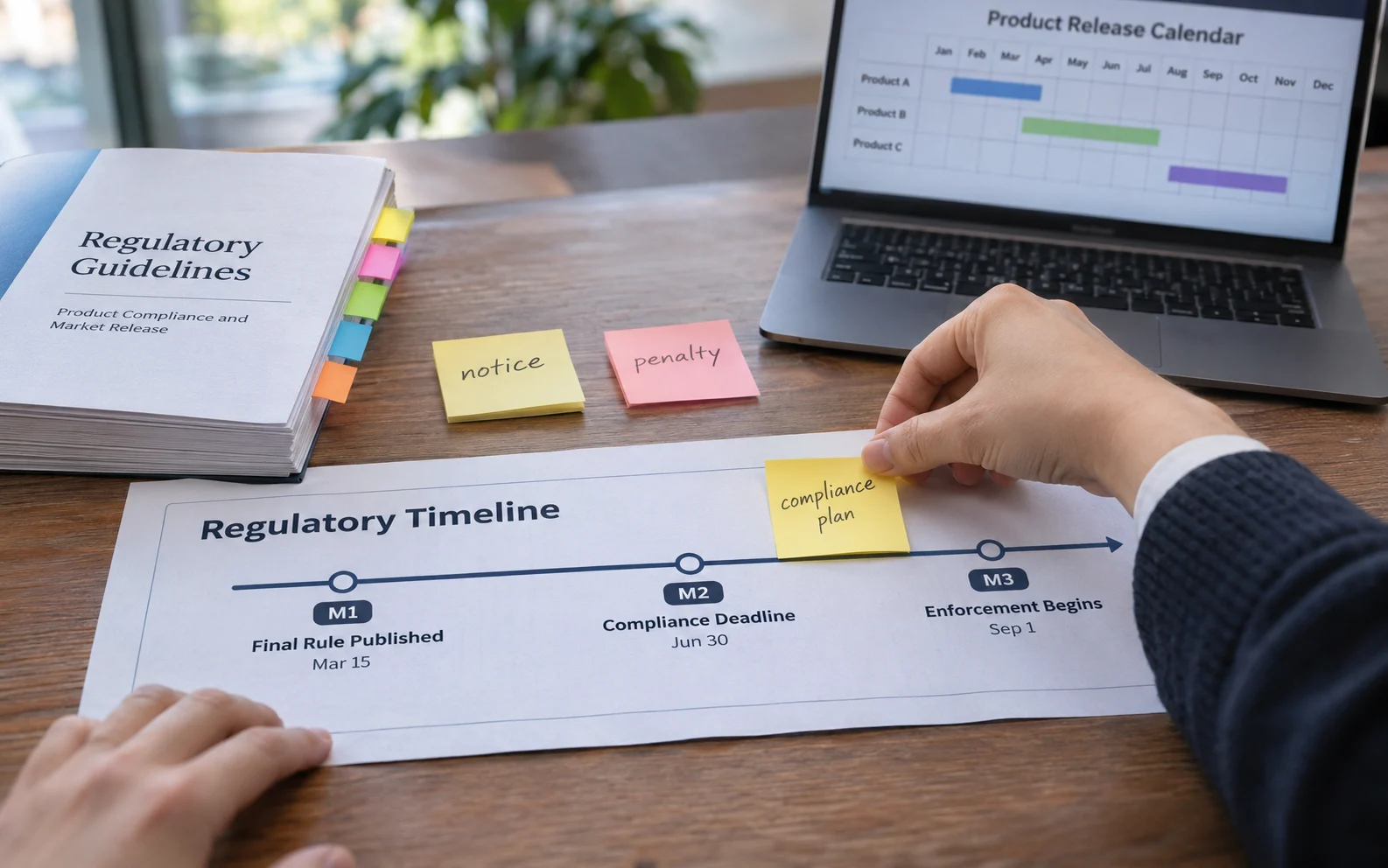
The Central Consumer Protection Authority issued the guidelines on 30 November 2023. Its 5 June 2025 advisory asked e-commerce platforms to undertake self-audits within three months and remove dark patterns. That was a dated advisory, not a fresh three-month period beginning whenever a team starts its review. The government’s June 2025 announcement also described notices issued to platforms in some cases.
Enforcement is not merely hypothetical. In a 3 June 2026 announcement, the government reported penalties of INR 5 lakh against PhysicsWallah and INR 1 lakh against McAfee, with directions to remove the practices. These are reported case-specific penalties, not a universal tariff for every interface issue.
The announcement described preselected donations and misleading free-course access conditions in the PhysicsWallah case, and a pressured subscription-renewal choice in the McAfee case. Product teams should examine comparable mechanics in their own journeys without assuming that every superficially similar screen has the same legal classification.
The 13 specified categories to recognise
The category names below follow the notified guidelines. The short prompts are review aids, not complete legal definitions.
| Category | Review prompt |
| False urgency | Is scarcity or time pressure fabricated? |
| Basket sneaking | Was a paid extra added without consent? |
| Confirm shaming | Does declining trigger guilt or fear? |
| Forced action | Is an unrelated action required? |
| Subscription trap | Is cancellation hidden or obstructed? |
| Interface interference | Is relevant information visually obscured? |
| Bait and switch | Does the delivered outcome contradict the offer? |
| Drip pricing | Are material charges concealed until later? |
| Disguised advertisement | Is promotion presented as independent content? |
| Nagging | Do persistent interruptions pressure a transaction? |
| Trick question | Does confusing wording misdirect the choice? |
| SaaS billing | Are recurring payments collected surreptitiously? |
| Rogue malwares | Do deceptive security claims lead to malicious software? |
A necessary verification step is not automatically deceptive. Ask whether the requirement is relevant, accurately explained and proportionate to the task. Where the classification is uncertain, record the facts for legal review instead of treating the category list as an automatic verdict.
Audit the journey from the user’s perspective
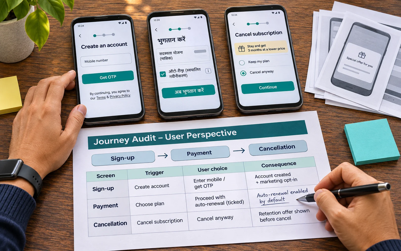
Start with an inventory of sign-up, purchase, consent, renewal, cancellation, refund and account-deletion journeys. Include mobile and desktop variants, different languages and the messages that bring users into the flow. Check new and existing accounts because defaults and offers may differ.
For each suspected issue, record the screen, trigger, user choice, financial or data consequence and supporting evidence. Capture what happens after acceptance and refusal. Record the release version and date so that reviewers can reproduce the behaviour.
Use three questions to guide investigation: What does the user believe will happen? What actually happens? What would a reasonable correction require? This connects the interface to its consequences and gives engineering a clearer problem to solve.
Replace pressure with a comprehensible decision
The following examples are hypothetical design recommendations. They are not descriptions of a ScreenRoot client or legal findings against a named platform.
| Journey issue | Recommended redesign | What to test |
| Optional cover arrives selected | Present its price and purpose with an explicit choice | Can users explain what they selected? |
| Decline copy implies irresponsibility | Use a neutral label such as “Continue without cover” | Can users decline without uncertainty? |
| A renewal date is hard to find | Put renewal timing and terms beside the decision | Can users identify when another charge occurs? |
| Cancellation loops through offers | Provide a clear cancellation path and confirmation | Can users complete cancellation without assistance? |
| A fee changes after commitment | Explain the total and any genuine variables before commitment | Can users predict the amount payable? |
Do not reduce the exercise to equal button sizes. Meaning, placement, defaults, timing and subsequent behaviour work together. A visually prominent opt-out can still be misleading if the next screen reverses the choice or the billing system ignores it.
Measure consequences beyond immediate conversion
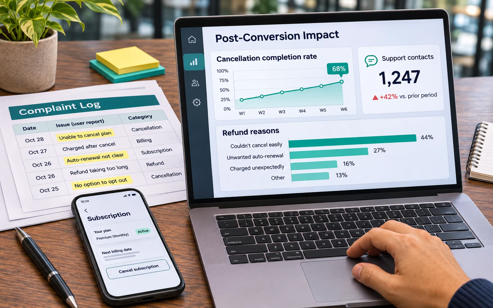
Review unwanted-purchase complaints, refund reasons, payment disputes, cancellation completion and support contacts alongside conversion. Define the denominator for each rate and examine comparable customer groups.
A fall in complaints is useful evidence only if reporting remains accessible. Likewise, a lower cancellation rate may reflect better retention or a more obstructive journey. Investigate the behaviour behind the number.
Build the business case using observed data. Do not assume that every transparent redesign will increase conversion immediately, or that a retained short-term conversion rate proves the previous flow was acceptable. A legal or consumer-rights requirement does not depend on an experiment producing a positive commercial result.
Assign owners and close the loop
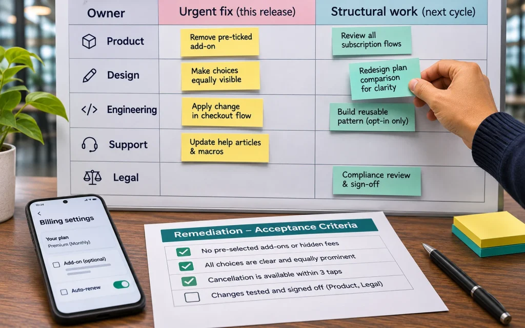
Product should own the remediation backlog, with design, engineering, growth, customer support and legal contributing to their areas. Separate urgent changes that stop unwanted consequences from structural work such as updating a billing integration.
Set acceptance criteria around observable behaviour. For example, an optional service remains unselected until the customer chooses it; the receipt reflects that choice; and a cancelled renewal no longer generates a scheduled charge. Test the interface and downstream systems together.
Record unresolved questions, owners and deadlines. Review new experiments and third-party widgets so that a corrected pattern does not return in a later release. Use periodic sampling and complaint analysis to decide where deeper investigation is needed.

What a relevant ScreenRoot example establishes
In ScreenRoot’s Medanta case study, the appointment form presents consultation fees and communication options upfront. That is a concrete example of information visibility. The page does not describe a dark-pattern remediation programme or establish a compliance result.
The transferable design question is whether people receive decision-relevant information when they need it. A case study can illustrate that approach without becoming a substitute for evaluating your own product and legal obligations.
Common questions about dark-pattern reviews
Is all persuasive design a dark pattern?
No. Clear recommendations and genuine offers can help users decide. Examine whether the experience misleads, obscures material information or undermines the intended choice.
Can a usability test establish legal compliance?
No. Testing can reveal misunderstanding and obstacles. Legal assessment also requires the applicable rules and the facts of the implementation. Use both kinds of review where appropriate.
Should sign-up and cancellation use exactly the same number of taps?
Treat ease of exit as a design objective, not an invented numerical legal rule. Necessary steps should be explainable, and cancellation should be clear and workable.
Begin with the decisions that affect users most
Prioritise payment, optional purchases, renewal and exit journeys. ScreenRoot’s UX audit service offers a starting point for reviewing usability and interface issues. Discuss the audit scope with your product and legal teams so that design findings and legal responsibilities are clearly connected.
Written by Team ScreenRoot. 16+ years leading enterprise UI/UX research for BFSI, SaaS, and Healthcare clients.
When you’re ready, let’s talk.
📞 Call us (Toll-Free): 1800 121 5955 (India)
✉️ Email us: [email protected]