1800 121 5955
A poorly designed banking app frustrates users. A poorly designed healthcare app can harm them. That’s the fundamental difference, and it’s why healthcare mobile app design occupies a category entirely its own.
The industry has undergone a decisive shift: “functional” is no longer enough. Patients managing chronic conditions, caregivers coordinating complex treatment plans, and clinicians making time-sensitive decisions all demand empathetic digital health experiences. These interfaces reduce cognitive load, communicate clearly under stress, and earn trust at every interaction. As ScreenRoot Research notes, UI/UX in healthcare is fundamentally about clinical safety and data integrity, bridging complex medical backends with the real human beings who depend on them.
“Healthcare UI/UX: The discipline of designing digital health interfaces that balance regulatory compliance, clinical accuracy, and patient-centered usability. A design failure isn’t just a poor experience; it’s a potential safety risk.”
This is precisely where generalist agencies fall short. Designing for regulated environments requires deep familiarity with compliance frameworks, medical workflows, and the behavioral nuances of vulnerable user groups. Without that foundation, even visually polished products create dangerous friction.
Choosing the right healthcare app development company means partnering with specialists who treat compliance as a design constraint, not an afterthought. With 16 years of experience delivering enterprise-grade digital products across complex, regulated sectors, ScreenRoot brings structured design thinking to every healthcare engagement instead of relying on guesswork.
The stakes extend well beyond aesthetics. The next section unpacks exactly how compliance requirements like HIPAA, GDPR, and WCAG 2.1 shape every design decision from the lock screen outward.

Compliance as a Feature: Navigating HIPAA, GDPR, WCAG 2.1, and Medical Device UI Design
Compliance isn’t a legal checkbox. In healthcare mobile apps, it’s a core design requirement. Every regulation maps directly to a UI decision, and understanding that relationship is central to any serious healthcare digital transformation strategy. When regulations are translated into thoughtful design, the result isn’t friction; it’s trust.
From Regulation to Interface: What It Actually Looks Like
Three frameworks shape the majority of design decisions in compliant healthcare apps. Each one, when translated thoughtfully into the interface, becomes an act of patient-centered design rather than a bureaucratic hurdle:
| Regulation | Design Impact | User Benefit |
|---|---|---|
| HIPAA | Masking sensitive data on lock screens; auto-logout after inactivity | Protects patient data from passive exposure |
| GDPR | Granular consent controls; clear data deletion workflows | Gives users meaningful control over their information |
| WCAG 2.1 | High-contrast UI; large touch targets; screen reader support | Makes apps usable for people with visual, motor, or cognitive impairments |
Notice that the “User Benefit” column isn’t incidental; it’s the point. Compliance requirements don’t exist in opposition to patient-centered design; they’re often its most concrete expression. HIPAA’s data masking rules protect real people from real exposure. GDPR’s consent workflows give patients genuine agency over their own health information. WCAG 2.1’s accessibility standards ensure that a visually impaired patient managing a chronic condition isn’t locked out of their own care.
According to ScreenRoot’s Compliance Insights, healthcare apps must meet WCAG 2.1 standards to serve users across a full range of ability levels. This requirement often surfaces gaps only proper usability testing methods can reveal. Designing for the edges of your user population, it turns out, tends to improve the experience for everyone in the middle.
Security That Doesn’t Slow Users Down
One common pattern is using biometric authentication, such as Face ID or fingerprint recognition, as a HIPAA-compliant authentication mechanism. Rather than adding a barrier, it removes one. Users get fast, secure access without memorizing complex passwords, which matters most in clinical or high-stress settings where every second counts.
“Informed Consent UI: A design pattern in which users are presented with clear, plain language explanations of how their data is collected and used, with explicit, actionable controls, before any information is processed. Under both HIPAA and GDPR, informed consent isn’t optional; how it’s designed directly affects whether users actually understand what they’re agreeing to.”
High contrast ratios and large touch targets (a minimum of 44×44px, per WCAG guidelines) aren’t accommodations; they’re baseline quality standards. In practice, designing for motor-impaired or visually impaired users improves the experience for everyone.
Getting compliance right at the interface level sets the foundation for everything that follows, including how the app communicates with patients when they need it most.
Patient-Centered Design: Reducing Cognitive Load in Moments of Crisis
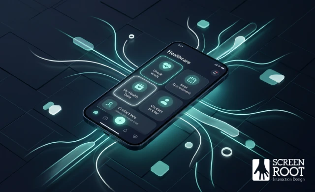
When a patient opens a healthcare app, they’re rarely in a neutral headspace. They may be in pain, anxious, or managing a chronic condition that demands quick action. Good design accounts for that reality, and a well-built HIPAA-compliant app UX doesn’t just protect data; it protects the user’s mental bandwidth when they need it most.
“Cognitive Load: The total amount of mental effort required to complete a task. In healthcare apps, high cognitive load during stressful moments directly increases the risk of user error and task abandonment.”
Minimizing ‘Time to Task’
A patient in pain shouldn’t have to navigate a 5-step menu, and any experienced healthcare mobile app development company will tell you that minimizing time to task isn’t a convenience feature; it’s a clinical priority. Booking a teleconsultation should require no more than two or three taps from the home screen. In practice, this means surfacing the most critical actions, such as scheduling, prescription refills, and urgent care access, prominently on the dashboard from the moment the app opens. Burying these paths behind navigation layers isn’t just a UX misstep; it’s a design failure with real clinical consequences. As both Technology Rivers and ScreenRoot have noted, the fastest path to the right action is often the difference between a patient who follows through and one who doesn’t.
Health Literacy and Plain Language
Clinical jargon is one of the most persistent barriers in healthcare app design. Displaying “asymptomatic” when you mean “no symptoms” assumes a level of medical literacy that most users don’t have. Plain language design replaces technical terms with clear, everyday alternatives throughout the interface, including labels, error messages, and onboarding flows. This isn’t about dumbing down content; it’s about meeting users where they are.
It’s also a dimension of HIPAA compliant app UX that often gets overlooked. When users can’t understand what they’re consenting to or what an error message is actually telling them, informed consent breaks down and trust erodes. Clear, plain language isn’t just good writing practice; it’s a functional requirement for apps handling protected health information. Applying solid UX principles consistently across microcopy and navigation labels can dramatically reduce confusion and support errors.
The Psychology of Healing Colors
Color carries emotional weight that users process before they read a single word. Blues and greens, associated with calm, trust, and nature, are widely used as primary palettes in healthcare apps because they reduce anxiety and signal safety. Emergency red, on the other hand, triggers urgency and is best reserved for critical alerts, not general UI elements. Overusing red in non-emergency contexts desensitizes users and creates unnecessary alarm.
| Color | Psychological Signal | Best Use Case |
|---|---|---|
| Blue/Green | Calm, trust | Primary UI, navigation |
| Red | Urgency, danger | Critical alerts only |
| Neutral gray | Clarity, focus | Background, secondary text |
Designing for emotional context isn’t just good practice; it’s measurable. Desirability testing can validate whether a color palette and visual tone actually resonate with your target patient population before launch.
Once the interface is psychologically sound, the next challenge is ensuring it serves every type of user in your ecosystem, because patients, clinicians, and caregivers each interact with healthcare apps in fundamentally different ways.
Optimizing Workflows for the Healthcare Trinity: Patients, Clinicians, and Caregivers
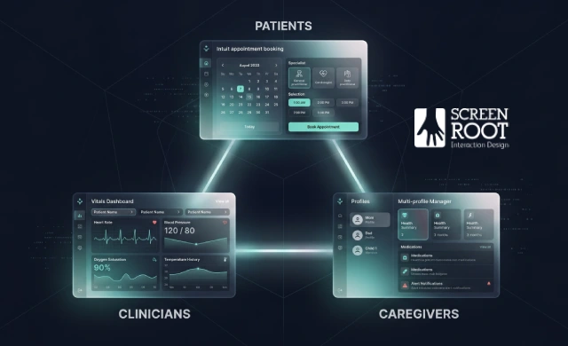
A healthcare app rarely serves just one type of user. In practice, a single platform may need to work equally well for a nervous patient booking a follow-up, a clinician scanning vitals mid-rounds, and a caregiver managing medications for an elderly parent. Designing for this healthcare trinity demands distinct UI patterns for each archetype, not a one-size-fits-all interface stretched to fit every context.
“Healthcare Trinity: The three primary user groups in a healthcare digital ecosystem, patients, clinicians, and caregivers, each with fundamentally different goals, stress levels, and cognitive needs.”
The Patient: Streamlined Scheduling and Medication Adherence
For patients, friction is the enemy. The core flows, such as booking appointments, viewing results, and tracking medications, need to feel effortless even when the user is anxious or unwell. As covered in the previous section on reducing cognitive load, simplicity here is a clinical decision, not just a design preference.
Key features that serve patients well:
- One-tap appointment scheduling with clear confirmation states
- Medication reminders with customizable frequency and snooze options
- Push notifications that use plain language, avoiding clinical jargon
The Clinician: Information Density Without Cognitive Overload
Clinician-facing interfaces operate under entirely different constraints. According to Roketco / ScreenRoot, clinician interfaces must prioritize information density, allowing vitals, alerts, and patient history to be scanned at a glance without sacrificing clarity. This principle also applies directly to medical device UI design, where misread data can have serious consequences.
Effective EHR dashboard design focuses on:
- At-a-glance vitals panels with color-coded status indicators
- Collapsible data modules that let clinicians surface only what’s relevant
- Minimal navigation depth, with critical actions within two taps
Well-designed clinician tools don’t just look clean; they reduce diagnostic errors by making the right information impossible to miss.
The Caregiver: Multi-Profile Management Done Right
Caregivers, often managing healthcare for children or aging parents alongside their own, need purpose-built account structures that make switching between profiles seamless. A single dashboard view with clearly labeled dependent profiles, shared medication logs, and appointment visibility across accounts removes the administrative burden that often causes caregivers to disengage.
- Profile switching without repeated authentication friction
- Shared calendars for coordinating care across multiple family members
- Notification routing that keeps the caregiver, not the dependent, informed
Getting this right across all three archetypes is a significant design investment. And as we’ll explore next, that investment translates directly into measurable business outcomes.
The ROI of Design-Led Healthcare Digital Transformation
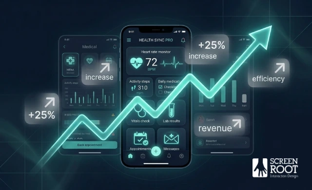
Investing in patient-centered design isn’t just about creating a better experience; it delivers measurable returns that directly affect your bottom line. When workflows are intuitive and interfaces are well-structured, the operational benefits compound quickly across every user touchpoint.
“Good design in healthcare isn’t a cost center; it’s one of the highest-leverage investments a digital health platform can make.”
Fewer Errors, Lower Overhead
Administrative inefficiencies are expensive. Confusing booking flows, poorly labeled form fields, and unclear navigation lead to errors that require staff intervention to resolve. According to Technology Rivers, thoughtful design changes can produce measurable increases in patient engagement alongside significant reductions in booking errors. Running a structured design usability review before launch, or as part of an ongoing improvement cycle, is one practical approach to catching these friction points before they become operational costs.
Higher Retention and Treatment Adherence
Patients who find an app easy to use are more likely to return to it. That consistency matters enormously for chronic condition management, medication reminders, and follow-up scheduling. When the interface supports rather than interrupts the care journey, adherence improves, and so do clinical outcomes.
Building for What’s Next
Healthcare platforms are rapidly incorporating AI-driven features: predictive triage, personalized care recommendations, and automated documentation. A well-architected UX foundation makes it far easier to integrate these capabilities without rebuilding the interface from scratch. Thoughtful prototyping early in the process ensures the product structure can flex as technology evolves.
The case for design investment is clear. The next question is how to execute it, which is where methodology becomes everything.
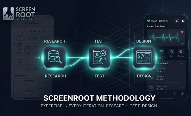
Partnering with ScreenRoot: A Research-First Methodology
Great healthcare app design doesn’t begin with a color palette or a wireframe; it begins with understanding real people in real clinical contexts. That conviction sits at the core of ScreenRoot’s approach to every engagement, from complex telemedicine interface design to in-clinic patient portal development.
Usability testing with real patients is non-negotiable. Assumptions fail in healthcare; observation doesn’t. Placing prototypes in front of actual patients, caregivers, and clinicians surfaces friction points that no internal review will catch. As one human-centered design study from Brown University confirms, iterative testing with target users is essential to producing interfaces that are both safe and effective. ScreenRoot’s research-driven design process embeds this discipline from day one, not as a final-stage checkbox, but as the engine driving every design decision.
The ScreenRoot’s Design Workshop brings that discipline into a collaborative format. Stakeholders, clinicians, and product owners align around shared user needs before a single pixel is placed. This structured alignment prevents costly rework downstream and ensures compliance requirements don’t surface as last-minute surprises.
“Design-led healthcare transformation: The practice of embedding user research, accessibility standards, and iterative testing into every phase of product development, not just at launch.”
The result is a repeatable framework: Research → Test → Design, applied with healthcare’s specific stakes in mind.

Ready to build a compliant, patient-centered healthcare digital experience?
Let’s talk about what’s possible for your platform. From patient portals and telemedicine platforms to clinician dashboards and caregiver tools, we bring 16+ years of expertise to every healthcare engagement.
Healthcare has always been about people. And in 2026, the digital products that serve those people need to reflect that same commitment, with every screen, every flow, and every interaction.
👉 Explore our services and see how we approach healthcare UX design.
When you’re ready, let’s talk.
📞 Call us (Toll-Free): 1800 121 5955 (India)
✉️ Email us: [email protected]
💬 WhatsApp: Reach out directly for a quick conversation
📝 Contact Form: Fill in your details on our website and we’ll get back to you promptly
Book a free discovery session today and let’s start building a healthcare experience your users can genuinely trust.