
 1800 121 5955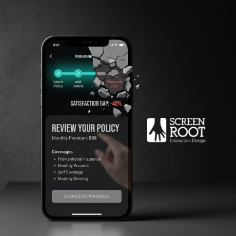
In short: Insurance apps lose users when policy purchase flows feel too long, too complex, or too transactional. The biggest fixes are relational UX, progressive disclosure, pre-fill support, and clearer checkout design. In regulated insurance journeys, trust and conversion move together.
The insurance industry has made major digital progress, but customer satisfaction still lags behind — by a wide margin in most industry surveys. That gap is not just a UX issue. It is a revenue issue.
In digital insurance, users are often asked to make a financial commitment while dealing with unfamiliar terms, uncertain outcomes, and lengthy forms. When the journey feels like a data-entry task instead of a guided decision, drop-off rises fast. The result is simple. Revenue leaks before the policy is purchased.
What Is Insurance Purchase Drop-Off?
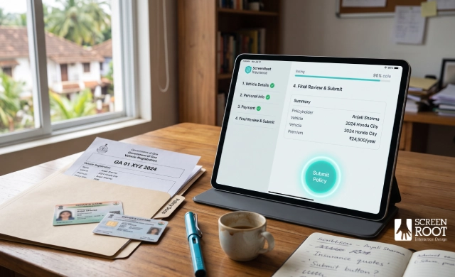
Insurance purchase drop-off happens when a user starts a quote or application flow but exits before completing the policy purchase. It is one of the most expensive types of abandonment because it happens late in the funnel, after acquisition spend has already been invested.
In insurance, this is often driven by a mismatch between user intent and interface design. Users come in wanting clarity, reassurance, and speed. Instead, they are met with long forms, dense language, and repeated data entry. The more complex the product, the more important the experience becomes.
Why Insurance Apps Lose Users
Most insurance apps are still built around a transactional mindset. The goal is to collect data, process the application, and issue the policy. That approach ignores how people actually behave when making high-stakes decisions.
Three patterns drive the most drop-off:
- Too many questions too early. A wall of fields creates instant friction. Users feel overwhelmed before they understand the value.
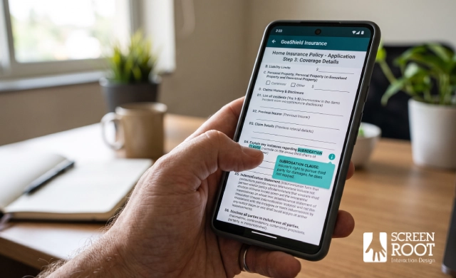
- Complex language. Terms like subrogation or indemnity limit may be accurate, but they often create anxiety for everyday users.
- Manual repetition. Asking users to retype details that systems already know makes the journey feel outdated and avoidable.
This is why the insurance app policy purchase UX matters so much. It is the moment where trust either grows or disappears. For teams working on a complex financial product, the policy purchase stage is often where the business either wins or loses the user.
The shift needed is from transactional design to relational design. That means helping users feel guided, not processed.
Progressive Disclosure in Insurance UX
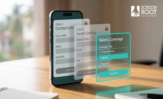
Progressive disclosure helps reduce cognitive overload by showing only the information users need at each step. In insurance journeys, this is one of the most effective ways to reduce abandonment without removing required complexity.
A good purchase flow should:
- Capture the essentials first, such as coverage type, basic asset details, or contact information.
- Use conditional logic to reveal only relevant fields.
- Keep mobile screens focused on one decision at a time.
This approach matters because users are more likely to continue when the flow feels manageable. Regulatory requirements still apply, but they do not need to appear all at once. The best insurance onboarding flows surface mandatory steps at the right moment, after intent has been established.
ScreenRoot has applied similar layered logic in other regulated digital journeys, including mobile banking app redesign projects, where complexity is reduced without losing compliance depth.

Why Pre-Fill Improves Conversion
Manual data entry remains one of the biggest conversion killers in insurance purchase flows. On mobile, it is even worse. The smaller the screen, the more painful each extra field becomes.
Pre-fill support can significantly reduce that friction. When verified data is pulled from trusted sources, users spend less time typing and more time confirming. That makes the journey feel faster, safer, and more modern.
Useful pre-fill sources include:
- Vehicle registration databases for make, model, and year.
- Property or address databases for ownership and location details.
- Identity verification systems for name, date of birth, and address matching.
The user should validate the information rather than enter it from scratch. That simple change reduces effort and improves trust. It also shortens the time to purchase, which can directly improve completion rates.
This is especially important in insurance, where even small delays can cause abandonment. Strong financial services UX patterns consistently show that reducing data-entry friction is one of the fastest ways to improve outcomes.
Optimising Quote to Purchase
The final step from quote to bound policy is where many users still drop off. After completing a long application, any extra friction at checkout feels much heavier.
This stage should do four things well:
- Show transparent pricing changes in real time.
- Offer local payment options such as UPI, NetBanking, and cards.
- Carry data forward so users do not re-enter the same details.
- Confirm success clearly with an immediate policy document or receipt.
That last point is often overlooked. A generic thank-you screen does not reassure the user that the purchase worked. A clear policy confirmation screen does. It closes the loop and reduces uncertainty.
ScreenRoot’s work with Future Generali demonstrated the value of this approach in a regulated insurance environment. The redesign focused on simplifying the journey from product selection to purchase, reducing friction at the exact point where users are most likely to abandon the flow. That kind of practical, research-led improvement is what turns a purchase journey into a conversion asset.
AI and Relational Insurance UX
AI is now reshaping insurance journeys in useful ways, but only when it supports the user rather than replacing human clarity.
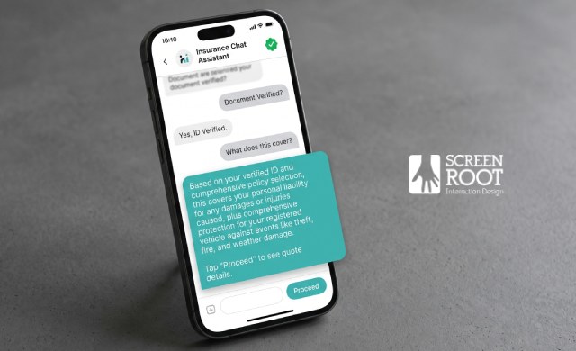
One major use case is document review. AI can scan and validate identity documents much faster than manual checks, which reduces wait times during onboarding. Another is conversational support. A helpful chatbot can answer questions, clarify coverage, and guide users through the application in plain language.
AI is also being used in embedded insurance, where coverage appears naturally within another purchase journey. This reduces the sense of interruption and makes the policy feel more relevant at the moment of intent.
Even so, human support still matters. Live escalation paths, clear error messages, and simple policy summaries remain essential. The best insurance experiences use AI to remove friction, not to create a colder interface.
Key Takeaways for Leaders
The 40% satisfaction gap is not just a UX problem. It is a business opportunity.
For insurance leaders, the most effective changes are often the simplest:
- Use relational design instead of transaction-first flows.
- Apply progressive disclosure to reduce overload.
- Add pre-fill support to cut repetition.
- Improve the quote-to-purchase handoff.
- Measure satisfaction, not just completion.
These changes work because they make the journey feel easier, faster, and more trustworthy. In insurance, that trust is what drives conversion.

Why Research-First Design Wins
Insurance UX is hard because it sits at the intersection of regulation, trust, and conversion. That is why generic design approaches often fall short. They may look polished, but they usually miss the logic of real insurance behaviour.
A research-first partner understands how users think, where they hesitate, and which parts of the flow need more explanation. ScreenRoot brings that discipline through 16+ years of enterprise UX work across BFSI and other complex sectors.
If you are looking to improve your insurance purchase journey, start by auditing the points where users hesitate, exit, or repeat information. Those are the moments where revenue is leaking.
Frequently Asked Questions
Why do users abandon insurance applications?
Most users drop off because the flow feels too long, too complex, or too transactional. Dense language, manual data entry, and unclear trust signals are common causes.
How does progressive disclosure help insurance UX?
It reduces cognitive overload by revealing information step by step instead of all at once. This helps users stay oriented and complete the purchase.
What improves insurance conversion the most?
Pre-fill support, simpler forms, clearer checkout design, and better communication of value are the biggest levers.
Why is relational design important in insurance apps?
It helps users feel guided and understood rather than processed. That improves trust, which is critical in financial decisions.
Written by Team ScreenRoot, 16+ years designing enterprise UX for BFSI, SaaS, and healthcare clients.
When you’re ready, let’s talk.
📞 Call us (Toll-Free): 1800 121 5955 (India)
✉️ Email us: [email protected]



