
 1800 121 5955
Key Takeaways
- A UX audit diagnoses where friction costs revenue. It is not a critique of visual taste, and a finding with no KPI attached doesn’t belong in the report.
- Start by agreeing on the single user action that moves revenue, then judge every finding against it.
- Combine behavioral data, a heuristic evaluation, and moderated testing. Data shows what is happening, and experts and users explain why.
- Five participants per user segment is enough to surface most usability problems. Jakob Nielsen’s model puts it at about 85%.
- Rate each finding by severity, plot Critical and Major issues on an Impact vs Effort matrix, and repeat the audit every quarter or major release.
A UX audit is only worth running if it changes what your team builds next. Done well, it traces friction in your product to lost revenue, ranks the fixes by business impact, and hands engineering a roadmap they will actually execute. Done badly, it becomes a list of opinions about corner radii and font weights.
This guide covers how to do a UX audit in four steps, with a checklist and template built for enterprise and regulated-industry products.
What is a UX audit?
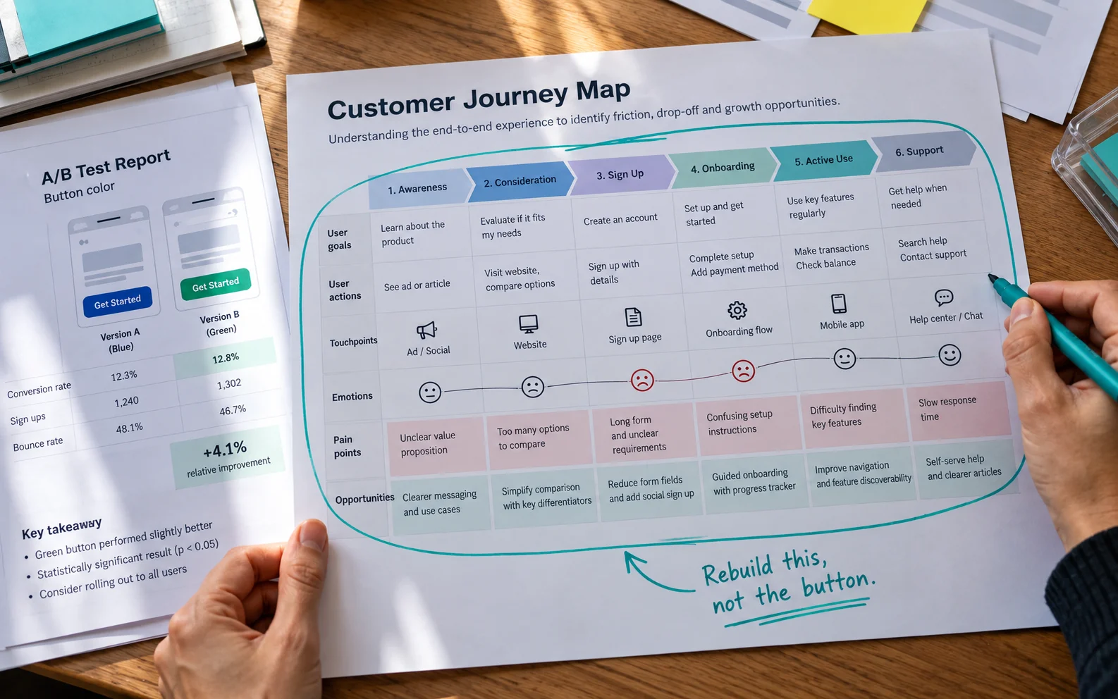
A UX audit is a structured evaluation of a digital product that identifies where users struggle, why, and what that friction costs the business. It combines analytics, expert heuristic review, accessibility and performance checks, and testing with real users. It ends with prioritized, evidence-backed recommendations tied to specific business KPIs.
How is a UX audit different from CRO? Conversion rate optimization tunes an existing funnel for incremental gains, testing one variant against another inside a structure nobody questions. A UX audit questions the structure itself. If your team has run dozens of A/B tests and results have flattened, you need a diagnosis, not another button color.
Step 1: How do you align a UX audit with business goals?
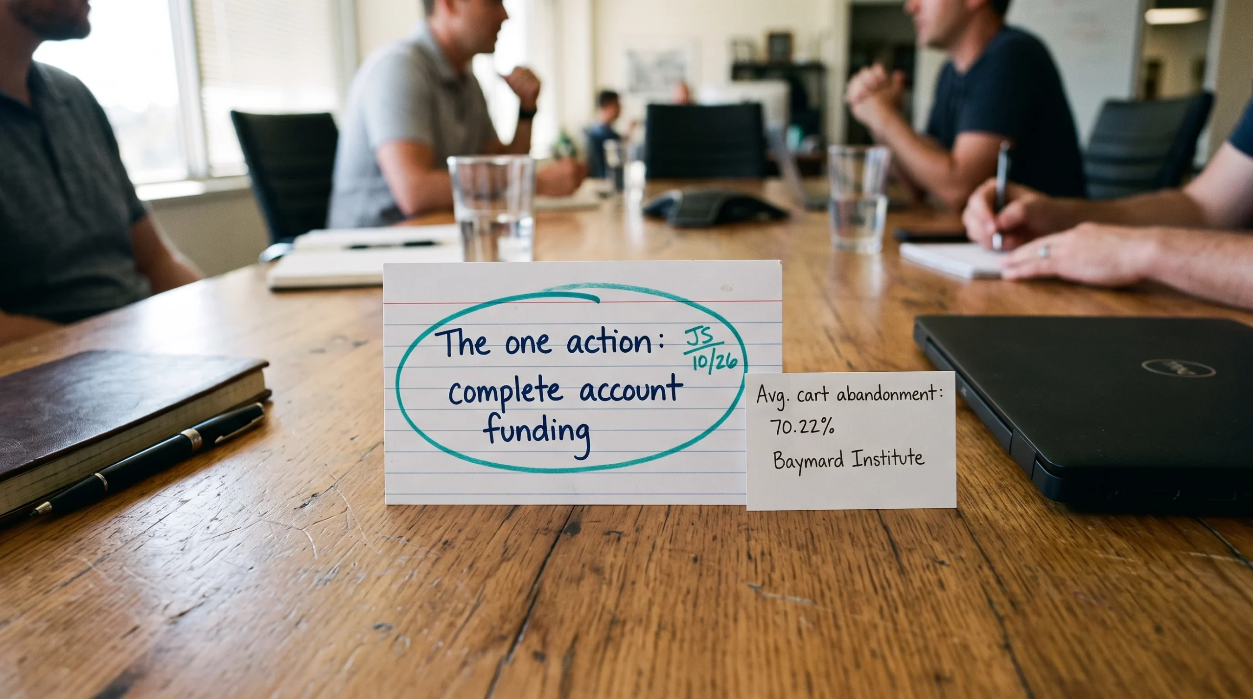
Start in the boardroom, not the interface. Before anyone opens a design file, agree on the single user action that moves revenue, such as completing a checkout, funding an account, submitting a claim, or adding a second seat. Every finding the audit uncovers is then judged against that action.
Next, interview the people who already hold the evidence. Product owners, support leads, sales engineers, and compliance officers each see a different slice of the same friction. Ask them:
- Which single user action, performed more often, would change our numbers this quarter?
- What are the top three complaints reaching support, in customers’ own words?
- Which KPI is most at risk right now: cart abandonment, activation, churn, or renewal?
- What have we already tried to fix here, and what happened?
- Which constraints are non-negotiable for regulatory or legacy reasons?
Anchor the answers to a benchmark. For example, Baymard Institute’s analysis of 50 studies puts the average documented online cart abandonment rate at 70.22%. That reframes abandonment as a structural condition to diagnose, not a seasonal blip to explain away. Set a similar reference point for whichever metric your stakeholders named.
This alignment matters most in regulated environments. Over the past year, ScreenRoot has worked on complex projects including a financial services app for commercial and SME customers, where a single ambiguous field can stall an entire onboarding pipeline.
Step 2: How do you gather data and run a heuristic evaluation?
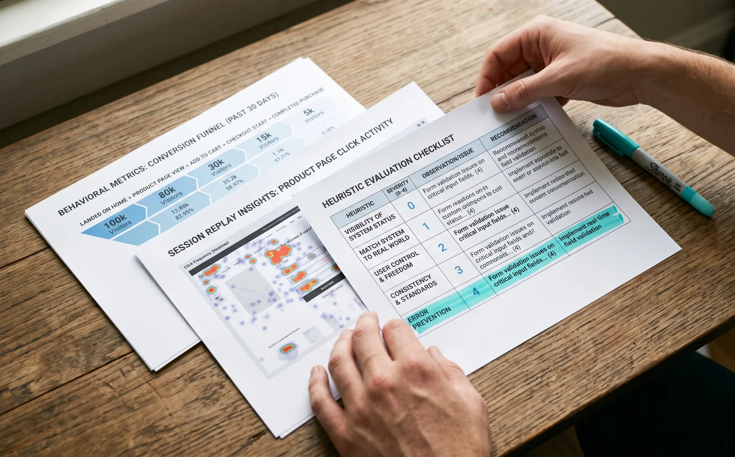
Combine quantitative data, which shows what is happening, with expert heuristic evaluation, which explains why, before drawing any conclusion. Pull behavioral metrics for your revenue action, map the full journey, add session replays, then review every screen against established usability heuristics, accessibility criteria, and performance on real devices.
1. Pull behavioral metrics for the revenue action: drop-off by step, time on task, error rates, repeat submissions, and support tickets mapped to specific screens.
2. Map the golden path end to end, including the unglamorous parts like email verification, document upload, and re-authentication, where enterprise products quietly lose people.
3. Layer in qualitative signals from session replays and heatmaps: rage clicks, dead clicks, and fields that get filled, cleared, and refilled.
4. Run a heuristic evaluation screen by screen against established usability principles such as Nielsen’s 10 usability heuristics: visibility of system status, error prevention, recognition over recall, and consistency of language across modules.
5. Test accessibility and performance as core checks, not appendices: keyboard navigation, focus states, contrast, screen reader labels, and load times on the devices your customers actually use.
6. Document every finding in one place using a shared UX audit template (below).
Heuristic evaluation earns its place because it is fast and catches the problems analytics can only hint at. For example, a funnel chart might show that 40% of applicants stop at the income verification screen. A trained evaluator can tell you the screen asks for a document type most SME customers don’t have.
What UX audit tools do you need?
Keep your UX audit tools deliberately boring. Four categories cover most of what a diagnostic needs:
| Tool Category | What It’s For |
| Product analytics | Funnels, drop-off by step, time on task |
| Session replay and heatmaps | Rage clicks, dead clicks, field re-entry |
| Accessibility checker | Automated WCAG checks, followed by manual keyboard and screen reader testing |
| Shared documentation space (e.g. Figma or Notion) | One home for every finding, in a consistent format |
Adding a fifth platform usually adds licensing reviews, not insight. Consistent documentation matters more than sophisticated tooling, because findings have to survive translation to engineering, legal, and the board.
UX audit template: what to record for each finding
| Field | What To Record |
| Finding ID | A unique reference for tracking into the backlog |
| Screenshot or clip | Visual evidence of the issue |
| Journey step | Where in the golden path it occurs |
| Heuristic or standard violated | For example, error prevention, or WCAG 2.1 AA criterion 1.4.3 (contrast) |
| Evidence | Analytics, replay, or test-session observation |
| Severity | Critical, Major, Minor, or Cosmetic |
| KPI affected | The business metric at risk |
| Estimated effort | Engineering days, including QA and compliance review |
| Recommendation and owner | The proposed fix and who is accountable |
Step 3: How do you test with real users to validate findings?
Validate your hypotheses with moderated usability testing on participants who match your real customer segments. Recruit five people per distinct segment, give them the primary task without a demo, and watch where they hesitate. Heuristic evaluation produces a hypothesis. Testing turns it into evidence a skeptical CFO will accept.
Recruit real segments, not internal proxies. An SME banking flow tested by your own operations team will look effortless, because they already know which document satisfies which requirement.
Keep rounds small. In his widely cited model, Jakob Nielsen of Nielsen Norman Group showed that testing with five users uncovers about 85% of usability problems. After that, sessions mostly reconfirm what you have already seen. Two segments means two rounds of five, not one panel of fifty.
Don’t demo, don’t narrate. Ask participants to complete the golden path, then stay quiet and watch where they hesitate, scroll back, reread a label, or open a new tab to look up a term your product invented. Hesitation is the signal. A user who completes the task in ninety seconds while sighing twice has told you more than a satisfaction score will.
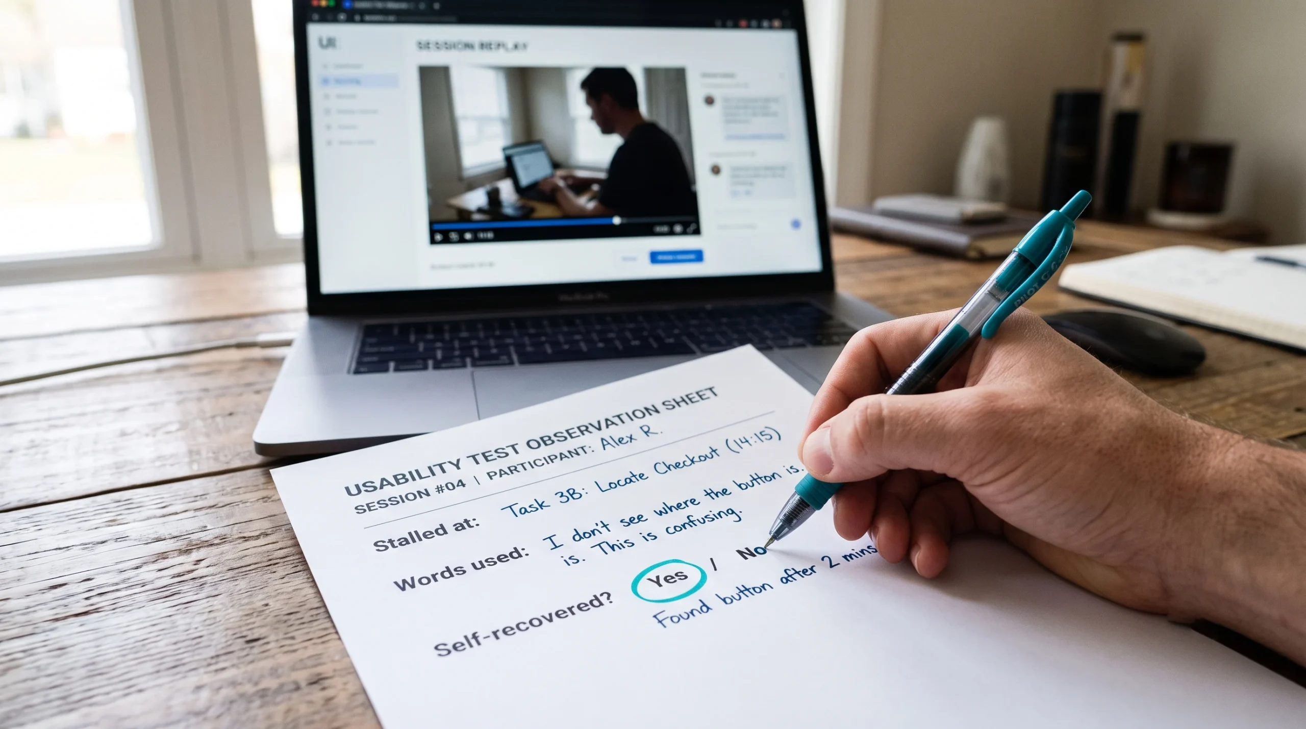
Record three things per session:
1. The step where they stalled
2. The words they used to describe the confusion
3. Whether they recovered on their own
That third item separates a Critical issue from an annoyance. Self-recovery means friction. No recovery means lost revenue. In BFSI and healthcare the stakes compound, because a confused user doesn’t just abandon a cart. They leave behind a partially completed application that now sits in a compliance queue.
Close each round by replaying two or three clips for stakeholders. Thirty seconds of a real customer failing to find the continue button ends arguments that a spreadsheet would have dragged out for a quarter.

Step 4: How do you prioritize UX audit findings?
Rate every finding with severity levels agreed before the report is written, then plot Critical and Major issues on an Impact vs Effort matrix. Ship high-impact, low-effort fixes first, turn high-impact, high-effort fixes into funded initiatives, and decline low-impact, high-effort work in writing.
An audit that hands engineering 140 undifferentiated issues will produce zero fixes. Sort ruthlessly:
| Severity | Definition | Action |
| Critical | Blocks the primary revenue task: checkout fails, an application can’t be submitted, an accessibility barrier locks out a user group, or the flow breaks a regulatory requirement | Fix this sprint |
| Major | Doesn’t block completion, but reliably causes frustration, rework, or support contact, such as unclear errors, forms that discard data, or inconsistent terms | Schedule in the roadmap. These drive slow churn that nobody attributes correctly |
| Minor | Causes hesitation or mild inefficiency for some users | Batch into a maintenance release |
| Cosmetic | Visual inconsistency with no measurable effect on behavior | Fix in the next design-system pass. Never lead the executive summary with it |
Build the Impact vs Effort matrix. The vertical axis is the estimated effect on the KPI named in Step 1. The horizontal axis is engineering days, including QA and compliance review. High impact with low effort ships first and buys credibility for the rest of the program. High impact with high effort becomes a funded initiative with a business case. Low impact with high effort is declined in writing, which is often the most useful output of the whole exercise.
Write the report in two layers. Executives get the KPI at risk, the estimated exposure, and the sequenced plan on one page. Product and engineering get the screenshots, recordings, severity ratings, and acceptance criteria. The findings are the same, told at different levels of detail. A report only one audience can read gets acted on by neither.
User experience audit checklist for 2026
Run this user experience audit checklist at the close of every audit cycle. Each item should come back as a yes with evidence attached, not a yes from memory.
1. The single revenue-driving user action is documented and agreed by product, support, and finance.
2. Every primary user journey is mapped end to end, including authentication, verification, and recovery paths.
3. Quantitative metrics and heuristic findings are cross-referenced, so every number has an explanation.
4. Top findings are validated with real users from each distinct segment, in small moderated rounds.
5. Accessibility conformance is tested across keyboard, contrast, focus states, and screen reader labels, with results logged for audit trails in regulated environments.
6. Every finding has a severity rating, and Critical and Major items are plotted on the Impact vs Effort matrix.
7. Each prioritized finding is tied to a named business KPI with an owner and a target date.
8. The next review cycle is scheduled before the current one closes.
Products drift. Regulations change, features pile up, and yesterday’s clean journey collects three new interstitials. Repeating this diagnostic quarterly or with each major release is how design debt stops compounding quietly on your balance sheet.
Frequently Asked Questions
How long does a UX audit take?
It depends on product scope and the number of journeys and user segments involved. A focused audit of one revenue-critical journey is much faster than a full-product audit across several segments. Plan time for stakeholder interviews, data analysis, heuristic review, at least one round of moderated testing per segment, and a prioritized report.
How many users do you need for a UX audit?
For moderated usability testing, five participants per distinct user segment is usually enough. Jakob Nielsen’s model shows five users uncover about 85% of usability problems, and later sessions mostly repeat earlier findings. If you serve two very different segments, such as retail and SME banking customers, run two rounds of five.
What is the difference between a UX audit and a usability test?
A usability test observes real users trying to complete tasks. A UX audit is a broader diagnostic that includes usability testing alongside analytics review, heuristic evaluation, accessibility and performance checks, and business prioritization. The audit’s output is a ranked, KPI-linked roadmap. A usability test’s output is evidence about specific tasks.
What should a UX audit report include?
A one-page executive summary covering the KPI at risk, estimated exposure, and a sequenced plan, plus a detailed layer for product and engineering. That layer holds each finding’s screenshot or clip, the journey step, the heuristic violated, the evidence, the severity rating, the affected KPI, the estimated effort, and a recommended fix with an owner.
How often should you run a UX audit?
Run a full audit at least once a year, and lighter reviews quarterly or with each major release. Products drift as features accumulate and regulations change, so treating the audit as a recurring operating rhythm catches friction before it compounds. Always schedule the next review before closing the current one.
Need an outside view of your product’s friction?
ScreenRoot runs research-first UX audits for banking, fintech, insurance, healthcare, and enterprise SaaS products, where every design decision also has to hold up to compliance scrutiny. See how that plays out in our work, or read how audit findings feed into digital banking UX and enterprise website redesign.
Written by Team ScreenRoot. 16+ years leading enterprise UI/UX research for BFSI, SaaS, and Healthcare clients.
When you’re ready, let’s talk.
📞 Call us (Toll-Free): 1800 121 5955 (India)
✉️ Email us: [email protected]



