Case Study
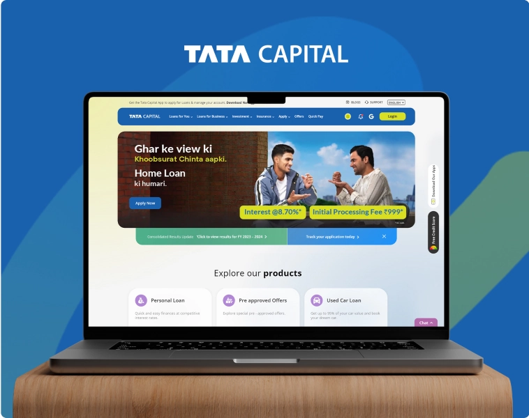
Tata Capital
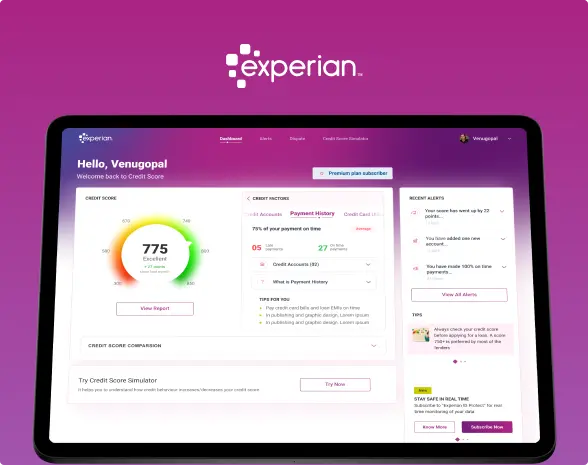
Tata Capital and ScreenRoot have a relationship that goes back over half a decade. From 2018, we have collaborated with Tata Capital on various digital assets and projects, from their Investments App to their B2B Channel Portal. When they decided to overhaul their website, we were the natural partners for crafting a website that would match the legacy of their name with the best contemporary UI/UX practices for financial website design.
Rewriting the blueprint
A complete overhaul of the Information Architecture–the skeletal outline of the user journey and data categorisation–was our first step in revamping Tata Capital’s website. Our goal in this exercise was to look at the website’s flow from an entirely new perspective and find the best flow & arrangement for pages.
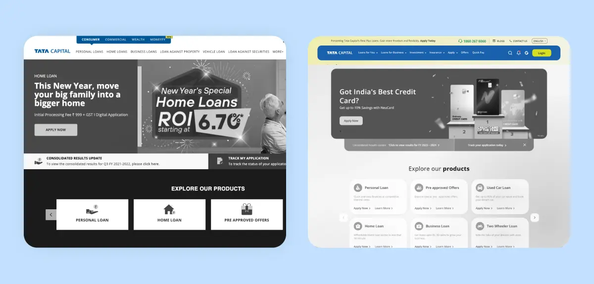
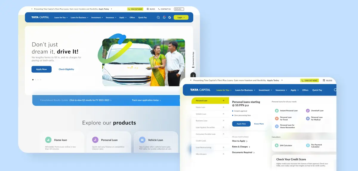
Streamlined, user-driven navigation
The navigation bar on the pre-existing Tata Capital website was organized based on business verticals. Knowing that this was a website aimed towards customers, we changed the navigation entirely to cater to the user’s needs. The new, improved navigation was neatly divided into product categories with an expansive drop down menu that gives a birds eye view of each category upon scrolling.
However good-looking and well designed a website might be, the user experience will be subpar if the page takes too long to load. For Tata Capital, all jazz aside, we prioritized page speeds and efficiency. The website had a brisk speed of 80+ on Desktop and 60+ on mobile. The most quick and intuitive customer journey, guaranteed.
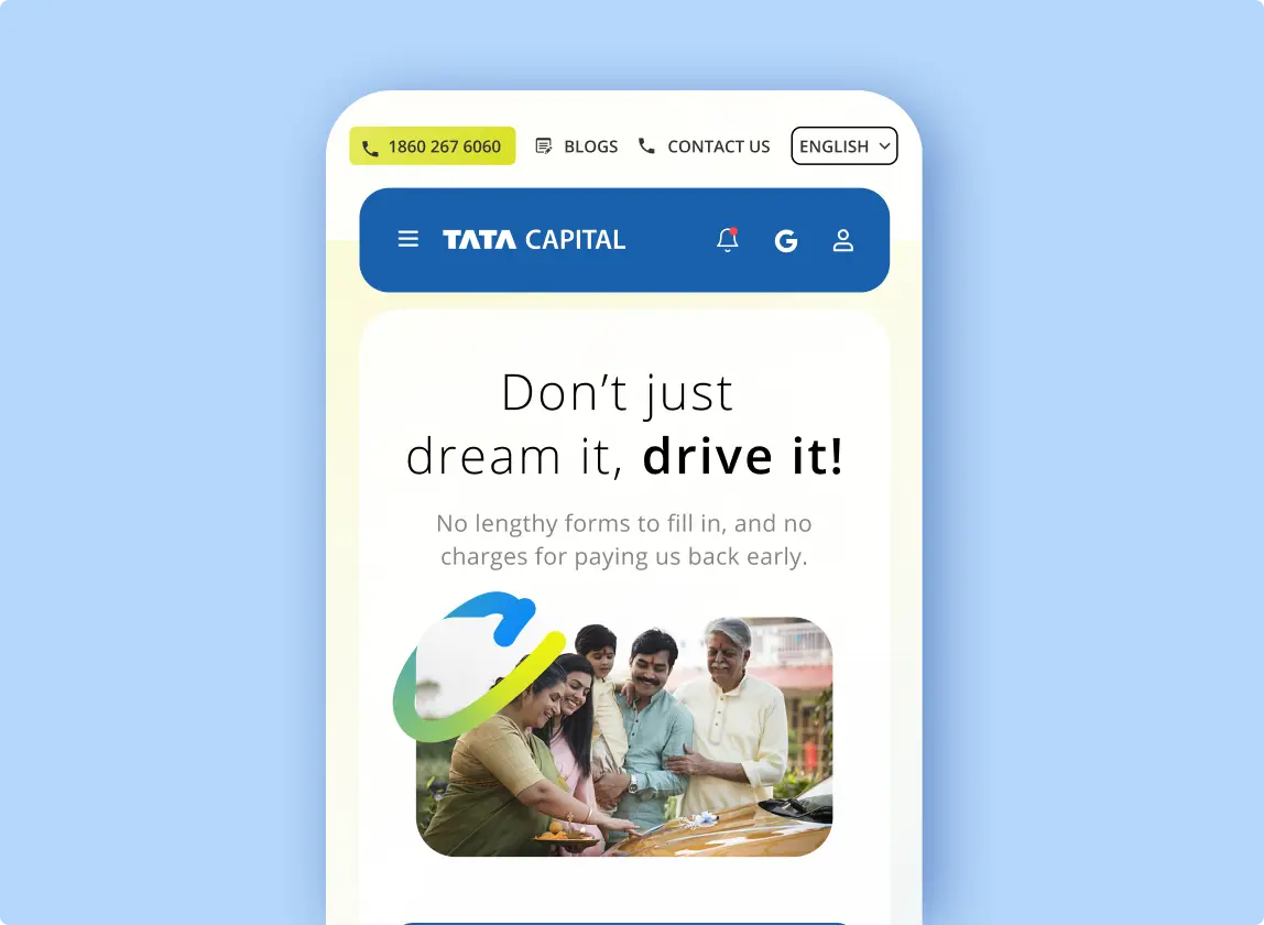
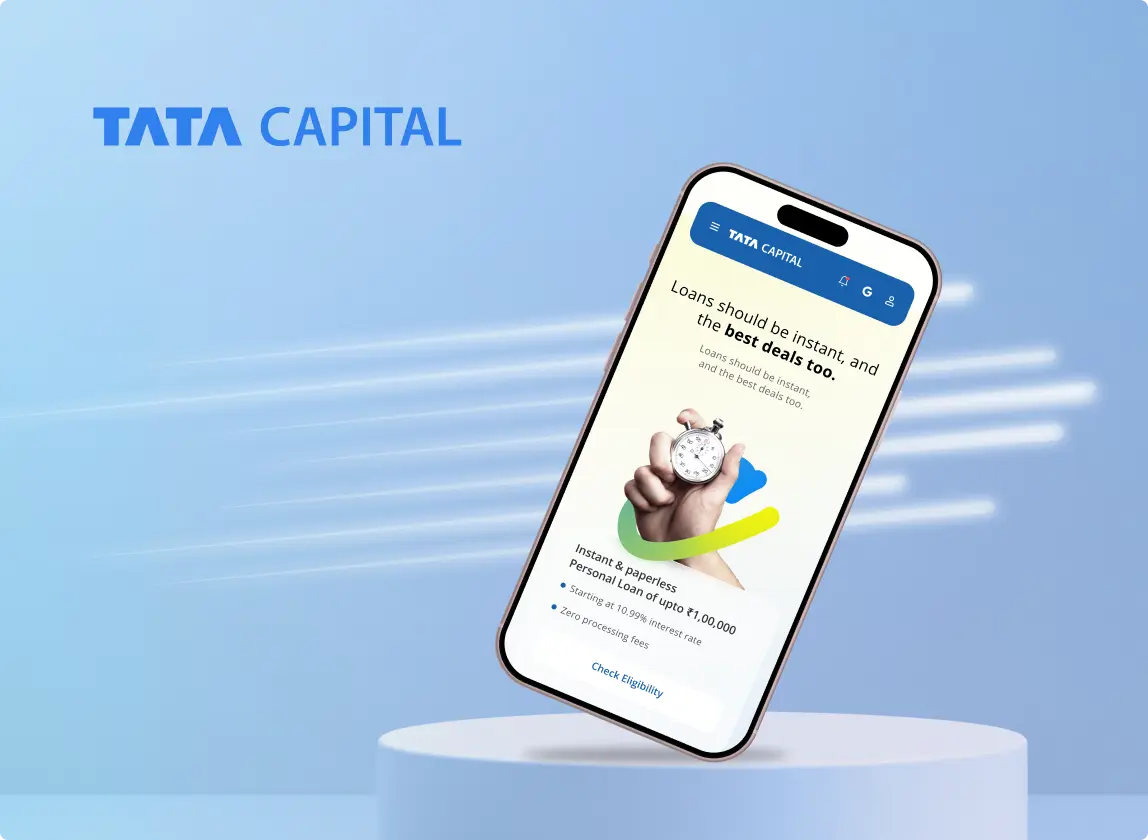
Our UI mantra for Tata Capital’s website was to make it look modern and vibrant. This was a new take on aesthetics for a company in financial services, especially for a renowned name like Tata Capital. With subtle background gradients alongside pastel-themed icons & illustrations, we aimed for a fresh, approachable look.
Convinced yet?
We believe our work speaks for itself. If it strikes a chord with you, let’s create something extraordinary together!