Case Study
Pizza Hut
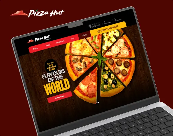
Pizza Hut wanted to elevate their online ordering experience to meet modern customer expectations. We transformed their digital presence through a website and app redesign, creating a sleek, user-friendly interface and an intuitive ordering system. Our approach made it simple for customers to browse the menu, customize orders, and complete transactions smoothly. Read further to know more!
Transforming the Ordering Journey with a Website Redesign
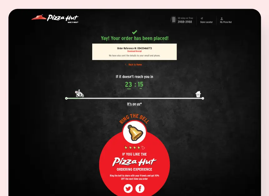
Data from our UX research agency told us that people who spent more than 5 minutes on Pizza Hut’s old website didn’t end up ordering. We designed the entire user journey reducing the average ordering and check out time to ~3 minutes. Meaningless drop-offs and more conversions and of course happy customers.
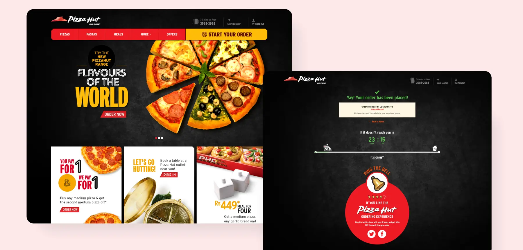
After extensive eye-tracking studies, we specialized a side cut photograph of a pizza slice to make the toppings, the crust, and the filling stand out. Along with a neutral black colour scheme, the contrast creates a sharp look. Just so the user focuses on the bright call-to-action buttons and acts faster.
We re-imagined traditional restaurant UI UX app design to crunch the online ordering process to 60 seconds v/s 5 minutes. Here’s how:
- We built a Smart Cart, which allows users to build their order in the shopping cart itself.
- The designed a cart that intuitively shows recommendations and favourites to add in clicks v/s not minutes.
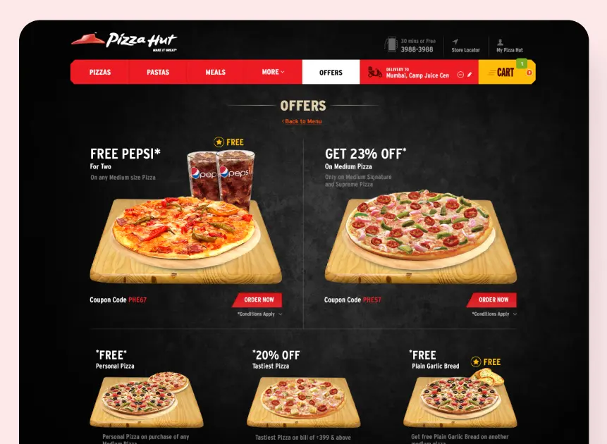
- The offer codes were put up front in the UI and can be applied in the cart itself.
Convinced yet?
We believe our work speaks for itself. If it strikes a chord with you, let’s create something extraordinary together!