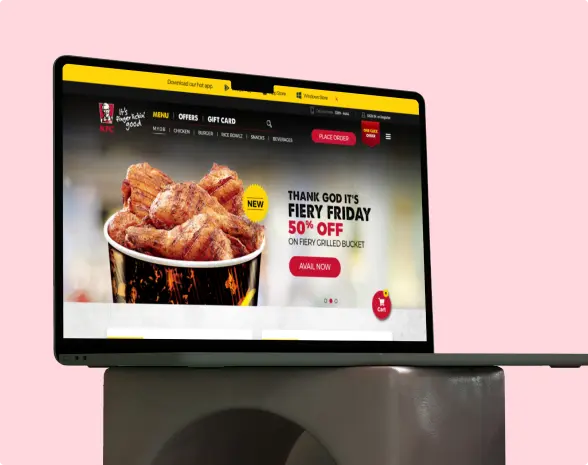
UI UX Design for KFC’s QSR Website
For Indian customers, dated design styles, unintuitive navigation, and a layered ordering process were few of the many issues that made online ordering tedious.
Given our love for KFC, we knew exactly what to do for its QSR website design: make the ordering experience quick, simple, and true to what KFC is all about. Yummy, crunchy, finger-licking chicken.
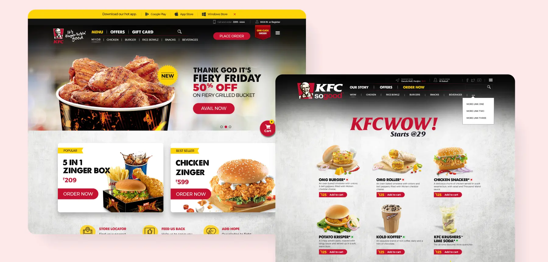
- Finding what to order is easy: Most frequented links are highlighted and menu items are arranged based on popularity. Users can just hover over to see all categories and then see a list of products in a click.
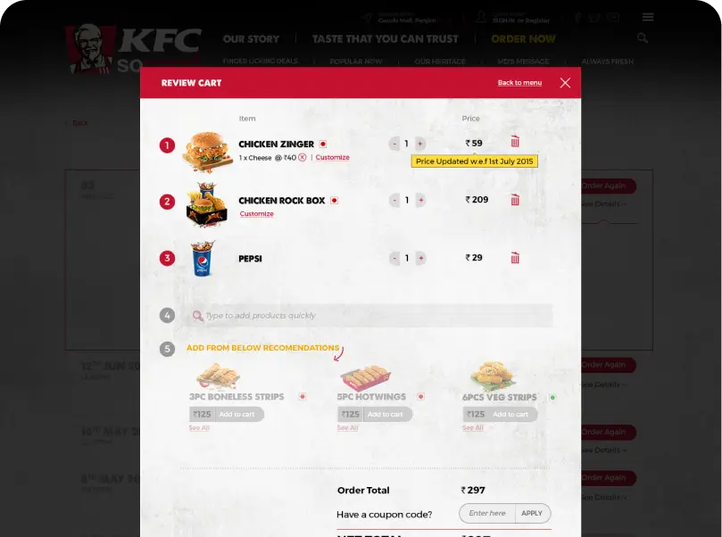
- Review order anytime from any page: Users can review their order by tapping on the cart button anchored on every page, in turn saving time.
- Never miss out on a great deal: Coupon codes are readily available at the checkout page, exactly where they’re needed in the UI.
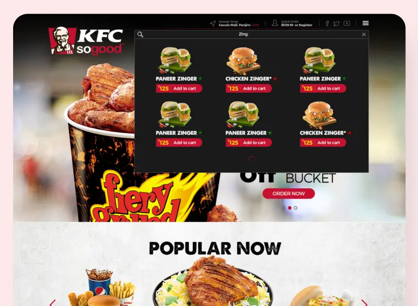
We wanted KFC lovers to feel hungrier the moment they log on. Which is why we made the product imagery bigger and craveable.
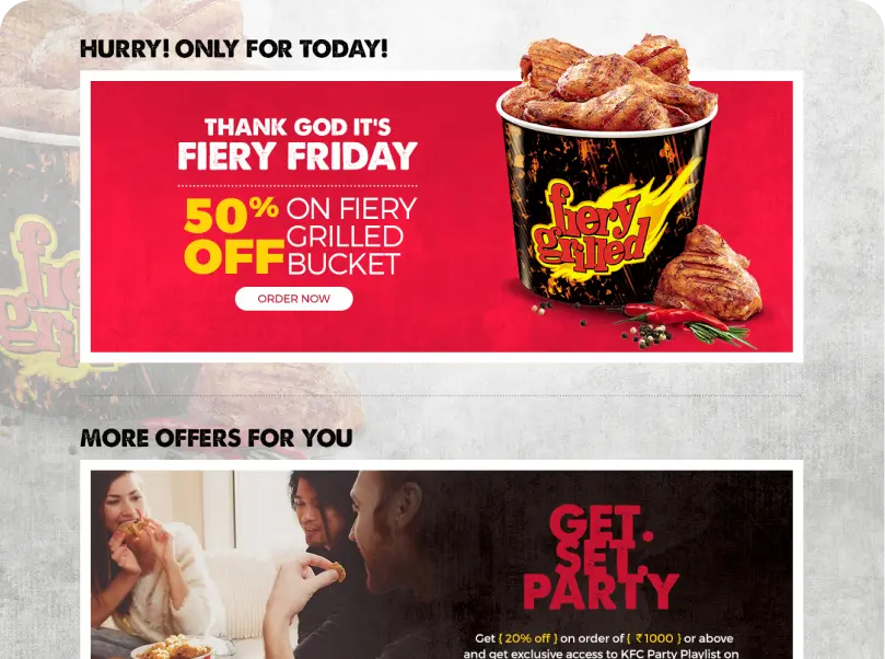
The website intuitively suggests add-ons for every product in the cart based on the users’ past orders. Enterprises call it upselling; top UX design firms call it smart recommendations.
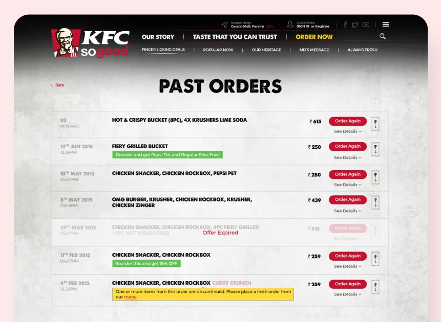
Our top QSR mobile app design team introduced a ‘type to order’ feature where users can just spell out their cravings in the cart itself. Signed in users can also reorder their favourites in a click.
Convinced yet?
We believe our work speaks for itself. If it strikes a chord with you, let’s create something extraordinary together!
