Property Listing App Design to
Find The Best, Easily
HDFC Red is designed to make finding a dream home easy and hassle-free. This real estate mobile app design eliminates irrelevant search results and inaccurate listings. ScreenRoot, a top app design company in India, crafted the UI UX to simplify house hunting. Key features include a prominent Shortlist button and a customizable search wizard. These allow users to save their favorite properties and personalize their search. The user-friendly interface also makes comparing properties easy by highlighting key details and relevance scores upfront.
Relevant Results Only
Buying a house isn’t quite like buying a phone, a PC, or even a car. It requires weeks of comparison to arrive at a decision. We added a Shortlist feature just so users don’t lose their favourite listings once they’ve made their minds. In fact, we made the shortlist button prominent enough in the UI for it not to be overlooked.
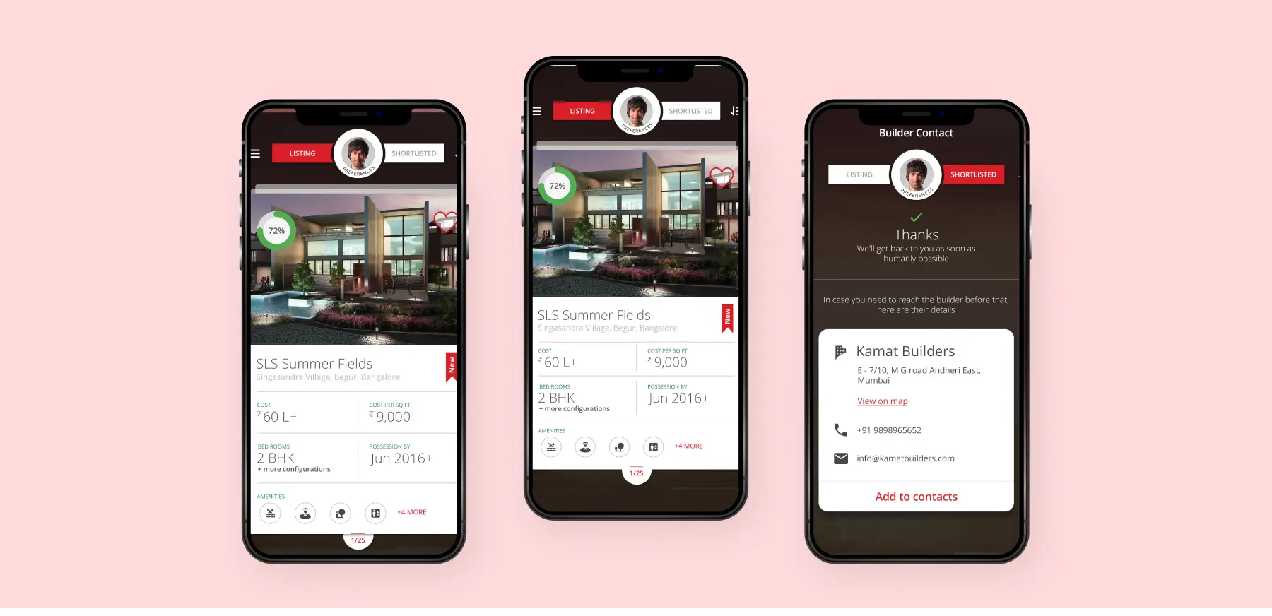
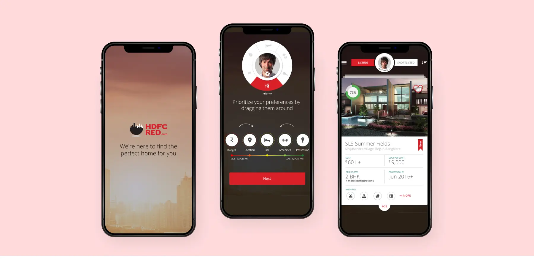
How would one know which search result among many is spot on? For starters, all search results are arranged in the order of a relevance score. It’s derived by mapping user preferences against actual property characteristics, and it boldly shows up on all listings. The most important info in all search results is highlighted and put up front. The thoughtfully designed interface aids decision making.
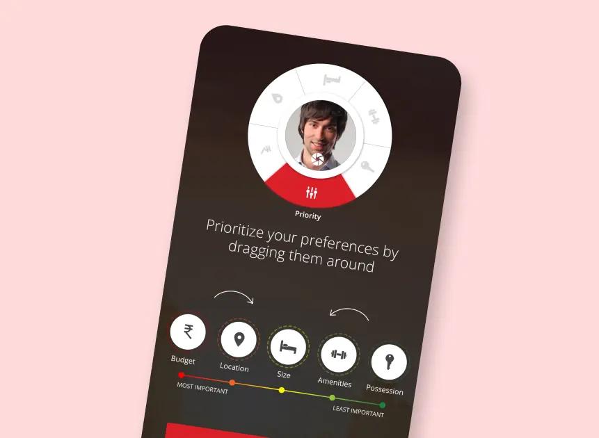
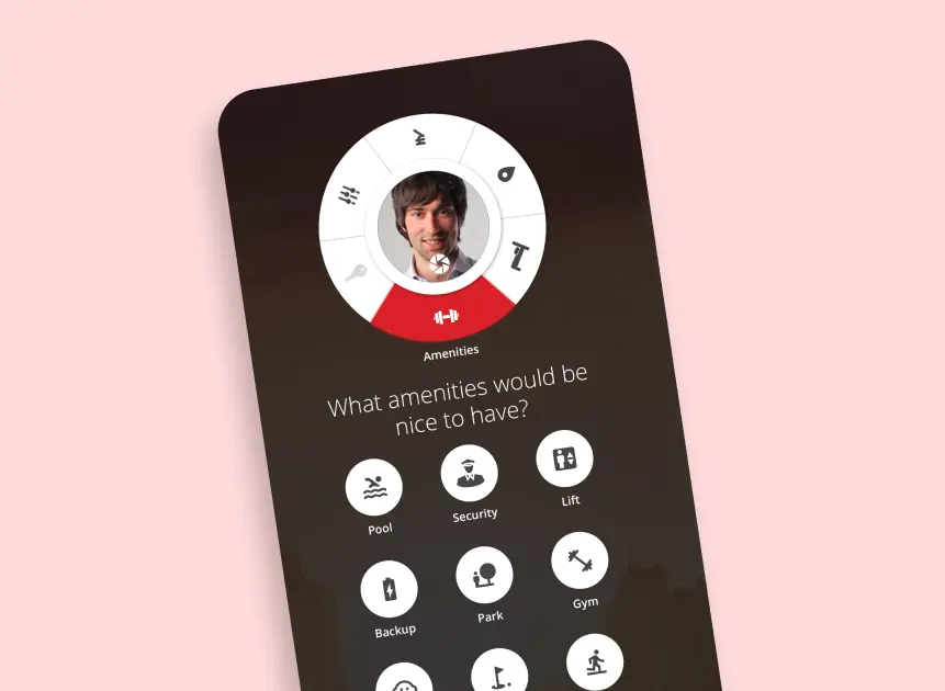
House buyers have a particular order of preferences. Some may have to stick to a budget, others may want a popular locality more than anything. ScreenRoot’s UX Design funnelled this insight into an intuitive and customizable search wizard. Users can now choose the order of their priorities, then fill in every search criterion, one at a time. Making for clean and minimalist real estate mobile app design.
Convinced yet?
We believe our work speaks for itself. If it strikes a chord with you, let’s create something extraordinary together!
