Redefining communication services
with a fresh approach
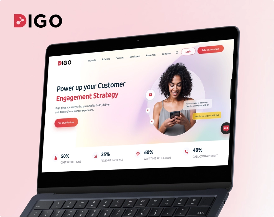
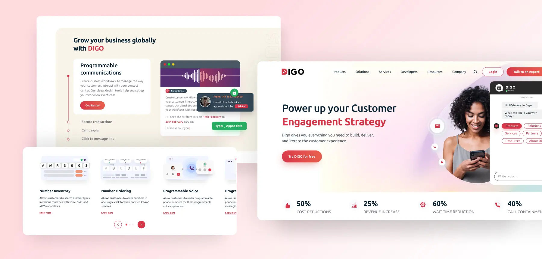
The website required a fresh, user-centred approach to explain Digo’s offerings, and highlight the brand’s innovative edge in the communications industry. Our competitor analysis revealed that users often struggle to find APIs and services that meet their specific needs. To address this, we crafted clear, relevant, and visually engaging service information. We structured content around user needs and added informative animations to simplify and showcase the platform’s unique, complex features.
From complexity to simplicity:
A new era in communication solutions
We started by getting to know Digo’s audience: enterprise app developers, and communication service providers. Then we did a deep dive into Digo’s competitors and other major players in the CPaaS space. Armed with insights from an industry-wide comparison, we set out to build a site that ticked all the right boxes.
The result is a streamlined, intuitive site where information is easy to access and decisions are easier to make. Digo’s new online presence now mirrors their commitment to innovative communication solutions, with a site that’s built to engage, inform, and empower.
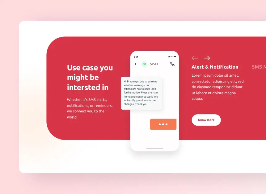
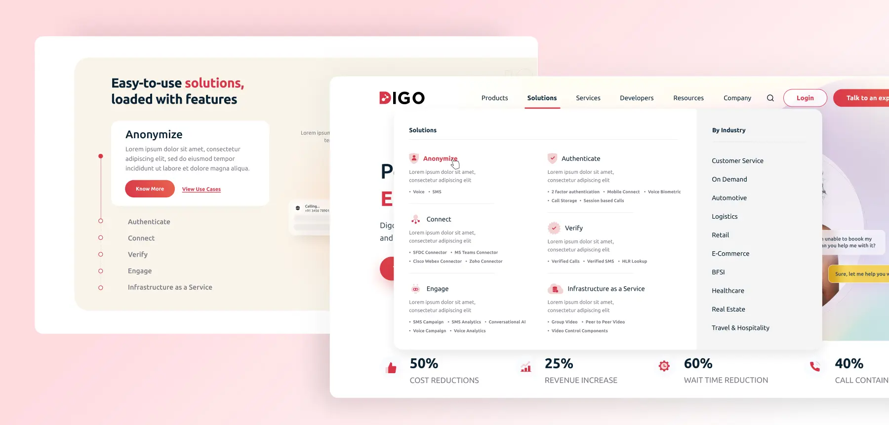
We organized services into clear categories for intuitive navigation, grouping them by specific needs to help users quickly find relevant options. To improve discoverability, we optimized the site with targeted keywords for better search engine visibility. The new layout removes the guesswork, making it easy for users to find the solutions and services they need.
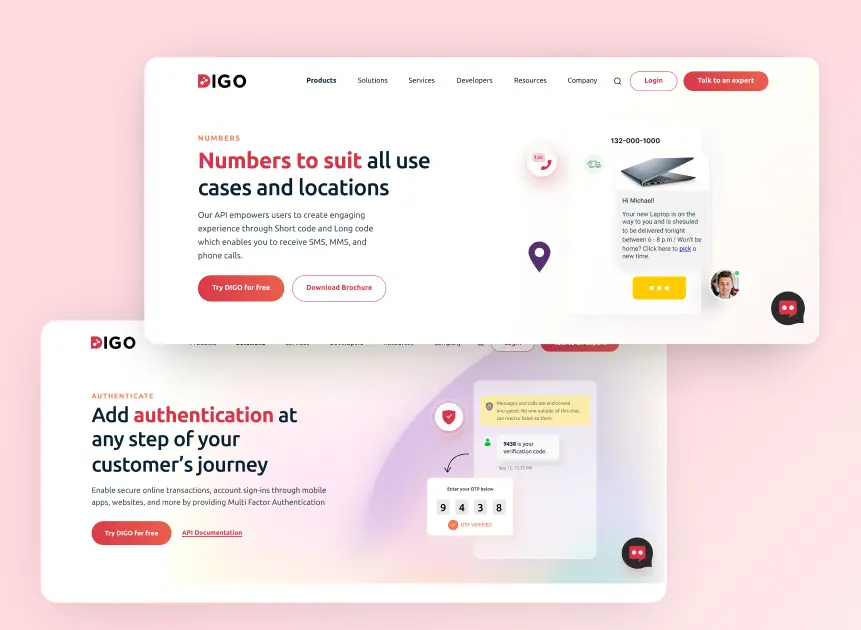
Digo needed a fresh look to match its forward-thinking brand, so we crafted a clean, modern layout with custom visuals that highlight its unique identity. Now, Digo’s visual style feels both current and inviting. Subtle animations and interactive touches add a bit of magic to each click, making exploration enjoyable and intuitive while guiding users effortlessly to what they need.
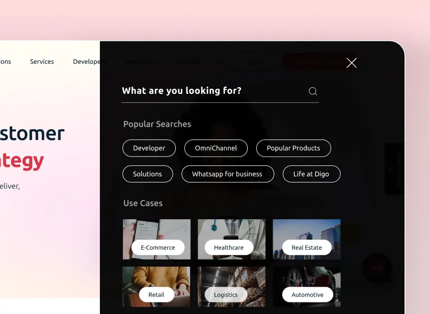
Showcasing Digo’s expertise across industries, the site features channel-specific solutions tailored to sectors like e-commerce, healthcare, and retail. This approach allows users to view solutions aligned with their industry, highlighting Digo’s unique capabilities and depth in each area.
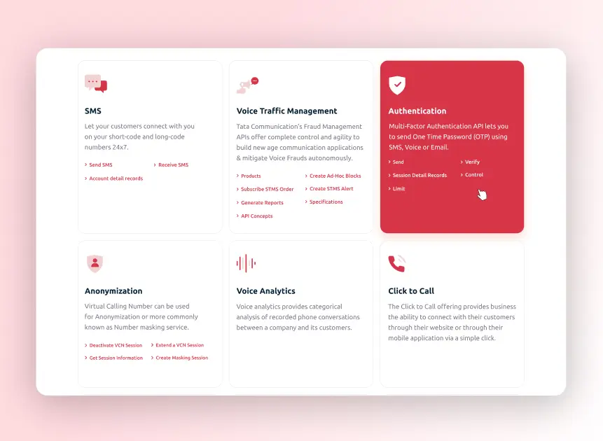
Introducing sections focused on developers to showcase relevant solutions like APIs. With a easy-to-navigate documentation, developers can quickly find the tools they need, making Digo the go-to platform for custom communication solutions. The streamlined structure ensures users can make quick, informed decisions.
Convinced yet?
We believe our work speaks for itself. If it strikes a chord with you, let’s create something extraordinary together!
