 1800 121 5955
 Case Study
Ceat Tyres
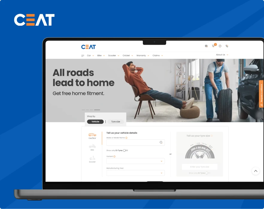
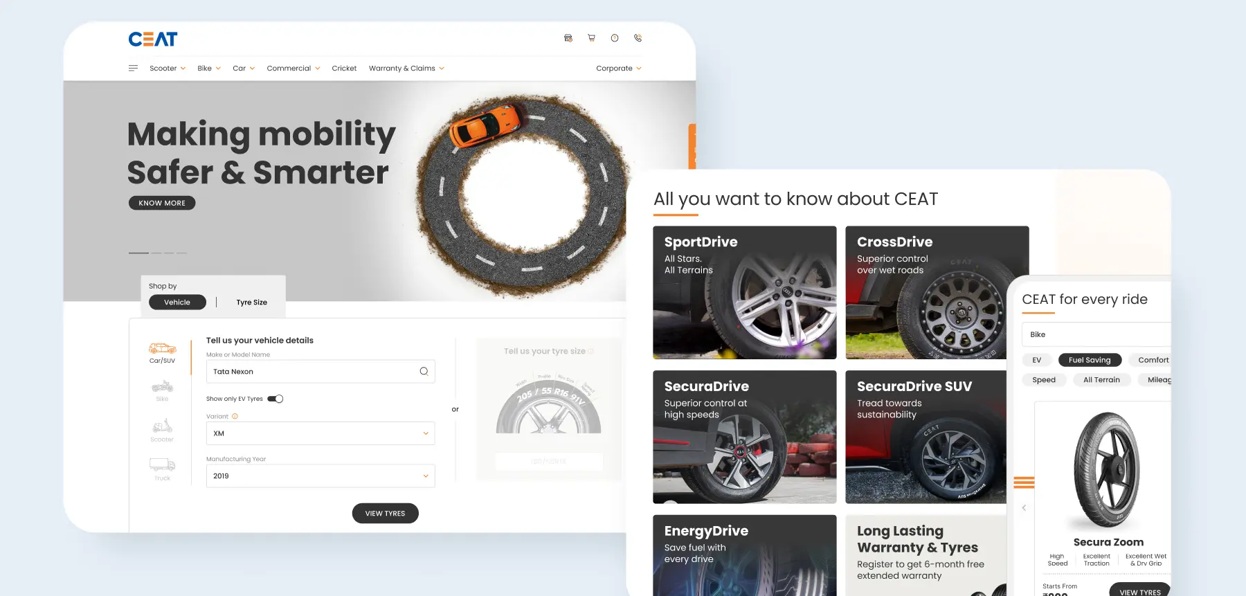
We worked with CEAT Tyres to revamp their website entirely. A key component of the project was to improve their digital presence for lead generation: the website was meant to double as an ecommerce portal. Prior to kickstarting the project, we conducted a deep dive into the pre-existing website’s strengths and weaknesses, identifying areas for improvement. One crucial point we noted was that the previous website was a tyre website without any tyres: they were not highlighted through visuals or through graphics. We turned the wheel around to make the story entirely about CEAT’s world class range of tyres.
Mobile-First Design
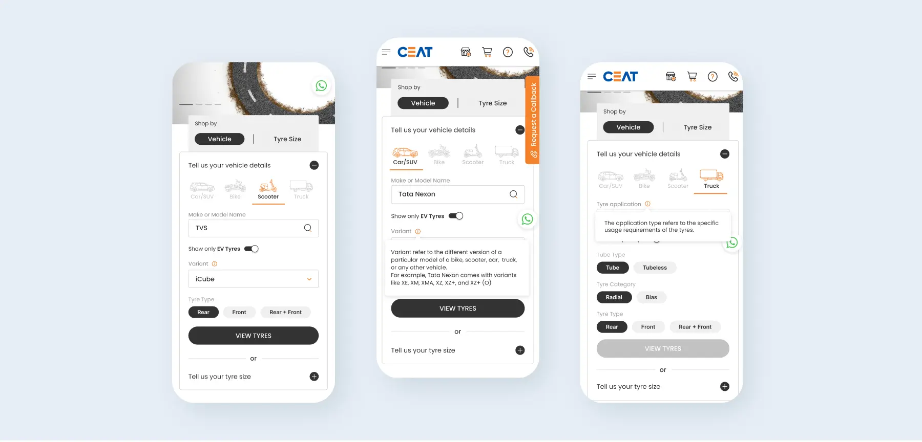
Based on our insights, we realized that CEAT Tyres’ target demographic is more likely to engage with the website on their mobile than on a laptop. While we usually follow the strategy of desktop-first designs, we adapted our game-plan for this project by redesigning CEAT’s website with a mobile-first approach, ensuring optimal user experience on smartphones and tablets to cater to the customer.
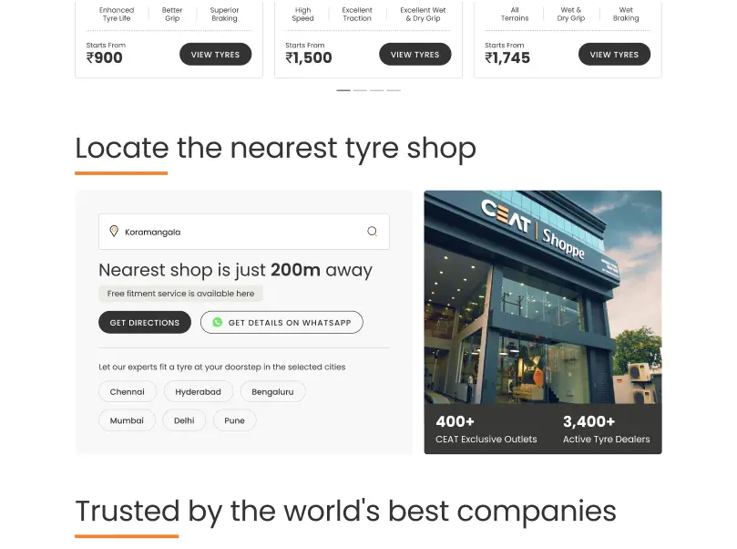
Oiling the Navigation Wheels
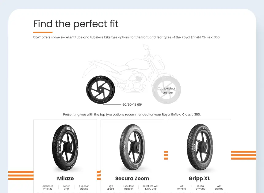
Recognizing the importance of intuitive navigation on mobile devices, we streamlined navigation menus and pathways to facilitate effortless browsing. We allowed users to navigate through tyre types based on vehicle, tyre size, brands, and models, so that they find the required product with ease. By simplifying the user journey and minimizing friction points, the redesigned website empowered users to access desired information swiftly and efficiently.
We incorporated non-intrusive lead generation forms throughout the website, prioritizing user experience without compromising on CEAT Tyres’ marketing objectives. By seamlessly integrating lead capture mechanisms into the browsing experience, the redesigned website fostered user engagement while simultaneously maximizing conversion opportunities.
Our revamp of CEAT Tyres’ website yielded tangible results, with a notable 12% increase in user engagement and a significant 3% uptick in lead generation. These metrics underscored the importance of customer-centric designing, fortifying CEAT Tyres’ digital presence and amplifying its impact in the competitive online landscape.
Convinced yet?
We believe our work speaks for itself. If it strikes a chord with you, let’s create something extraordinary together!