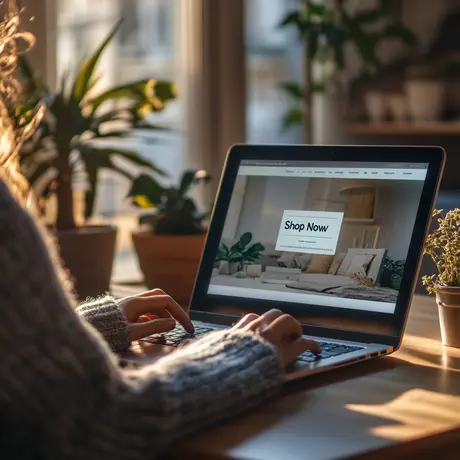
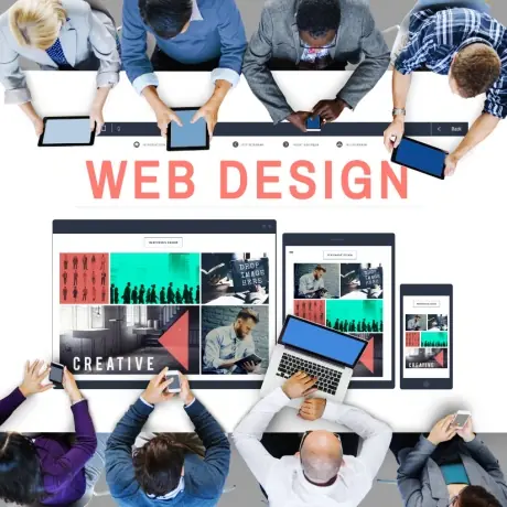
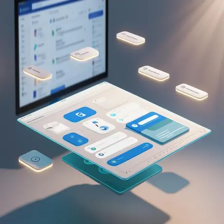
Blog

« Back

Millennials are coming of age. Their spending capacity has crossed $200 billion. While they are the high-spending customers of the future, it’s best to acquire them today. But it’s not all that easy. Getting them to stay on your home page for more than 10 seconds is tricky, let alone getting them to sign up. That’s where UI/UX (User Interface/User Experience) design lends its capabilities. Effective UI UX design can help businesses aid engagement, establish relevance, and of course, get users to take desired actions right from the home page. Especially if you’re trying to acquire millennial customers.

So what is it that your home page should feature? And how does it help you acquire a prospect skimming through your home page? Let’s find out.

Take for instance a bank or a broking firm. It would want its first-time website visitors, which includes millennial customers, to open an account or start investing. Instead of bombarding them with products, testimonials, or awards, it’s wiser to pre-empt what they need and address just that bang on the home page. The UX and supportive copy can then be crafted to address the most critical needs and queries, leading to relevant products or services.

Millennials take pride in their self-sufficiency. So a self-servicing solution on the home page is more likely to trigger desired actions. If you prompt users, like millennial customers, with “I want to buy a _________ in ___ years”, they will know exactly what they want. As much as it’s their decision, the UX plants the idea of wanting what they thought of. The use of first-person copy can further personalize the flow, giving the user ownership of the product or service. In parallel, thoughtful copy guiding the user through the onboarding journey adds a DIY touch to the user experience.

Why drift away from the traditional home page? The evolving digital behavior of millennial customers is fuelled by convenience and relevance. Convenience comes from simpler navigation and skimmable jargon-free information. Relevance comes from identifying what users need. How do we know it’s true? By practice. Edelweiss, one of India’s leading Financial Institutions, wanted to acquire more millennial customers. But their content-heavy and clutter-ridden home page was getting in its way. That’s where Screenroot stepped in.

Complex home page UI/UX of an Indian investment and stock broking firm

Edelweiss’s old content-heavy homepage (as above) struggled to attract and acquire millennial customers.

For starters, our UX team created a radical home page structure, specifically laid out to make millennials sign up or transact. After in-depth research on what millennials think about investing, we boiled it down to the seven most critical needs. Every need, articulated in simple thought-provoking statements or queries, was mapped to a relevant product or service. The all-new Edelweiss.in home page has the intent of every likely user fleshed out. The new home page also features first-person jargon-free copy for a rather personalized, intimate, and intuitive user experience.

Clean homepage UI/UX design for millennials

Edelweiss’s new home page is designed to drive millennials to take relevant actions.

UI UX design matters just as much as the home page. Your home page can be your ultimate customer acquisition tool if designed right. Well-researched and thoughtful UI UX design can make it happen. And what are the odds? That’s exactly what we specialize in. Drop us a line and we’ll show you what the future could hold for your website.

© 2024 ScreenRoot Technologies Limited. All Rights Reserved