
 1800 121 5955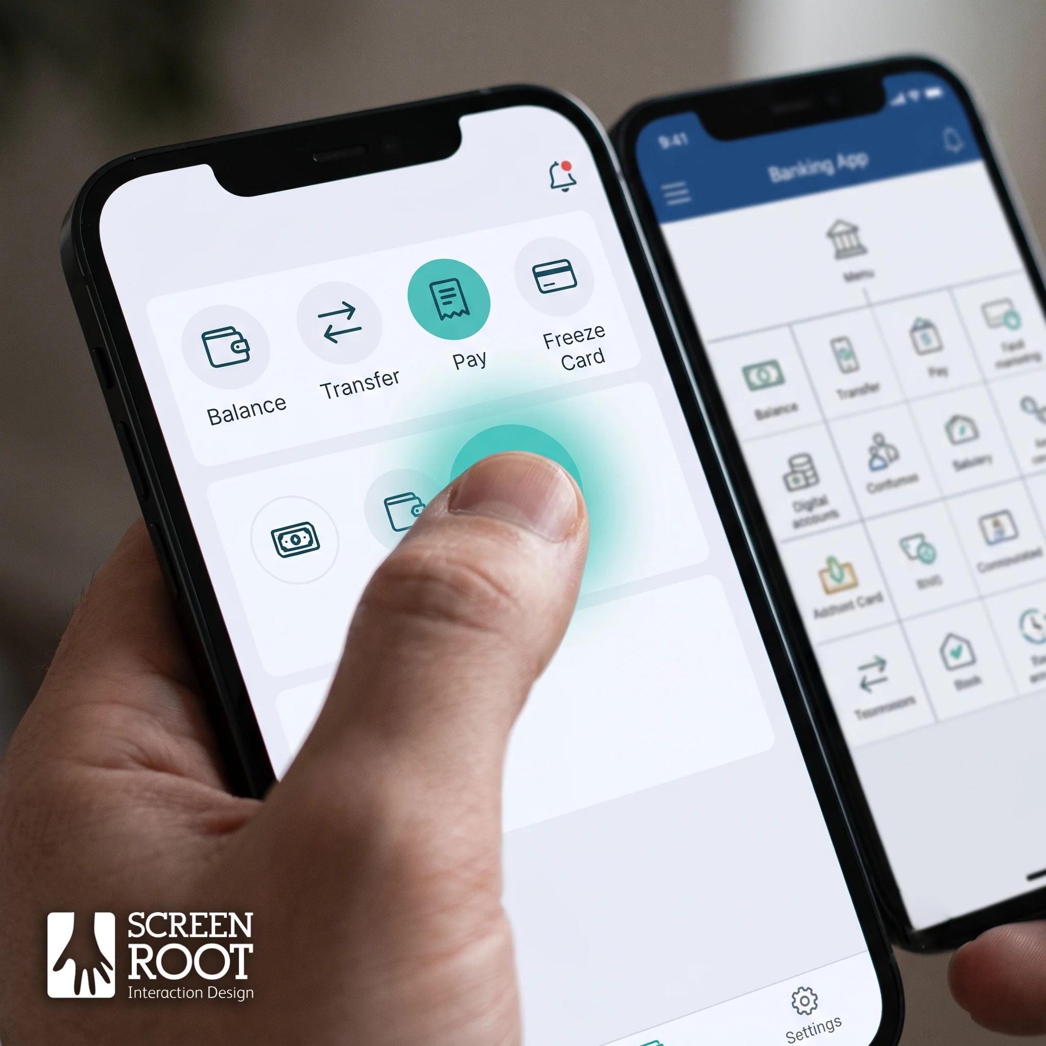
Key takeaways
- Most banks have a mobile app. Far fewer have an app customers actually adopt. The gap is usually cognitive load, not missing features.
- Design the home screen around task frequency (balance, transfers, known payees, card controls), not around the bank’s internal org chart.
- Treat multi-device banking as a supported pattern: cross-device approval, tiered limits, and re-enrollment that reuses a verified identity.
- In international transfers, a visible status timeline and an itemized FX breakdown remove the uncertainty that drives support calls.
- Usability testing should be an ongoing operating rhythm, not a pre-launch gate. Adoption erodes quietly between releases.
Improving digital banking UX means cutting the effort a customer spends on the tasks they perform most often. Every mid-to-large bank ships a mobile app, but far fewer own the customer relationship that app was supposed to secure. The gap is rarely missing functionality. It is cognitive load: too many taps to reach a balance, unexplained pending states, and authentication flows that read like compliance documents.
The app is no longer a channel that supports the branch. It is the branch. Juniper Research forecast in 2021 that 53% of the world’s population, more than 4.2 billion people, would use digital banking by 2026. In North America, Forrester found that 65% of US banking customers want to be able to accomplish any financial task through a mobile app.
Abandonment is what makes poor UX expensive. A customer who stalls halfway through setting up a payee doesn’t complain. They open a competitor’s app, or they call the contact center and turn a near-zero-cost digital interaction into a costly human one. Good digital banking UX prevents both.
What is digital banking UX?
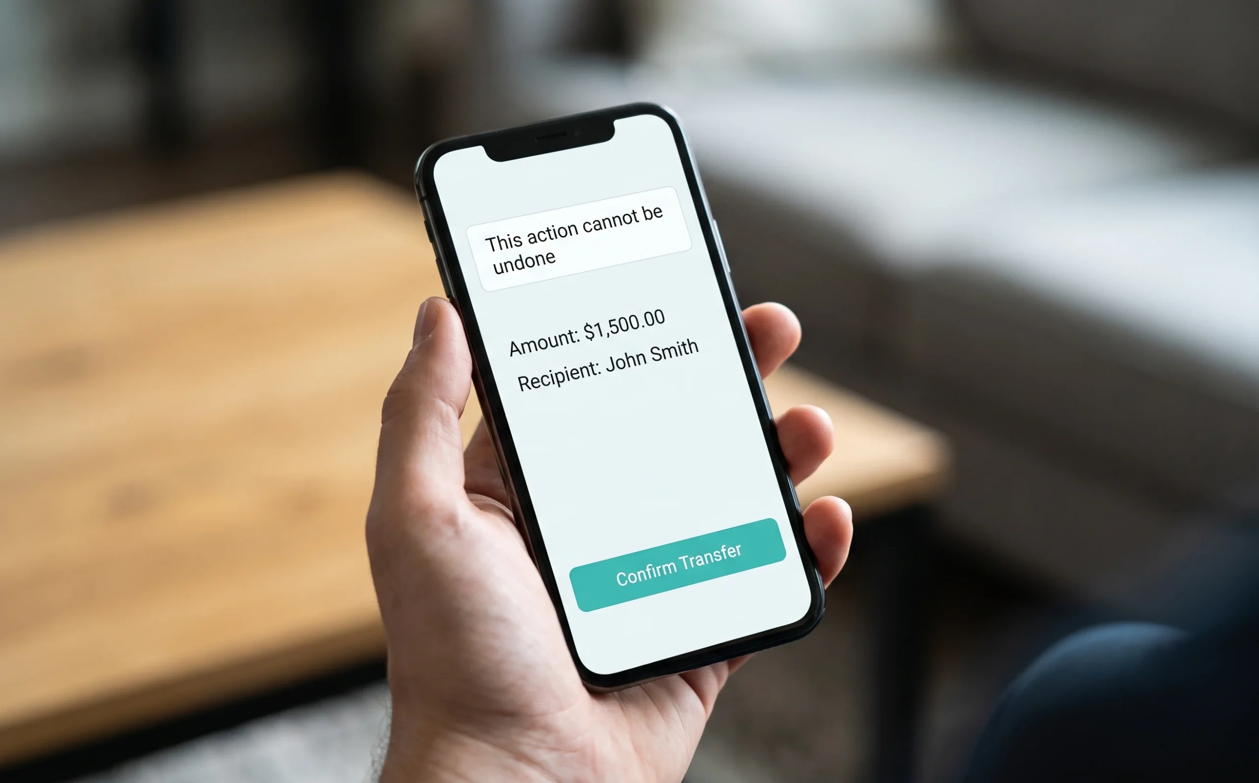
Digital banking UX is the quality of a customer’s experience across a bank’s app, website, and connected channels: how easily they can complete tasks, understand what is happening to their money, and trust that it is secure. Good digital banking UX minimizes effort and uncertainty in high-stakes, often irreversible financial actions while meeting regulatory requirements.
Feature parity is cheap to copy. A transfer flow that a first-time user completes without calling support is not. That is why experience, rather than functionality, has become the differentiator between banks.
How should you design a mobile banking app home screen?
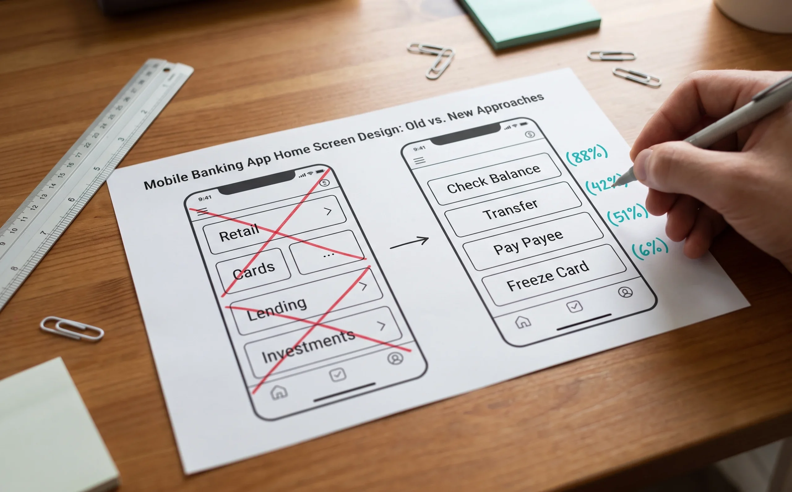
Design the mobile banking app home screen around the four or five tasks that account for most sessions, not around product cross-sells or internal team structure. Put checking a balance, moving money, paying a known payee, reviewing a charge, and freezing a card first. Then revisit the order quarterly using real frequency data.
Design around task frequency, not org structure. When mobile banking app design mirrors the bank’s internal split between retail, cards, and lending teams, users pay the price for an org chart they can’t see. Frequency data should set the hierarchy.
Reduce cognitive load before adding visual polish. Good banking app interface design removes decisions rather than decorating them:
- One primary action per screen
- Plain-language labels instead of core-system field names
- Progressive disclosure for anything a typical customer uses twice a year
Every term inherited from the mainframe is a small comprehension cost, paid across millions of sessions.
Anchor decisions in research, not opinion. In regulated sectors, design intuition is unreliable because the constraints are unusual and mistakes are costly in only one direction. A misread confirmation screen in retail means a returned sweater. In banking it means an irreversible transfer. ScreenRoot’s banking work starts with behavioral research and journey mapping, not a visual refresh. The aesthetic follows the evidence.
ScreenRoot’s six-month, ground-up redesign of the Yes Bank mobile app followed this approach. Core tasks such as payments, transfers, and investments were given a distinct icon style so they stand out, and more than 100 features were described in approachable language for users from Gen Z to Gen X. The app has since crossed a million downloads across Google Play and the App Store.
How do you balance security and usability when customers bank on a dedicated device?
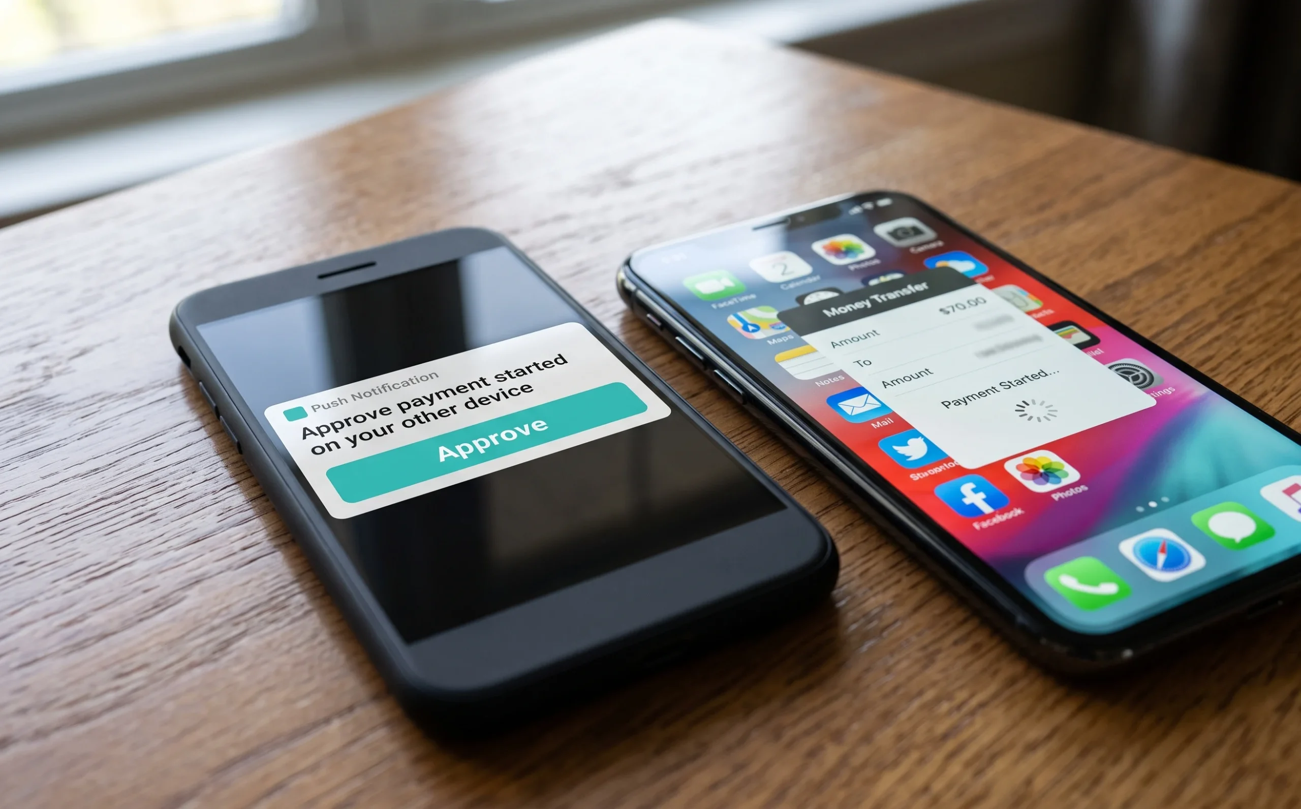
Make multi-device banking a supported pattern rather than a workaround. Some security-conscious customers keep banking on a separate, clean phone with no social apps and minimal permissions. The design answer is cross-device approval, tiered limits for low-value payments, and re-enrollment that reuses an already-verified identity.
The logic behind a dedicated banking device is sound, because a smaller attack surface is a real defense against malware and screen-overlay fraud. The result, though, is a journey split across two devices, and most apps handle that split badly:
| Friction Point | What Goes Wrong | Design Fix |
| Second-device setup | Enrolling a new device repeats the full identity-verification process, and users abandon | Re-enrollment that reuses an already-verified identity |
| Spontaneous payments | The banking phone is at home when a payment is needed | Cross-device approval, where the secure phone authorizes a payment started elsewhere |
| Low-value transactions | Every payment requires the secure device | Tiered limits that keep small payments on the everyday phone |
| Missed alerts | Fraud alerts arrive on a phone sitting in a drawer | Alert routing that reaches the device the customer is actually carrying |
Security and convenience only conflict when the interface refuses to acknowledge how people actually live.
How can banks reduce anxiety in international transfers?
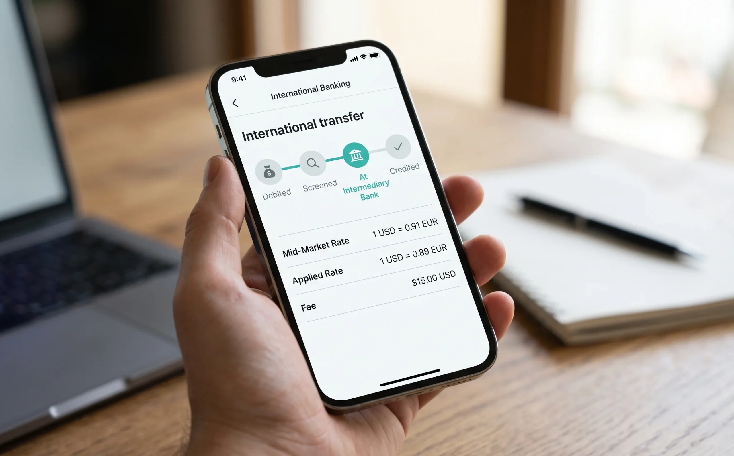
Show customers where their money is at every stage. Cross-border payments are among the highest-anxiety interactions in retail and SME banking, because money disappears into a correspondent network the customer can’t see. A status timeline, a transparent FX and fee breakdown, and inline validation of bank codes remove most of the uncertainty behind support calls.
“I sent it Tuesday. The money left my account, the recipient hasn’t received it, and nobody can tell me where it is.”
That complaint is a design failure, not an operations failure. The payment is usually progressing normally. The interface just doesn’t say so.
- Show the money in transit. Render the journey as a timeline: debited, screened, at the intermediary bank, credited. Even an estimated stage beats an empty screen, and each visible step removes a reason to call.
- Separate the FX markup from the fee. Before confirmation, show the mid-market rate, the applied rate, the spread, and any correspondent deductions. Customers forgive costs they understand and resent costs they discover later.
- Make bank codes self-explaining. Inline validation of SWIFT/BIC codes, automatic bank-name lookup on paste, and contextual help at the point of confusion prevent misrouted payments that damage trust permanently.
In ScreenRoot’s experience designing for complex banking systems, perceived control in high-stakes flows matters as much as actual speed. Customers will accept a three-day settlement they can watch over a one-day settlement they can’t.

What role does banking app usability testing play in adoption?
Continuous banking app usability testing keeps adoption from eroding between releases. Each release tends to add a little friction to a core journey. Testing as an ongoing rhythm, rather than a one-time pre-launch gate, catches that drift early enough to reverse it and stops teams from building features nobody adopts.
| Testing Type | Adoption Benefit |
| Moderated task-based sessions | Shows where users hesitate, misread labels, or abandon before the flow ships |
| Real-world scenario simulation (poor connectivity, bright sunlight, interruptions) | Confirms authentication and payment flows work in the conditions customers actually bank in |
| Legacy-to-new migration testing | Identifies relearning costs for existing customers, the group most likely to churn after a redesign |
| Accessibility and assistive-technology audits | Protects compliance and widens the addressable base across age and ability |
| Staged feature validation with limited cohorts | Confirms demand and comprehension before committing full engineering spend |
| Post-release analytics paired with qualitative follow-up | Explains why a funnel metric moved, not just that it moved |
For a CIO, the key distinction is between testing as a gate and testing as a rhythm. Gated testing catches defects. Continuous testing catches drift: the slow buildup of small compromises that, over eighteen months of sprints, turns a well-designed app into a tolerated one. Validating features with real users before build also reduces the volume of shipped functionality nobody adopts, one of the largest hidden costs in bank digital budgets.

What should banking leaders prioritize in 2026?
Banking leaders should treat experience as the differentiator, transparency as the fastest route to trust, and security as a design problem rather than a trade-off. Digital maturity is now measured by how little effort an app demands, not by how much it can do.
- Experience is the differentiator because functionality no longer is. When competitors offer the same core features, the deciding factor is which app makes routine banking disappear fastest. Efforts to improve digital banking UX belong in the growth budget, not the cosmetic one.
- Transparency builds trust faster than reassurance. Visible transaction states, unbundled fees, and honest processing estimates outperform security badges and marketing language.
- Security and convenience are a design problem. Step-up authentication and fraud controls can work without stalling the customer if friction is placed where risk is concentrated, not spread evenly across every interaction.
- Specialized expertise beats generalist design in regulated environments. Banking interfaces carry legal constraints, irreversible actions, and core-system limitations that consumer patterns don’t account for.
- Usability testing is an operating discipline. Adoption metrics degrade quietly between releases, and only continuous research explains why early enough to act.
Where should a bank start?
Start with a friction audit, not a redesign. Instrument the five journeys that carry the most volume, find where customers drop out or call, and map those drop-offs to the interface decisions that caused them. That audit almost always produces a shorter, cheaper, more defensible roadmap than a full redesign.
BFSI design is not consumer design with stricter rules attached. The constraints are structural: irreversible transactions, mandated disclosures, core systems that expose fields no customer should ever see, fraud patterns that change faster than release cycles, and an audience that ranges from digital natives to first-time smartphone users. A generalist team meeting these conditions for the first time spends months learning what a specialist team already knows.
ScreenRoot has designed digital products for complex, regulated environments since 2008, including banking work for Karnataka Bank, Yes Bank, and Suryoday. We arrive with established patterns for authentication, transaction transparency, multi-device journeys, and legacy migration, and we validate them with real users before engineering commits. See examples in our work, read our guide to fintech web design, or see how to start with a UX audit.
Frequently Asked Questions
What makes a good digital banking user experience?
A good digital banking experience makes frequent tasks fast, explains what is happening to money at every step, and places security friction only where risk is highest. It uses plain language instead of system terms, puts one primary action on each screen, and is validated through ongoing usability testing with real customers across ages and abilities.
Why do customers abandon banking apps?
Customers abandon banking apps when tasks take too many steps, labels are unclear, pending states go unexplained, or authentication feels disproportionate to the action. Rather than complaining, they switch to a competitor’s app or call the contact center, which turns a low-cost digital interaction into an expensive human one and weakens the relationship.
How often should banks run usability testing on their apps?
Continuously. Most teams benefit from small, moderated testing rounds every release cycle on the highest-volume journeys, plus migration testing before any redesign and accessibility audits on a regular schedule. Testing only before launch catches defects but misses the gradual drift in usability that builds up across many small releases.
How can banks make international transfers less stressful for customers?
Show a status timeline from debit to credit, display the exchange rate, spread, and all fees before confirmation, and validate SWIFT/BIC codes as they are entered. Customers tolerate slower settlement when they can see progress. Silence is what drives anxiety and support calls, not the time the transfer takes.
How do you balance security and usability in banking apps?
Match friction to risk. Use step-up authentication for high-value or unusual actions, and keep routine low-value tasks fast. Support multi-device patterns with cross-device approval and tiered limits, and let customers re-enroll devices using an identity that has already been verified. Security and usability only conflict when every action gets the same friction.
Written by Team ScreenRoot. 16+ years leading enterprise UI/UX research for BFSI, SaaS, and Healthcare clients.
When you’re ready, let’s talk.
📞 Call us (Toll-Free): 1800 121 5955 (India)
✉️ Email us: [email protected]



